library(tidyverse)
library(ggplot2)

knitr::opts_chunk$set(echo = TRUE, warning=FALSE, message=FALSE) Challenge 5
Introduction to Visualization
Read in data
- AB_NYC_2019.csv
AB <- read_csv("_data/AB_NYC_2019.csv")
AB_clean <- AB %>% select(-c(1,3)) %>% mutate_at(c(1,2,3,4,7), as.factor)
AB_clean <- AB_clean %>% mutate_at(c(8,9,10,13,14), as.integer) %>% rename("dwelling_name" = name )
ABAB_cleanTidy Data and briefly describe the data
For this dataset, I first remove the first and third column which are not useful for my analysis. From tibble above, we can simply see the variable are not very suitable. I assume that this dataset won’t be changed anymore, so as you can see, I mutate some variable types. Also, I rename “name” column as “dwelling_name” which is more specific.
Univariate Visualizations
AB_clean %>% ggplot(aes(x = `neighbourhood_group`)) +
  geom_bar() + geom_text(stat='count', aes(label=..count..), vjust=-0.5) +
   labs(x = "Neighbourhood group",
       y = "Number of dwelling",
       title = "The number of dewlling in each neighbourhood group") +
  theme_minimal()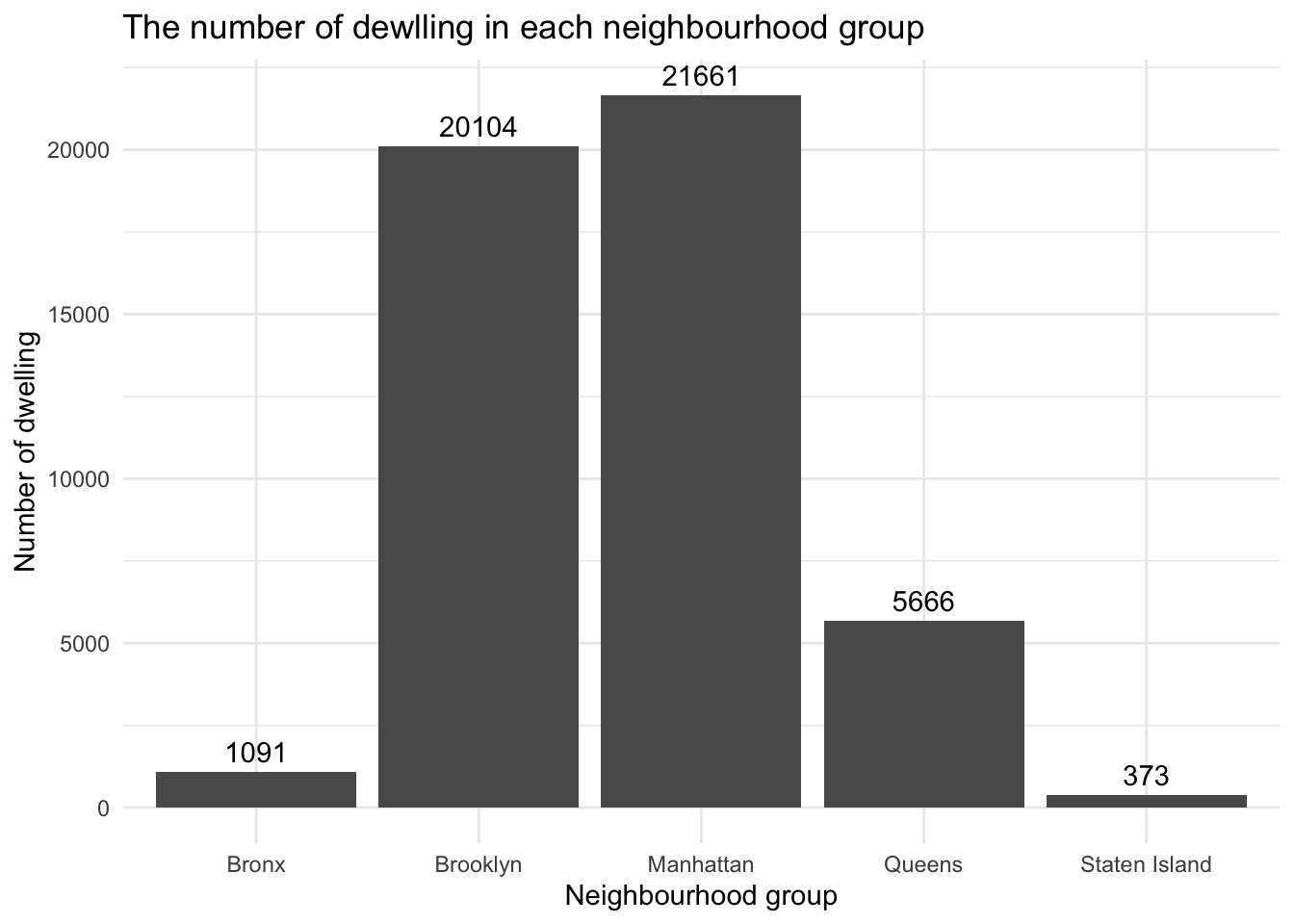
From this graph, we can see how many dwellings were in each neighborhood group. We can clearly get the number of dwellings in Manhattan and Brooklyn were much more than others.
AB_clean %>% ggplot(aes(x = `availability_365`)) +
  geom_histogram() +
  labs(x = "Available days in 2019",
       title = "The count available days in 2019") +
  theme_minimal()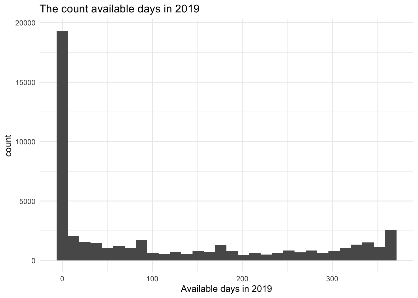
From this graph, we can see most of the dwellings were rented out all year round. Dwellings that didn’t rented out for 200 days were the fewest. There are about 2500 dwellings that were barely rented out all year.
AB_clean %>% ggplot(aes(x = `availability_365`)) +
  geom_density(alpha = 0.2, fill = "red") +
  labs(x = "Available days in 2019",
       title = "The count available days in 2019") +
  theme_minimal()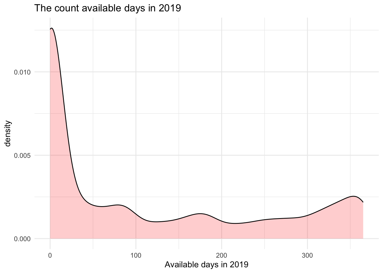
From this graph, we can see more directly that most houses were rented out all year round. There are also small peaks between 40 and 365 days and the last peak which is about 360 days is a little bit higher than other peaks.
Bivariate Visualization(s)
ggplot(AB_clean, aes( availability_365, price)) +
  geom_point() +
  labs(x = "Available days in 2019",
       y = "The price of dwelling",
       title = "The relationship between available days and price") +
  theme_minimal()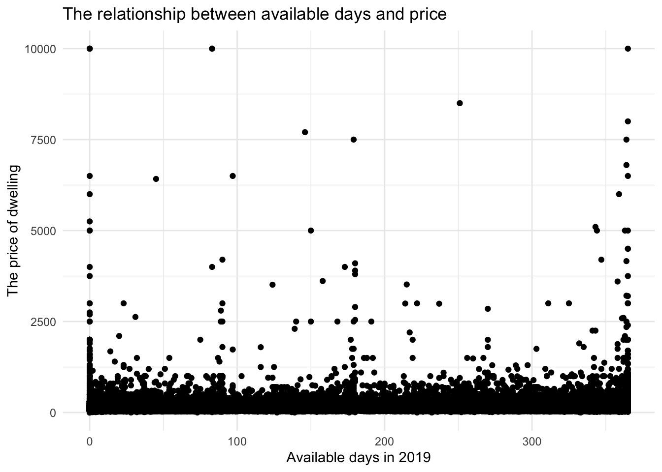
From this graph, we can see no matter how many days are available in a year, most of the prices were concentrated below 1250 dollars and only several prices of dwellings were higher than 2500 dollars. So we can take a closer look at the relationship between price and available days in the low price region.
ggplot(AB_clean, aes( availability_365, price)) +
  geom_smooth()  +
  labs(x = "Available days in 2019",
       y = "The price of dwelling",
       title = "The relationship between available days and price") +
  theme_minimal()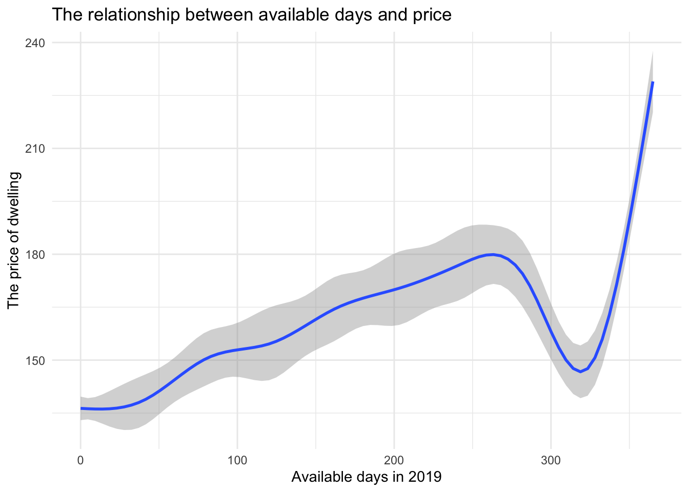
From this graph, we can see the price fluctuation is mainly concentrated below 240 dollars. From 0 to about 265 available days, the overall price was gradually rising. Then from 265 to 325 available days, there was a considerable reduction in price. From 325 to 365 available days, the price increased sharply.