library(tidyverse)
library(ggplot2)

knitr::opts_chunk$set(echo = TRUE, warning=FALSE, message=FALSE)
Challenge 5
challenge_5
australian_marriage
Introduction to Visualization
Challenge Overview
Today’s challenge is to:
- read in a data set, and describe the data set using both words and any supporting information (e.g., tables, etc)
- tidy data (as needed, including sanity checks)
- mutate variables as needed (including sanity checks)
- create at least two univariate visualizations
- try to make them “publication” ready
- Explain why you choose the specific graph type
- Create at least one bivariate visualization
- try to make them “publication” ready
- Explain why you choose the specific graph type
R Graph Gallery is a good starting point for thinking about what information is conveyed in standard graph types, and includes example R code.
(be sure to only include the category tags for the data you use!)
Read in data
Read in one (or more) of the following datasets, using the correct R package and command.
- cereal.csv ⭐
- Total_cost_for_top_15_pathogens_2018.xlsx ⭐
- Australian Marriage ⭐⭐
- AB_NYC_2019.csv ⭐⭐⭐
- StateCounty2012.xls ⭐⭐⭐
- Public School Characteristics ⭐⭐⭐⭐
- USA Households ⭐⭐⭐⭐⭐
Using the read.csv function we can read the data into a data frame.
australian_marriage <- read.csv("_data/australian_marriage_tidy.csv")
australian_marriage
Briefly describe the data
Tidy Data (as needed)
This data set contains the results of a 2017 survey of Australians in which they were asked whether or not they are married. Currently, a row represents a country and a response type (yes or no). In order to tidy the data and prepare it for visualization, we need to pivot the data so that the yes and no responses become columns, and each country is represented by one case. We will also make the percentage column into two columns, for percentage yes and percentage no.
australian_marriage <- australian_marriage %>%
  pivot_wider(names_from = resp, values_from = c(count, percent))
australian_marriage
Univariate Visualizations
First, we will plot the number of yes reponses for each territory using a bar graph.
ggplot(australian_marriage, aes(x = str_wrap(territory, width = 10), y = count_yes, fill = territory)) +
  geom_bar(stat = "identity") +
  labs(title = "Count of Yes Responses by Territory", x = "Territory", y = "Count Yes") +
  guides(fill = FALSE)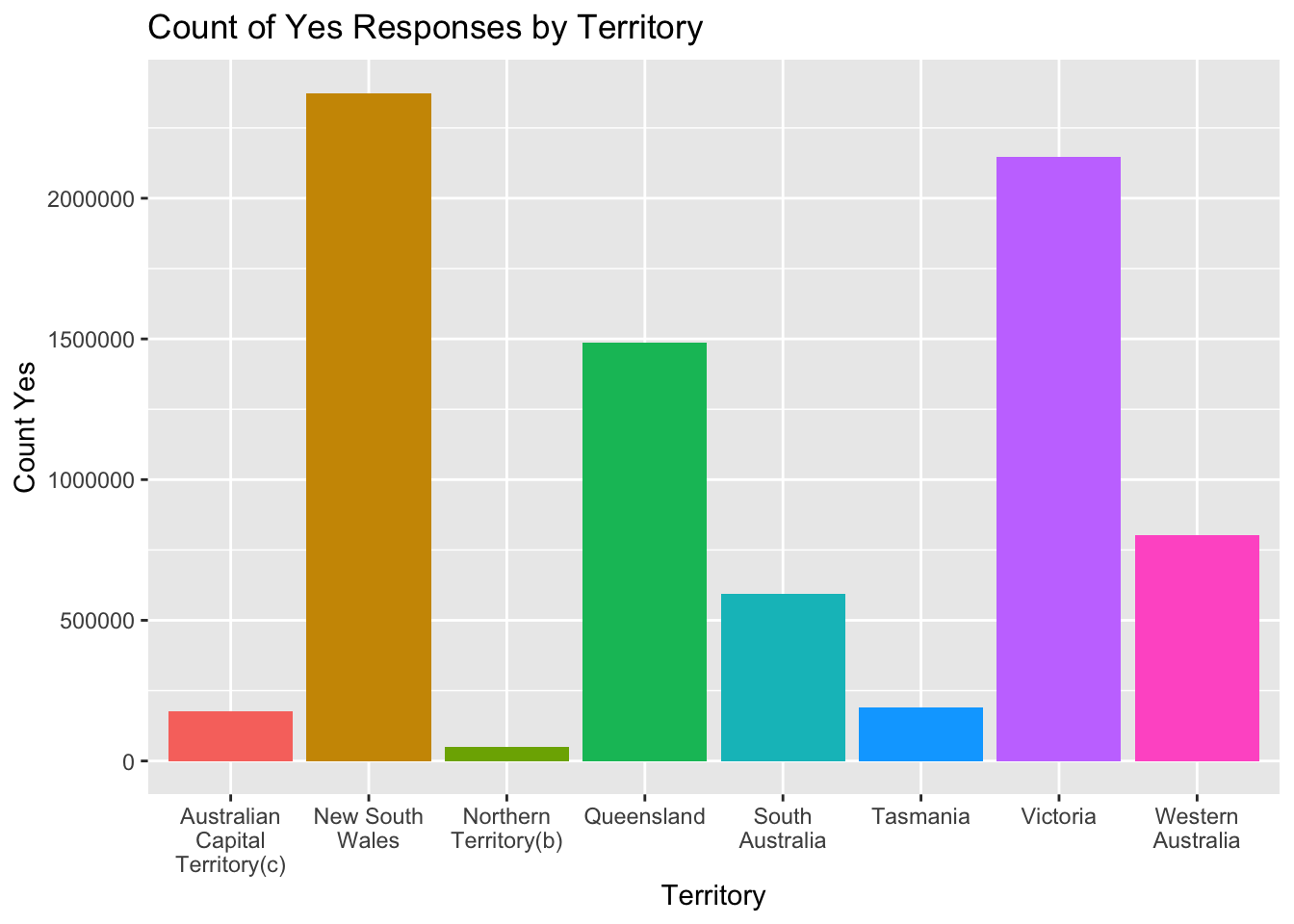
We can see from the graph there is a wide range of yes responses for the different territories, with New South Wales having the most responses (and likely the most married couples), and Northern Territory having the least. Since the territories likely vary greatly in population, let’s now look at the percentage of yes responses in each territory instead.
ggplot(australian_marriage, aes(x = str_wrap(territory, width = 10), y = percent_yes, fill = territory)) +
  geom_bar(stat = "identity") +
  labs(title = "Percent Yes Responses by Territory", x = "Percent Yes", y = "Territory") +
  guides(fill = FALSE)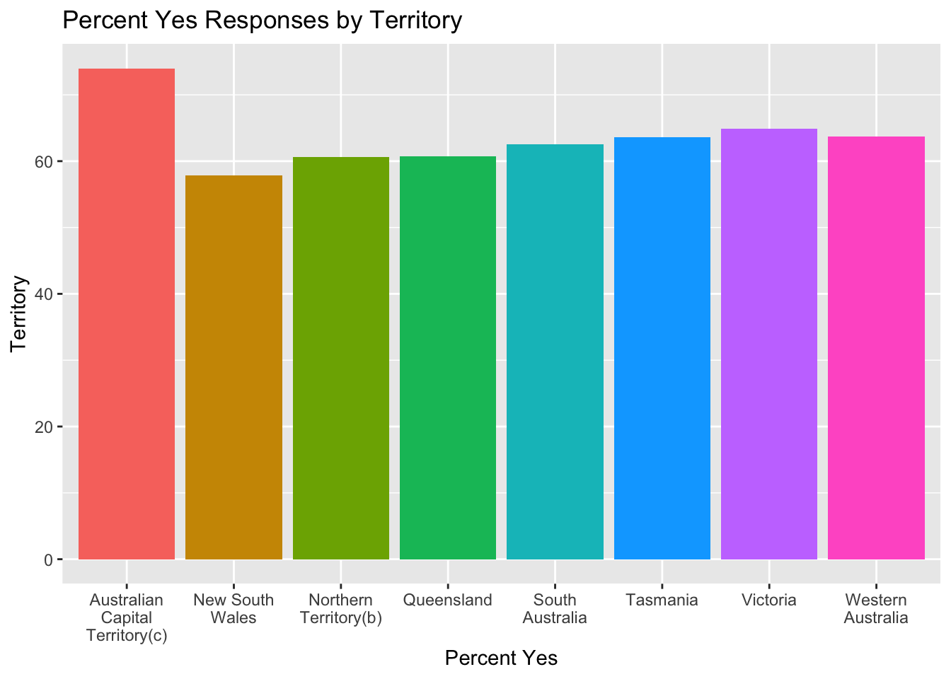
We can see from this graph that the Australian Capital Territory has the highest percentage of yes votes (and likely the highest percentage of married couples). This illustrates why looking at percentages can be important since the first graph showed that this territory had the second least amount of yes votes, which could be misleading.
Bivariate Visualization(s)
ggplot(australian_marriage, aes(count_yes, count_no, color = territory)) +
  geom_point() +
  labs(title = "Number of Yes vs No Responses by Territory", x = "Count Yes", y = "Count No") + coord_fixed()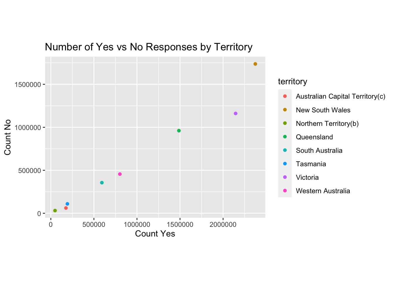
From this graph, we can see that for all territories, the number of yes responses exceeded the number of no responses. This aligns with what the Percent Yes by Territory graph showed us previous (all yes percentages were over 50%).