library(tidyverse)
library(ggplot2)
library(readxl)
knitr::opts_chunk$set(echo = TRUE, warning=FALSE, message=FALSE)Challenge 6
challenge_6
hotel_bookings
air_bnb
fed_rate
debt
usa_households
abc_poll
Visualizing Time and Relationships
Read in data and clean data
- fed_rate ⭐⭐
fed <- read_csv("_data/FedFundsRate.csv")
fed_clean <- fed %>% select(-c(4:6)) %>% fill(`Real GDP (Percent Change)`, .direction = "down") %>%
fill(`Inflation Rate`, .direction = "down") %>%
fill(`Effective Federal Funds Rate`, .direction = "down") %>%
mutate(date = str_c(Month, Year, Day, sep= "-"), date = myd(date)) %>%
select(-c(1:3))
fedfed_cleanI delete some columns I don’t need, mutate the date type column and fill the columns. This is a clear and easy dataset to plot the graphs of annual trend.
Time Dependent Visualization
fed_clean %>% ggplot(aes(x = date, y = `Effective Federal Funds Rate` )) +
geom_line(color = "indianred3",
size=0.8 ) +
labs(title = "Annual Trend in the Effective Federal Funds Rate",
x = "Year",
y = "Effective Federal Funds Rate") +
theme_minimal() 
This graph is the annual trend of effective federal funds rate from 1954 to 2017. From 1954 to about 1982, the general trend was increasing then went down. We can see in about 1982, the rate was extremely high.
fed_long <- fed_clean %>% pivot_longer(cols = -date, names_to = "variable", values_to = "value")
fed_longfed_long %>% filter(variable%in%c("Effective", "GDP", "Unemployment", "inflation")) %>%
ggplot(., aes(x=date, y=value, color = variable))+
geom_point(size = 0) +
geom_line() +
facet_grid(rows = vars(variable))Error in `combine_vars()`:
! Faceting variables must have at least one valueRead in data and clean data
- AB_NYC ⭐⭐⭐⭐⭐
hotel <- read_csv("_data/hotel_bookings.csv")
hotelhotel_clean <- hotel %>% mutate(arrival_date = str_c( arrival_date_month, arrival_date_year, arrival_date_day_of_month, sep= "-"), arrival_date = myd(arrival_date)) %>%
select(-c(4:7)) %>%
mutate_at(c(1,2,9,10), as.factor)%>%
mutate(state = case_when
(is_canceled == "1" ~ "canceled",
is_canceled == "0" ~ "regular")) %>%
select(-is_canceled) %>%
mutate(stays_nights = rowSums(across(c(3:4)))) %>%
select(-c(3:4)) %>%
mutate(Guests_number = rowSums(across(c(3:5))))%>%
select(-c(3:5)) %>%
mutate(market_segment = str_remove(market_segment, "TA")) %>%
mutate(market_segment = str_remove(market_segment, "/TO")) %>%
select(-c(distribution_channel,company)) %>% rename("average_daily_rate" = adr)
hotel_cleanI clean the dataset above. It may not useful for plotting graphs in below codes, but I just practice some.
Visualizing Part-Whole Relationships
not_outlier <- function(x){
return(x > quantile(x, 0.25) - 1.5* IQR(x) & x< quantile(x, 0.75) + 1.5* IQR(x))
}
hotel_clean <- hotel_clean %>% filter(not_outlier(average_daily_rate)) %>% arrange(arrival_date)
hotel_clean2 <- hotel_clean %>% filter(country == "PRT")
hotel_clean %>%ggplot(aes(x = "", y = hotel, fill = hotel)) +
geom_bar(width = 1,
stat = "identity") +
coord_polar("y",
start = 0,
direction = -1) +
theme_void()+
labs(title = "The Proportion of Resort Hotel and City Hotel in PRT",
x = "",
y = "")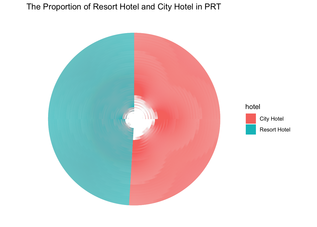
It is little bit abstract to plot the part - whole graphs for me.
This graph shows the proportion of city hotel and resort hotel in PRT, in which we can see the number of resort hotel is much more than city hotel.
hotel_clean3 <-hotel_clean %>% group_by(hotel) %>%count(hotel)
hotel_clean3 %>%ggplot(aes(x = "", y = n, fill = hotel)) +
geom_bar(width = 1,
stat = "identity") +
coord_polar("y",
start = 0,
direction = -1) +
theme_void()+
labs(title = "The Proportion of Resort Hotel and City Hotel in All Countries",
x = "",
y = "")
This graph shows the proportion of city hotel and resort hotel in all countries, in which we can see the number of resort hotel is still much more than city hotel. But the proportion of city hotel is a little bit bigger than that in PRT.
debt <- read_excel("_data/debt_in_trillions.xlsx")
debt <- debt %>% mutate(date = parse_date_time(`Year and Quarter`, orders = "yq"))ggplot(debt, aes(x=date, y=Total)) +
geom_point() +
geom_line() +
scale_y_continuous(labels = scales :: label_number(suffix = "Trillion"))
ggplot(debt, aes(x=date, y=Total)) +
geom_point() +
geom_line() +
scale_y_continuous(limits=c(0, max(debt$Total)) , labels = scales :: label_number(suffix = "Trillion"))
debt_long <- debt %>% pivot_longer(
cols = Mortgage : Other,
names_to = "Loan",
values_to = "total"
) %>%
select(-Total) %>%
mutate(Loan = as.factor(Loan))
debtdebt_longggplot(debt_long, aes(x=date, y = total, color= Loan)) +
geom_line() +
geom_point(size=.5) +
theme(legend.position = "right") +
scale_y_continuous(labels = scales::label_number(suffix = "Trillion"))
ggplot(debt_long, aes(x=date, y = total, fill= Loan)) +
geom_bar(position = "stack", stat = "identity") +
theme(legend.position = "top") +
scale_y_continuous(labels = scales::label_number(suffix = "Trillion"))
debt_long <- debt_long %>%
mutate(Loan = fct_relevel(Loan, "Mortgage", "Auto Loan", "HE Revolving", "Student Loan", "Credit Card", "Other"))
ggplot(debt_long, aes(x=date, y = total, fill= Loan)) +
#sum up all
geom_bar(position = "stack", stat = "identity") +
#the position of legend
theme(legend.position = "top") +
#add "Trillion" in y label
scale_y_continuous(labels = scales::label_number(suffix = "Trillion")) +
#make legend in 1 line
guides(fill = guide_legend(nrow = 1)) +
#replace space to change line
scale_fill_discrete(labels =
str_replace(levels(debt_long$Loan), " ", "\n"))