library(tidyverse)
library(ggplot2)
library(readr)
library(readxl)
library(dplyr)
library(lubridate)


knitr::opts_chunk$set(echo = TRUE, warning=FALSE, message=FALSE)
Challenge 6 Post
challenge_6
debt
Visualizing Time and Relationships
Challenge Overview
Today’s challenge is to:
- read in a data set, and describe the data set using both words and any supporting information (e.g., tables, etc)
- tidy data (as needed, including sanity checks)
- mutate variables as needed (including sanity checks)
- create at least one graph including time (evolution)
- try to make them “publication” ready (optional)
- Explain why you choose the specific graph type
- Create at least one graph depicting part-whole or flow relationships
- try to make them “publication” ready (optional)
- Explain why you choose the specific graph type
R Graph Gallery is a good starting point for thinking about what information is conveyed in standard graph types, and includes example R code.
(be sure to only include the category tags for the data you use!)
Read in data
Read in one (or more) of the following datasets, using the correct R package and command.
- Today, I’ll be reading in the debt dataset ⭐
debt <- read_excel("_data/debt_in_trillions.xlsx")
debtsummary(debt) Year and Quarter Mortgage HE Revolving Auto Loan
Length:74 Min. : 4.942 Min. :0.2420 Min. :0.6220
Class :character 1st Qu.: 8.036 1st Qu.:0.4275 1st Qu.:0.7430
Mode :character Median : 8.412 Median :0.5165 Median :0.8145
Mean : 8.274 Mean :0.5161 Mean :0.9309
3rd Qu.: 9.047 3rd Qu.:0.6172 3rd Qu.:1.1515
Max. :10.442 Max. :0.7140 Max. :1.4150
Credit Card Student Loan Other Total
Min. :0.6590 Min. :0.2407 Min. :0.2960 Min. : 7.231
1st Qu.:0.6966 1st Qu.:0.5333 1st Qu.:0.3414 1st Qu.:11.311
Median :0.7375 Median :0.9088 Median :0.3921 Median :11.852
Mean :0.7565 Mean :0.9189 Mean :0.3831 Mean :11.779
3rd Qu.:0.8165 3rd Qu.:1.3022 3rd Qu.:0.4154 3rd Qu.:12.674
Max. :0.9270 Max. :1.5840 Max. :0.4860 Max. :14.957 dim(debt)[1] 74 8Briefly describe the data
In the debt dataset, there are 74 observations and 8 variables. As it currently is, Year and Quarter is a character variable whereas the remaining variables all have numeric value(s). From the Year and Quarter variable, we can infer that this dataset collects information from the first quarter of 2003 through the second quarter of 2021. Organized by year and quarter, this dataset seems to provide measurements of different types of debt linked to different types of loans (Mortgage debt, HE Revolving debt, Auto Loan debt, Credit Card debt, Student Loan debt, ‘Other’ debt, and Total debt).
Tidying Data & Mutating Variables
Is your data already tidy, or is there work to be done? Are there any variables that require mutation to be usable in your analysis stream? For example, do you need to calculate new values in order to graph them? Can string values be represented numerically? Do you need to turn any variables into factors and reorder for ease of graphics and visualization? Be sure to anticipate your end result to provide a sanity check, and document your work here.
Technically, year values and quarter values share a cell within the Year and Quarter column; this should be tidied. We’ll go with transforming the Year and Quarter column into more succinct date values, which will be helpful for visualization and further analysis; we can do this by using the parse_date_time () function within the mutate () function. After this, I’ll separate the ‘old’ Year and Quarter column using separate, with the intention to delete the year and keep Quarter as its own column.
#transforming Year and Quarter column into Date using parse_date_time () and mutate ()

debt2 <- debt %>%
  mutate(Date=parse_date_time(`Year and Quarter`, orders="yq"))
debt2
# separate 'old' Year and Quarter column
debt3 <- debt2 %>%
separate(`Year and Quarter`, into = c("Year", "Quarter"), sep = ":Q")
debt3#delete Year column
debt4 <- debt3 %>%
select(-c(`Year`))
debt4Seems like we now have a date column and from separating the ‘old’ Year and Quarter column, we’ve retained the Quarter variable!
We can use pivot_longer () to put all the information for different types of debt (which are currently their own distinct variables) into two columns/variables called Debt_Type (character values) and Debt_Amount (numeric values). After pivoting, the remaining columns/variables will be Quarter, Debt_Type, Debt_Amount, and Date.
# pivoting variables of different types/measures of debt into two variables called Debt_Type and Debt_Amount

debt5 <- debt4 %>%
  pivot_longer(cols = c(`Mortgage`, `HE Revolving`, `Auto Loan`, `Credit Card`, `Student Loan`, `Other`), names_to = "Debt_Type", values_to = "Debt_Amount")
debt5 <- debt5 %>%
  select(-c(Total))
debt5
Seems like the pivot worked as expected; in this version of the dataset, Quarter, Date, Debt_Type and Debt_Amount are now variables!
Time Dependent Visualization
First, we’ll track total debt over time, or in other words, by date. I’ll use a basic connected scatterplot, which is a line plot overlaid by the dots from a scatterplot that can be used to show the relationship between two numeric variables (Holtz, 2018).
#total debt over time
ggplot(debt4, aes(x= Date, y=Total))+
  geom_line(color= "darkblue", size=2)+
  labs(title= " Line Plot of Total Debt from 2003-2021", x= "Date", y= "Debt, in trillions")+
  geom_point(shape=21, color= "darkblue", fill="green", size=2)+
  theme_minimal()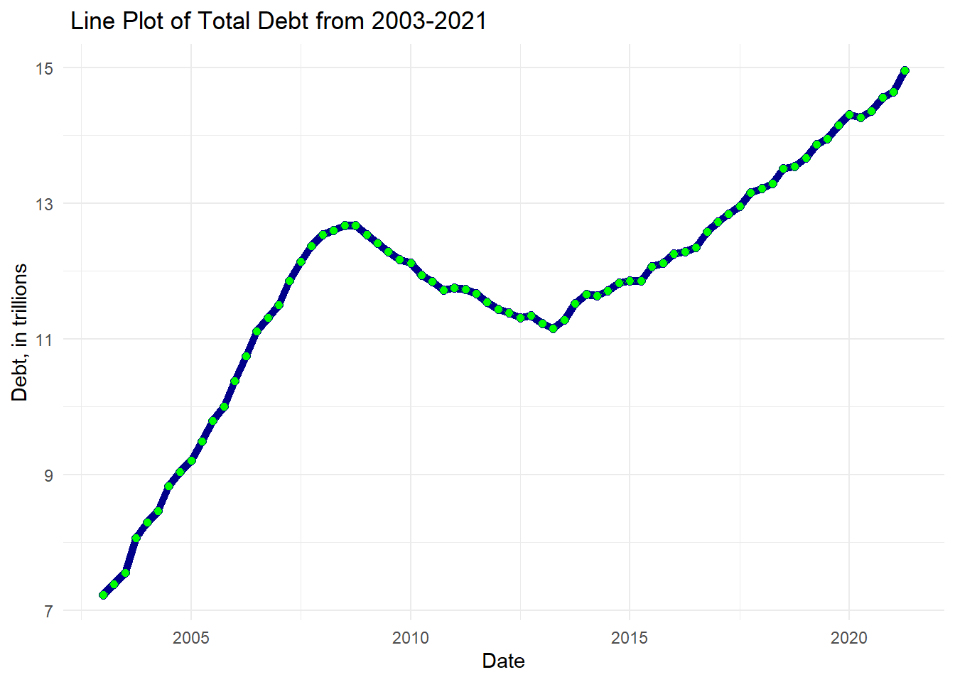
From what we can see, for the most part, it seems like there is a relatively positive correlation–as the years have passed, the total amount of debt (in trillions) continues to rise!
Visualizing Part-Whole Relationships
Next, we’ll use a line plot, using geom_path() to visualize Debt (in trillions) by Year sorted by Debt_Type. We’ll also use a stacked bar plot to visualize Debt (in trillions) by Year, sorted by Quarter. These types of plots are useful for displaying multiple variables simultaneously, “split into groups and subgroups” (Holtz, 2018).
#mutate date to get just the year
debt6 <- debt5 %>%
  mutate(Date=year(`Date`))
debt6
# factor () to sequence Debt Type
debt6$Debt_Type <- factor(debt6$Debt_Type, levels = c("Other", "HE Revolving", "Credit Card", "Student Loan", "Auto Loan", "Mortgage"))
# Line Plot of Debt over Year sorted by Debt Type
ggplot(debt6, aes(x= Date, y= `Debt_Amount`, fill= Debt_Type))+
geom_path(size=0.5, aes(col=Debt_Type))+
labs(x= "Year", y= "Debt, in trillions", fill= "Debt Type", title= "Line Plot of Debt over Year sorted by Debt Type")+
theme_minimal()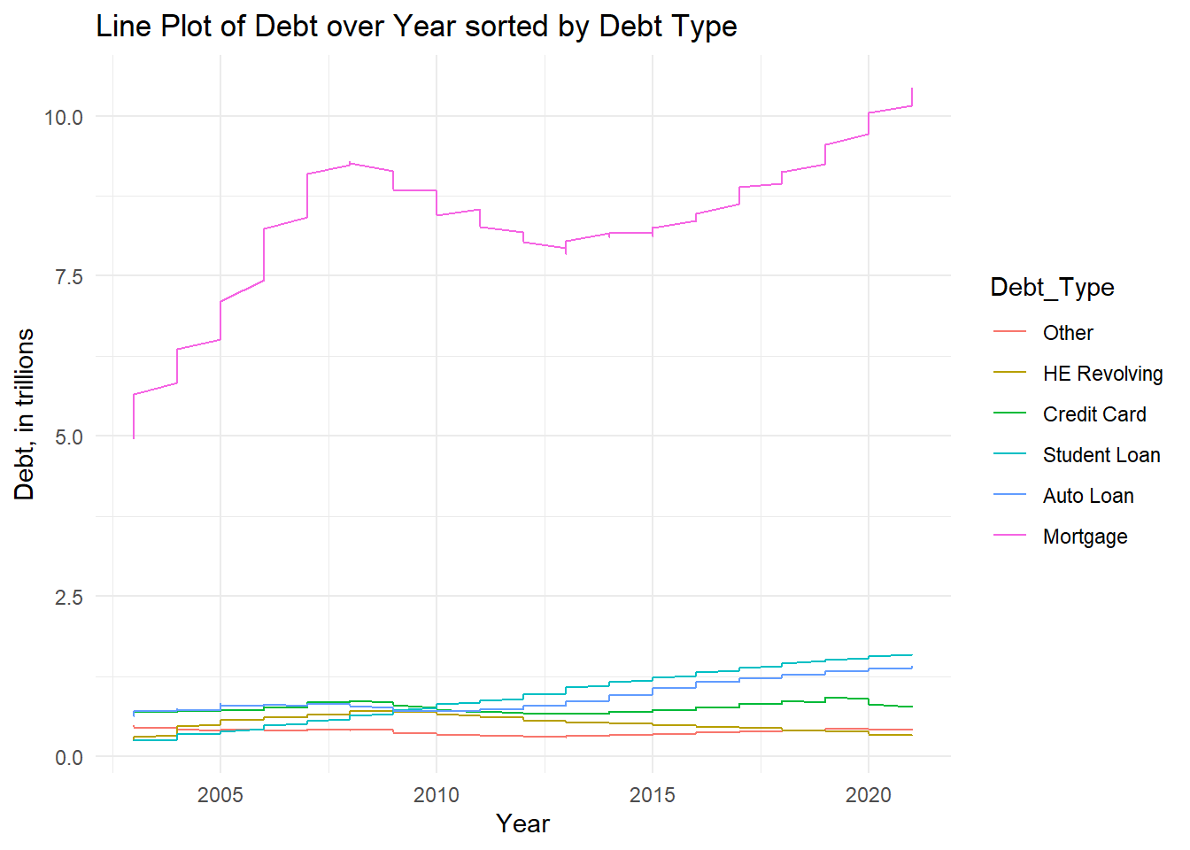
# factor () to sequence Quarter
debt6$Quarter <- factor(debt6$Quarter, levels = c("4", "3", "2","1"))

# Stacked Bar Plot of Debt over Year sorted by Quarter
ggplot(debt6, aes(x=Date, y= `Debt_Amount`, fill= Quarter))+
  geom_col(aes(col=Quarter))+
  labs(x= "Year", y= "Debt, in trillions", fill= "Quarter", title = "Stacked Bar Plot of Debt over Year by Quarter")+
  theme_minimal()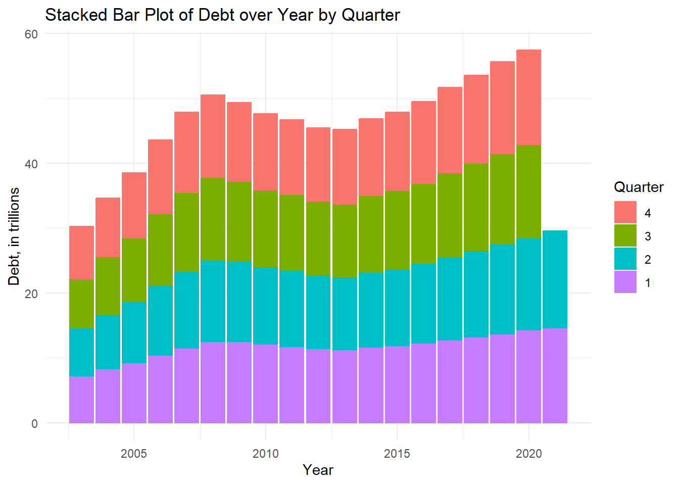
From the first graph, the line plot, we can see that Mortgage incurs the highest amount of debt out of all the debt types and has a line that most resembles, the time dependent visualization, “Line Plot of Total Debt from 2003-2021.” From the second graph–the stacked bar plot, in particular, we can better see that even though the year 2021 visually seems like an outlier in other graphs, its Quarter 1 and Quarter 2 debt amounts were following the upward trending pattern as they are higher than those respective figures in 2020, the previous year.
References
Holtz, Y. (2018). Connected scatterplot. The R Graph Gallery. https://r-graph-gallery.com/connected-scatterplot.html
Holtz, Y. (2018). Connected scatterplot with R and ggplot2. The R Graph Gallery. https://r-graph-gallery.com/connected_scatterplot_ggplot2.html
Holtz, Y. (2018). Grouped, stacked and percent stacked barplot in ggplot2. The R Graph Gallery. https://r-graph-gallery.com/48-grouped-barplot-with-ggplot2.html