library(tidyverse)
library(readxl)
library(ggplot2)

knitr::opts_chunk$set(echo = TRUE, warning=FALSE, message=FALSE)Challenge 6
challenge_6
debt
Visualizing Time and Relationships
Read in data
Using the read.csv function we can read the data into a data frame.
debt <- read_excel("_data/debt_in_trillions.xlsx")
debt
Briefly describe the data
This data shows the debt in trillions for each quarter for the years 2003 to 2021. It gives the debt for different categories including mortgage, HE revolving, auto loan, credit card, student load, other, as well as the total debt for each quarter.
Tidy Data (as needed)
This data set is already tidy. Each case represents one quarter and gives the debt for that quarter amongst the categories. All numerical columns in this data set are correctly represented by doubles and the Year and Quarter column is represented by chars. One slight mutation we can make is to rename the column names to remove spaces.
colnames(debt) <- gsub(" ", "_", colnames(debt))
debt
Time Dependent Visualization
Lets look at how the total debt trended over the entire timefrome of the data set using a line plot.
ggplot(debt, aes(x = Year_and_Quarter, y = Total)) +
  geom_line(aes(group = 1), color = "blue") +
  theme_minimal() +
  theme(axis.text.x = element_text(angle = 60, hjust = 1)) +
  labs(title = "Total Debt vs Time", x = "Year and Quarter", y = "Billions of Dollars")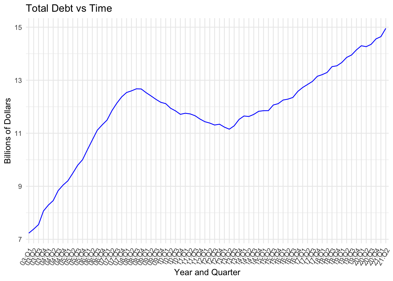
Since there are many data points, the line plot is effective at displaying the trend of the total debt over time. From the graph we can see that generally the total debt has gone up over the years 2003-2021. However, we see that the trend has not been completely linear, as the total debt trended downwards between 2009 and 2013.
Visualizing Part-Whole Relationships
Lets look at how the total debt over the timeframe was broken down by category using a pie chart. First, we need to remove the Year_and_Quarter and Total columns from the data sine they will not be in the pie chart.
debt_trim <- debt %>%
  select(-c("Year_and_Quarter", "Total"))
debt_trim
Next, we need to sum all of the columns to get the total debt for each column over the timeframe.
sums_df <- data.frame(Sums = colSums(debt_trim))
sums_df
Finally, we can create the pie chart.
values <- sums_df$Sums
label_names <- row.names(sums_df)
pie(values, labels = label_names, main = "Total Debt by Category 2003-2021")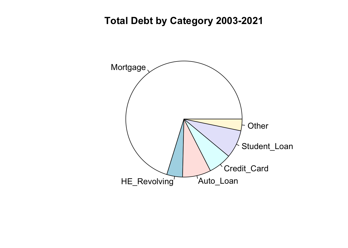
The pie chart is effective at portraying this information because it visually shows how much each category contributes to the total debt. From the chart we can see that mortgages were by far the largest source of debt from 2003-2021. The remaining categories make up just over a quarter of the total debt during this time.