library(tidyverse)
library(ggplot2)
library(readxl)
library(lubridate)

knitr::opts_chunk$set(echo = TRUE, warning=FALSE, message=FALSE)
Challenge 6 Solution
challenge_6
hotel_bookings
air_bnb
fed_rate
debt
usa_households
abc_poll
Susannah Reed Poland
Visualizing Time and Relationships
Challenge Overview
Today’s challenge is to:
- read in a data set, and describe the data set using both words and any supporting information (e.g., tables, etc)
- tidy data (as needed, including sanity checks)
- mutate variables as needed (including sanity checks)
- create at least one graph including time (evolution)
- try to make them “publication” ready (optional)
- Explain why you choose the specific graph type
- Create at least one graph depicting part-whole or flow relationships
- try to make them “publication” ready (optional)
- Explain why you choose the specific graph type
Read in data
debt_orig<-read_excel("_data/debt_in_trillions.xlsx")Briefly describe the data
Sean shared in our last session (June 13) that this dataset was generated by the New York Federal Reserve. It presents the amount of debt of American households, totaled and also broken down across 6 loans types, as measured quarterly in the years spanning 2003 and 2021 (Q2). From the title of the dataset we glean that the values represent trillions of dollars.
There are 74 unique case of year:quarter and 7 other variables: Mortgage, HE revolving, Auto Loan, Student Loan, Credit Card, Other, and Total debt.
Tidy Data (as needed)
In order to plot this, we will want to use the year and quarter information to generate a date. This will allow us to visualise the data with respect to a date using the functions of the lubridate package.
#create a new column, "date", which parses the "Year and Quarter" column into the first date of that quarter. Remove Year and Quarter.
debt<-debt_orig%>%
  mutate(date_orig = parse_date_time(`Year and Quarter`, orders="yq"))%>%
  select(-`Year and Quarter`)
debt
Time Dependent Visualization
#Scatterplot of total debt across time
debt%>%
  ggplot(aes(date_orig, Total)) + geom_point() + scale_y_continuous(limits=c(2, max(debt$Total)))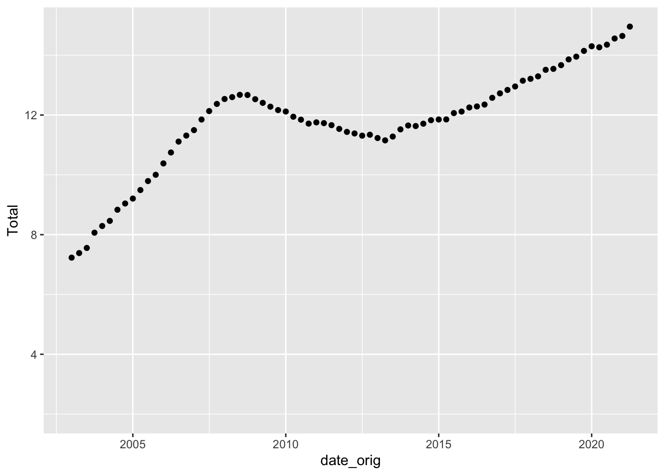
#Scatterplot of student loan debt over time
debt%>%
  ggplot(aes(date_orig, `Student Loan`)) + geom_point() + scale_y_continuous(limits=c(0, max(debt$`Student Loan`)))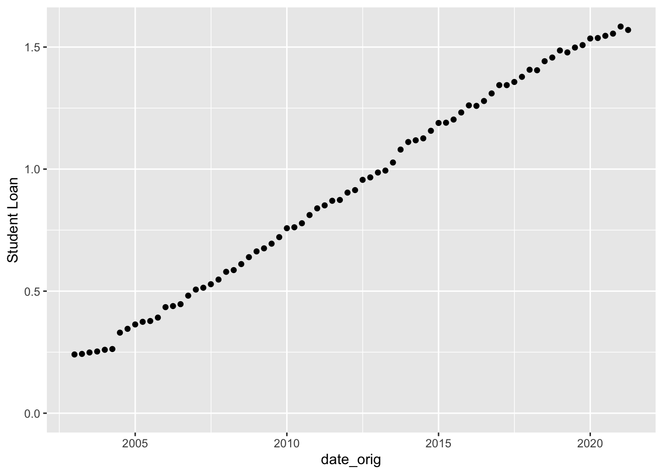
#Scatterplot of mortgage debt over time
debt%>%
  ggplot(aes(date_orig, `Mortgage`)) + geom_point() + scale_y_continuous(limits=c(0, max(debt$Mortgage)))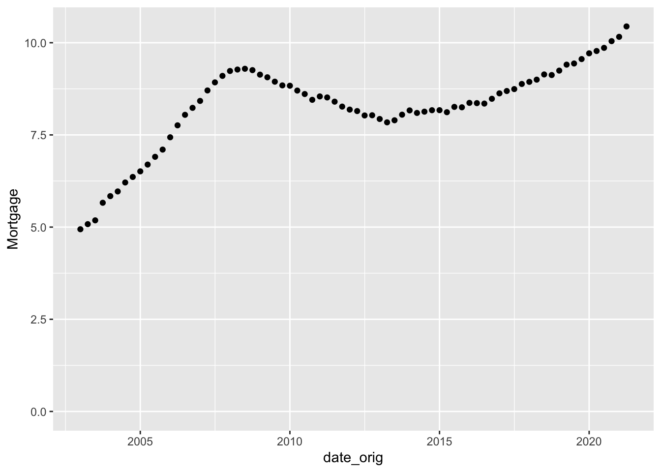
To visualize how each type of debt changes over time, we first have to tidy the data:
#Tidy data
debt_long<-debt%>%
  pivot_longer(cols = "Mortgage":"Other", names_to = "Type", values_to= "Amount")%>%
  select(-Total)
debt_long
Now we can plot it in a line graph, with axis labels and a title to facilitate comprehension.
#Plot
ggplot(debt_long, aes(date_orig, Amount, colour = Type)) + geom_line() + labs(title = "American Household Debt 2003-2023", y = "Trillions of USD", x = "Year")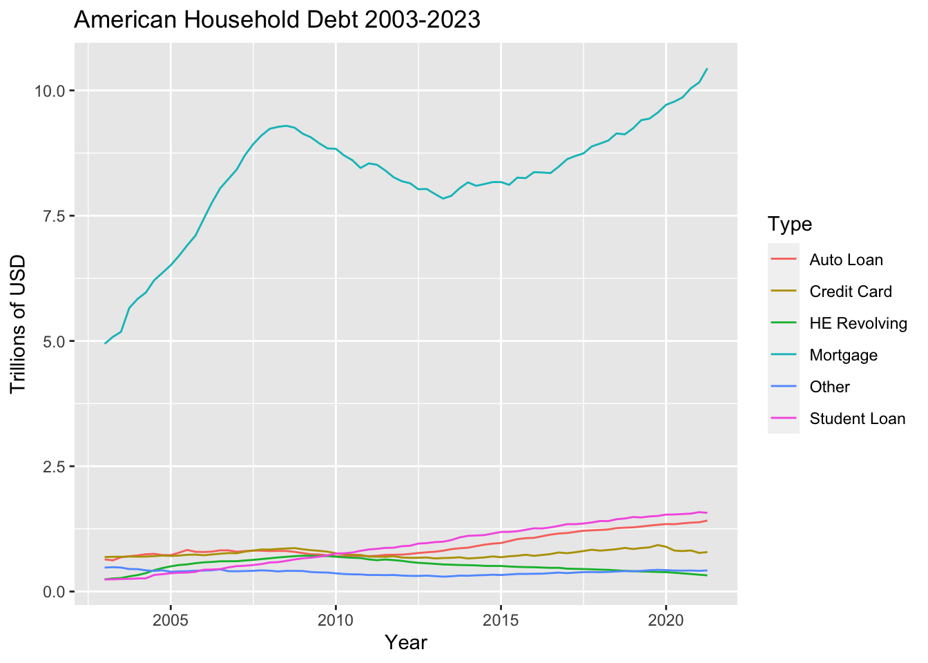
We can clearly see that mortgage debt is not only far greater than any other type of debt, but its variability is far more dramatic. The pronounced decline at 2008 toward a local minimum around 2013 was probably due to the 2008 housing crisis.
Visualizing Part-Whole Relationships
debt_long%>%
  ggplot(aes(x=date_orig, y=Amount, fill=Type)) + geom_bar(position="stack", stat="identity") + labs(title = "American Household Debt 2003-2023 - Porportionals of Types", y = "Trillions of USD", x = "Year")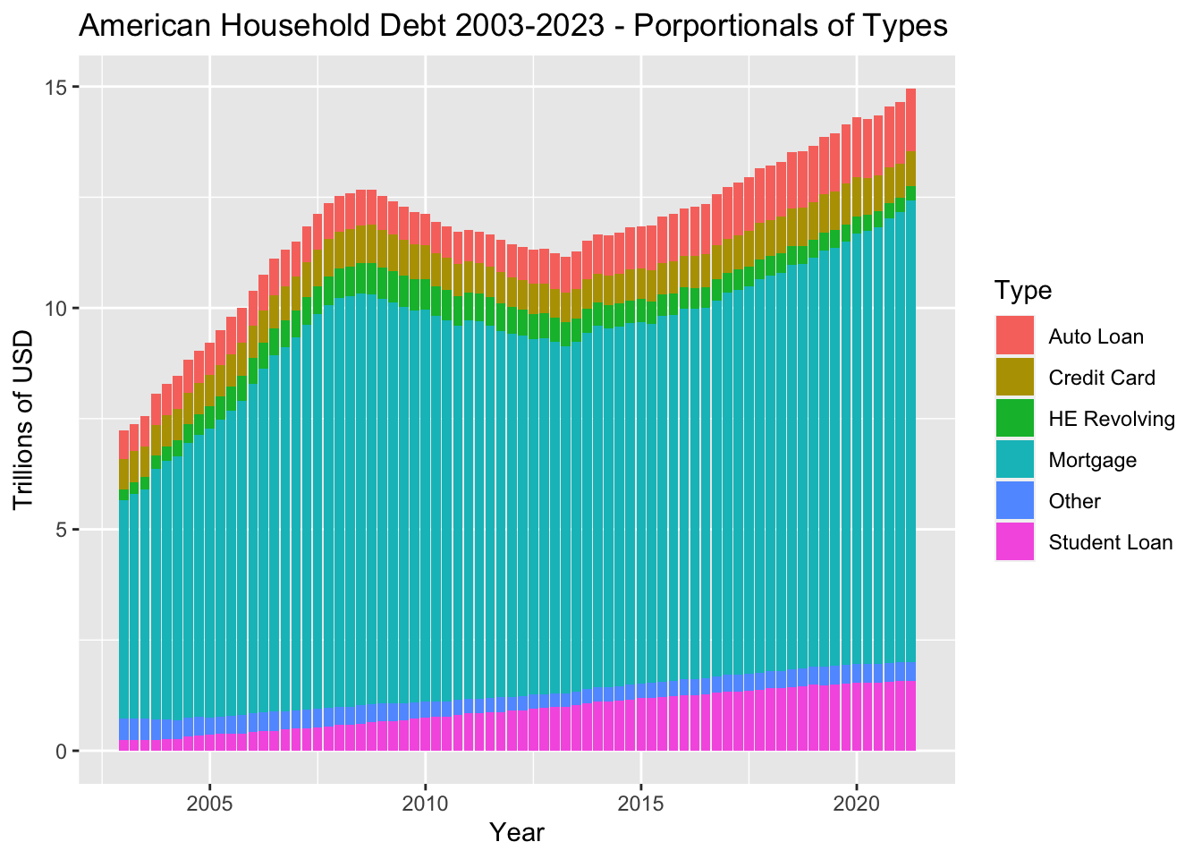
This bar plot shows the overall total amount of American household debt has changed over time, and also the relative porportions of different types of debt.
(Note - I am still confused about factors, and understand that using the factor argument would allow me to change the order in which the types of debt are stacked. I’ll study this and try it in a subsequent challenge!)