library(tidyverse)
library(ggplot2)

knitr::opts_chunk$set(echo = TRUE, warning=FALSE, message=FALSE)Challenge 7
Visualizing Multiple Dimensions
Read in data and clean it
eggs_tidy.csv
egg <- read.csv("_data/eggs_tidy.csv")

egg <- egg %>% mutate(date = str_c(month, year, sep="-"), date = my(date)) %>% select(-c(1,2))


egg
egg_long <- egg %>%
pivot_longer(cols = -date, names_to = "dozen", values_to = "value") %>%
mutate(dozen = as_factor(dozen))
egg_longThis dataset records the sales of eggs of each size from January 2004 to December 2013.I pivot it longer, which makes all the scales in one column.
Visualization with Multiple Dimensions
egg_long <- egg_long %>% mutate(year = year(date)) %>%
  group_by(dozen, year) %>%
  mutate(n = sum(value)) %>%
  mutate(dozen = fct_relevel(dozen,"large_dozen","extra_large_dozen","large_half_dozen","extra_large_half_dozen" ))

ggplot(egg_long, aes(x=year, y= n, fill=dozen)) +
  geom_bar(position="stack", stat="identity") +
  labs(title = "The number of sold eggs in each year ",
       x = "Year",
       y = "Number of sold eggs") +
  scale_fill_discrete(labels=c('Large dozen', 'Extra Large dozen', 'Large half dozen','Extra large half dozen'))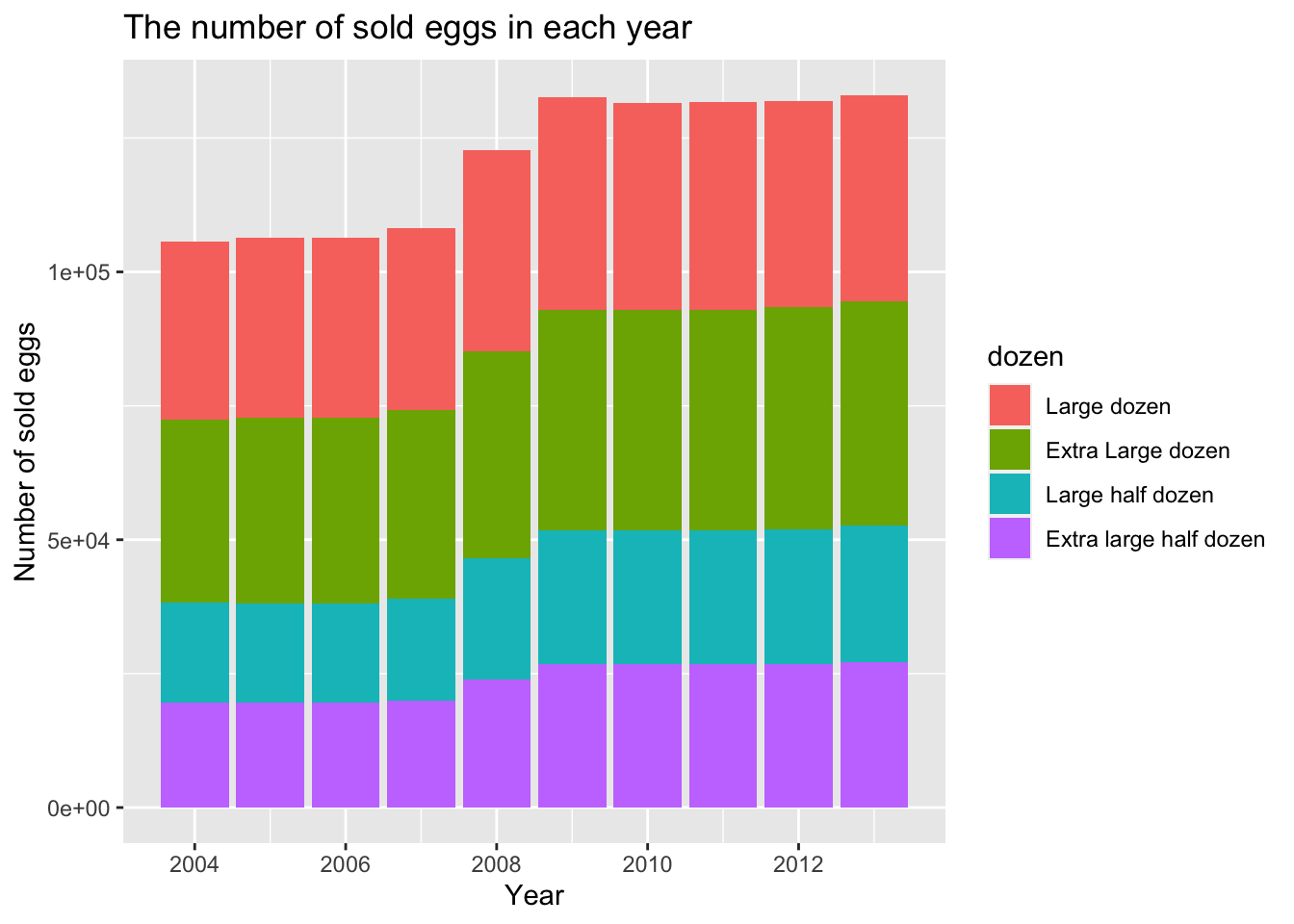
This graph shows the proportion of eggs of each size in each year. We can see that eggs of large dozen and extra large dozen account for the majority in all years.
ggplot(egg_long, aes(x=year, y= n, color=dozen)) +
  geom_line() +
  labs(title = "Year trend of thehe number of sold eggs ",
       x = "Year",
       y = "Number of sold eggs") +
  scale_color_discrete(labels=c('Large dozen', 'Extra Large dozen', 'Large half dozen','Extra large half dozen'))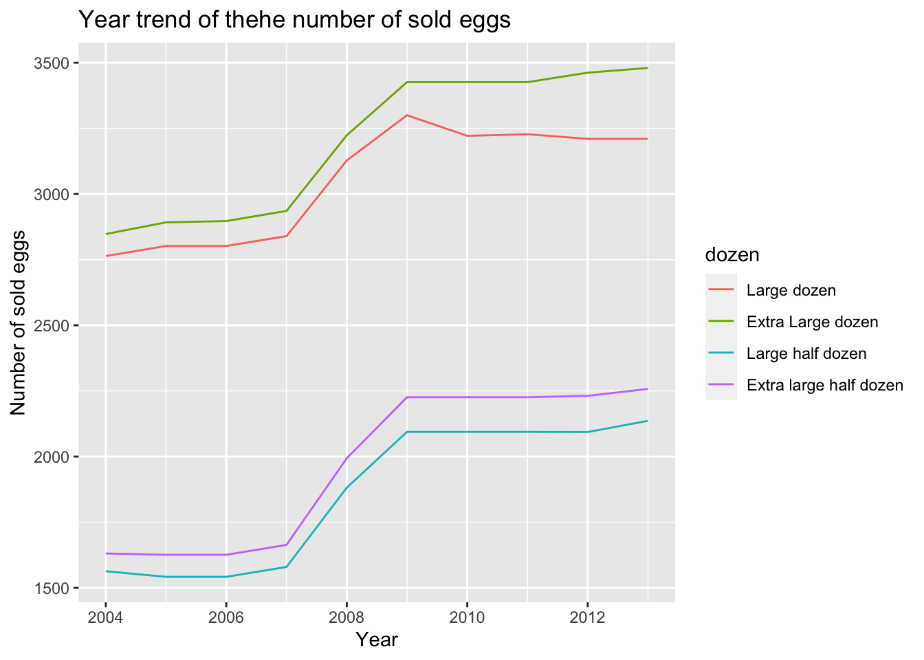
This graph shows the annual rate of change in sales of eggs by size. We can see that the general trend of egg sales per size is up. From 2007 to 2009, there was a clear increase in the sales of eggs of all sizes. But since 2018, there has been a slight decline in the sales of extra large dozen. Overall, the sales volume of large dozen and extra large dozen is significantly higher than that of large half dozen and extra large half dozen.
egg_long %>% mutate(dozen = recode(dozen, "extra_large_dozen" = "Extra large dozen", "extra_large_half_dozen" = "extra large half dozen", "large_dozen" ="Large dozen" , "large_half_dozen" = "Large half dozen")) %>% ggplot( aes(x=year, y= n, color=dozen)) +
  geom_line() +
  labs(title = "Year trend of the number of sold each scale of eggs ",
       x = "Year",
       y = "Number of sold eggs") +
facet_wrap(~dozen) 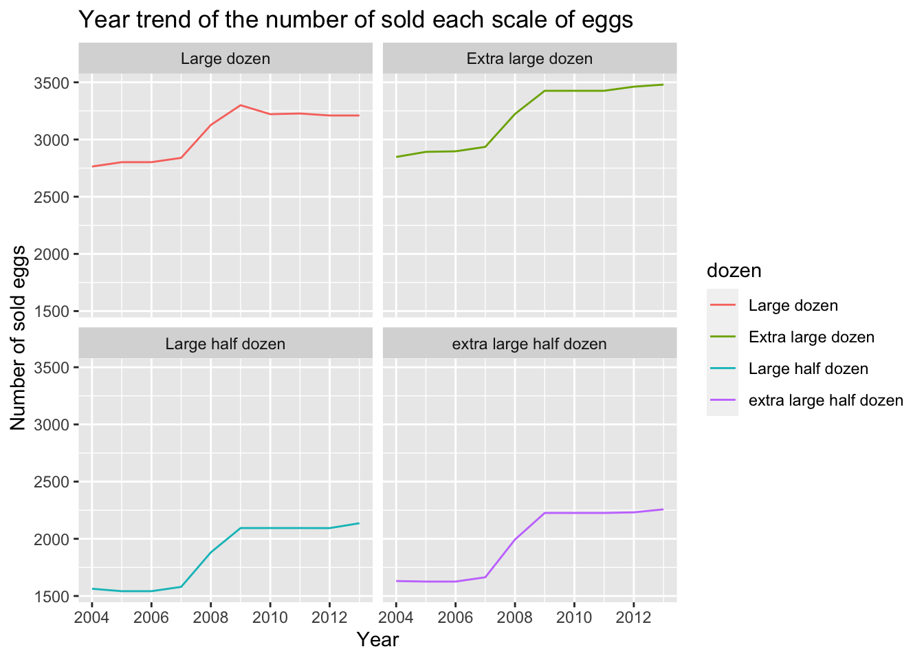
This graph separates each specification, and we can see the annual change rate of sales of a size separately.
egg_long %>% group_by(year) %>%
  summarise(n = sum(value)) %>%
  ggplot(aes(x=year,y=n)) +
  geom_line() +
  geom_point()+
  labs(title = "Year trend of the number of sold eggs ",
       x = "Year",
       y = "Number of sold eggs") +
  theme_minimal() +
  geom_text(aes(label = n), size=3, vjust=-.5)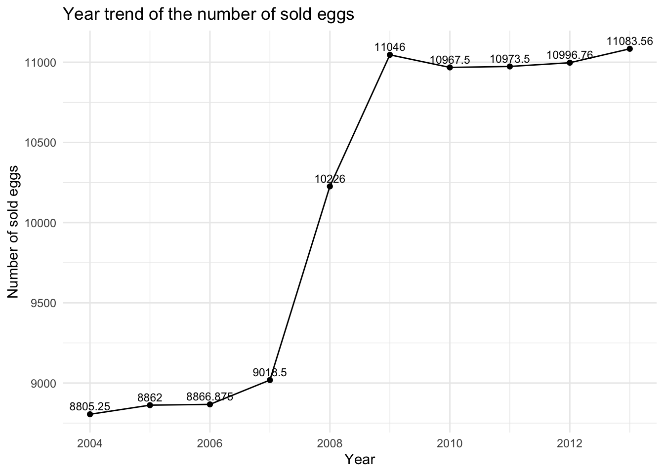
This graph shows the annual change in sales of eggs of all sizes. We can see a slight decline in sales from 2009 to 2012, followed by a slight increase.
egg_long %>%mutate(dozen = recode(dozen, "extra_large_dozen" = "Extra large dozen", "extra_large_half_dozen" = "extra large half dozen", "large_dozen" ="Large dozen" , "large_half_dozen" = "Large half dozen")) %>%
  group_by(dozen) %>% summarise(n=sum(value))%>%
  ggplot(aes(x=dozen,y=n,fill=dozen))+
  geom_bar(position="stack", stat="identity") +
  geom_text(aes(label = n), size=3, vjust=-.5) +
  labs(title = "Total number of sold eggs in each scale",
       x = "Scale",
       y = "Number of sold eggs") +
theme(axis.text.x = element_text(angle=45)) 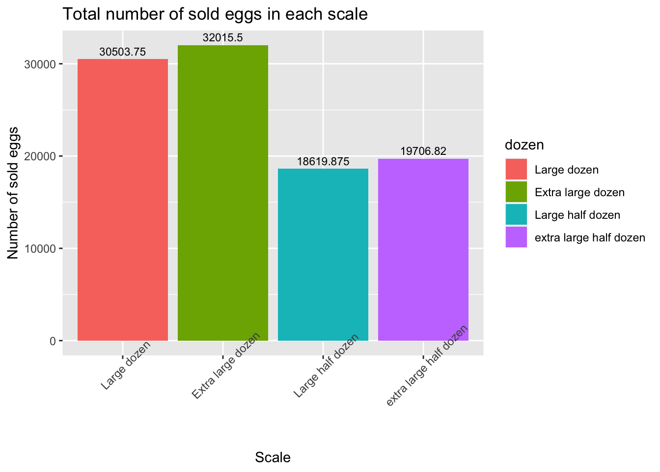
This graph shows the total sales of each size of eggs from 2004 to 2013. Interestingly, large dozen is slightly less than extra large dozen, and large half dozen is slightly less than extra large half dozen.