library(tidyverse)
library(ggplot2)

knitr::opts_chunk$set(echo = TRUE, warning=FALSE, message=FALSE)Challenge 7
challenge_7
australian_marriage
Visualizing Multiple Dimensions
Read in data
Using the read.csv function we can read the data into a data frame.
australian_marriage <- read.csv("_data/australian_marriage_tidy.csv")
australian_marriage
Briefly describe the data
Tidy Data (as needed)
This data set contains the results of a 2017 survey of Australians in which they were asked whether or not they are married. Currently, a row represents a country and a response type (yes or no). In order to tidy the data and prepare it for visualization, we need to pivot the data so that the yes and no responses become columns, and each country is represented by one case. We will also make the percentage column into two columns, for percentage yes and percentage no.
australian_marriage <- australian_marriage %>%
  pivot_wider(names_from = resp, values_from = c(count, percent))
australian_marriage
Visualization with Multiple Dimensions
First, we will plot the number of yes reponses for each territory using a bar graph.
ggplot(australian_marriage, aes(x = str_wrap(territory, width = 10), y = count_yes, fill = territory)) +
  geom_bar(stat = "identity") +
  labs(title = "Count of Yes Responses by Territory", x = "Territory", y = "Count Yes") +
  guides(fill = FALSE)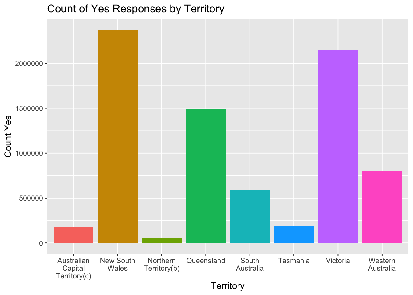
We can see from the graph there is a wide range of yes responses for the different territories, with New South Wales having the most responses (and likely the most married couples), and Northern Territory having the least. Since the territories likely vary greatly in population, let’s now look at the percentage of yes responses in each territory as well. We can do this by adding the percent_yes dimension to the chart using the fill setting in the aes function.
ggplot(australian_marriage, aes(x = str_wrap(territory, width = 10), y = count_yes, fill = percent_yes)) +
  geom_bar(stat = "identity") +
  labs(title = "Count of Yes Responses by Territory", x = "Territory", y = "Count Yes", fill = "Percent Votes Yes")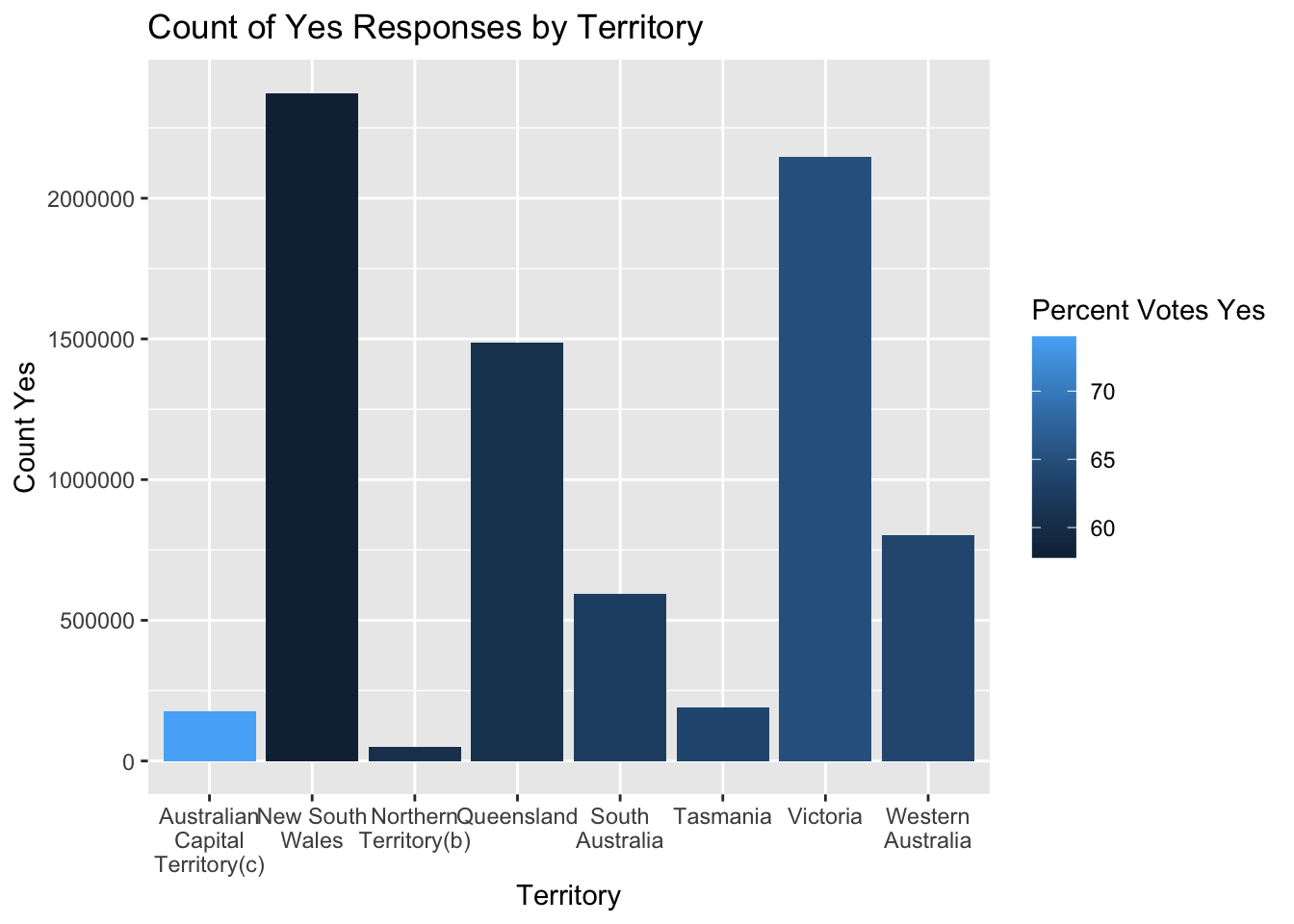
We can see from the updated graph that the Australian Capital Territory has the highest percentage of yes votes (and likely the highest percentage of married couples) despite having one of the fewest yes responses. This illustrates why looking at percentages is important when population sizes vary.
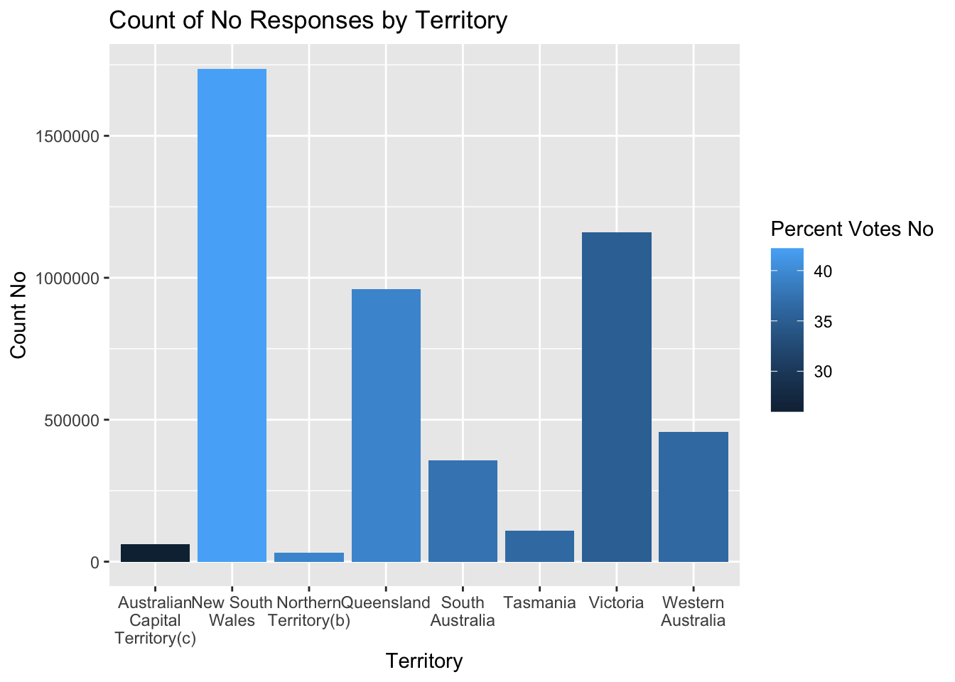
Similarly, we can create a chart that shows the count of no responses for each territory as well as the percentage of no responses in each territory using the fill setting in the aes function.
ggplot(australian_marriage, aes(x = str_wrap(territory, width = 10), y = count_no, fill = percent_no)) +
  geom_bar(stat = "identity") +
  labs(title = "Count of No Responses by Territory", x = "Territory", y = "Count No", fill = "Percent Votes No")