library(tidyverse)
library(readxl)
library(ggplot2)

knitr::opts_chunk$set(echo = TRUE, warning=FALSE, message=FALSE)
Challenge 8
challenge_8
faostat
Joining Data
Challenge Overview
Using the read.csv function we can read the FAOSTAT_egg_chicken and FAOSTAT_country_groups data into data frames.
egg_chicken <- read.csv("_data/FAOSTAT_egg_chicken.csv")
egg_chicken
country_groups <- read.csv("_data/FAOSTAT_country_groups.csv")
country_groupsBriefly describe the data
The FAOSTAT_egg_chicken data set shows the number of eggs sold in countries around the world for the years 1961-2018. The FAOSTAT_country_groups data frame shows the country group for each country (ex. country: Algeria, country group: Africa).
Tidy Data (as needed)
For the sake of this challenge, we are only going to look at the eggs sold in 2018 in units of “1000 head”. We will use the subset function to select only rows with these conditions in the egg_chicken data frame, and then only select the columns we are interested in (the Area, Year, and Value (number of sold eggs)).
egg_chicken <- subset(egg_chicken, Year == 2018 & Unit == "1000 Head") %>%
  select(Area, Year, Value)
egg_chicken
In the country_groups data frame, we will tidy the data to only select the country group and country columns.
country_groups <- country_groups %>%
  select(Country.Group, Country)
country_groups
Join Data
Using the right_join function we can add the country group to each row in the egg_chicken data frame.
joined_data <- right_join(country_groups, egg_chicken, by = c("Country" = "Area"))
joined_data
Now, we will filter only the rows where the country group is in the following list: Europe, Americas, Asia, Oceania, Africa.
filtered_data <- joined_data %>%
  filter(Country.Group %in% c("Europe", "Americas", "Asia", "Oceania", "Africa"))
filtered_data
Now, we can group the data by these regions.
grouped_data <- filtered_data %>%
rename(Region = Country.Group) %>%
group_by(Region) %>%
summarize(EggsSold = sum(Value))
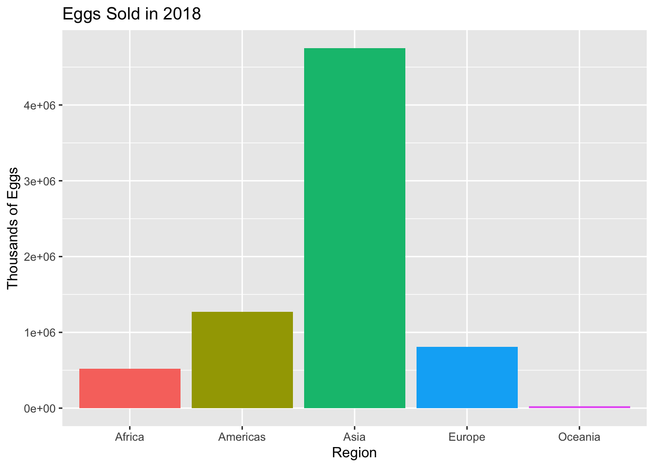
grouped_dataNow, we can visualize the joined and grouped data to show how many eggs were sold in each region in 2018.
ggplot(grouped_data, aes(x = Region, y = EggsSold, fill = Region)) +
  geom_bar(stat = "identity") +
  labs(title = "Eggs Sold in 2018", x = "Region", y = "Thousands of Eggs") +
  guides(fill = FALSE)