n <- 100 # sample size
m <- seq(1,10) # means
samps <- map(m,rnorm,n=n) Challenge 10
challenge_10
Prasann Desai
purrr
Challenge Overview
The purrr package is a powerful tool for functional programming. It allows the user to apply a single function across multiple objects. It can replace for loops with a more readable (and often faster) simple function call.
For example, we can draw n random samples from 10 different distributions using a vector of 10 means.
We can then use map_dbl to verify that this worked correctly by computing the mean for each sample.
samps %>%
  map_dbl(mean)
[1] 0.9492413 2.2953791 2.8792359 4.0798361 5.0445141 5.8061162
[7] 6.9988846 7.9222024 8.9798486 10.0718168purrr is tricky to learn (but beyond useful once you get a handle on it). Therefore, it’s imperative that you complete the purr and map readings before attempting this challenge.
The challenge
Use purrr with a function to perform some data science task. What this task is is up to you. It could involve computing summary statistics, reading in multiple datasets, running a random process multiple times, or anything else you might need to do in your work as a data analyst. You might consider using purrr with a function you wrote for challenge 9.
# Function call to read a csv files and mutating any dataset as required
cereal_df <- read_csv("_data/cereal.csv")
abc_poll_2021 <- read_csv("_data/abc_poll_2021.csv")
abc_poll_2021 <- mutate(abc_poll_2021, is_hispanic = !str_detect(ppethm, "Non-Hispanic"), pprace = str_split(ppethm, ",", simplify = TRUE)[,1])
abc_poll_2021 <- mutate(abc_poll_2021, `Interview Consent` = case_when(str_detect(Contact, "Yes") ~ "Yes",
                                                                     str_detect(Contact, "No") ~ "No"
                                                                     ))
abc_poll_2021 <- rename(abc_poll_2021, Race = pprace)
# Function definition for plotting pie chart
plot_pie_chart <- function(input_df, category_var, chart_title) {
# Mutating the dataset
split_by_type <- count(input_df, across(all_of(category_var))) %>% arrange(-n) %>% mutate(prop = round(-n*100/sum(n),1), lab.ypos = cumsum(prop) - 0.5*prop)
split_by_type$label <- paste0(round(-split_by_type$prop), "%")
textsize = (10/nrow(split_by_type)) + 1
# Creating a pie chart
ggplot(split_by_type,
aes(x = 1,
y = prop,
fill = .data[[category_var]])) +
geom_bar(width = 1,
stat = "identity",
color = "black") +
geom_text(
aes(label=label), position = position_stack(vjust=0.5),
color = "black",
size = textsize) +
coord_polar("y",
start = 0
) +
theme_void() +
labs(title = chart_title)
}# Creating individual lists of all input parameters
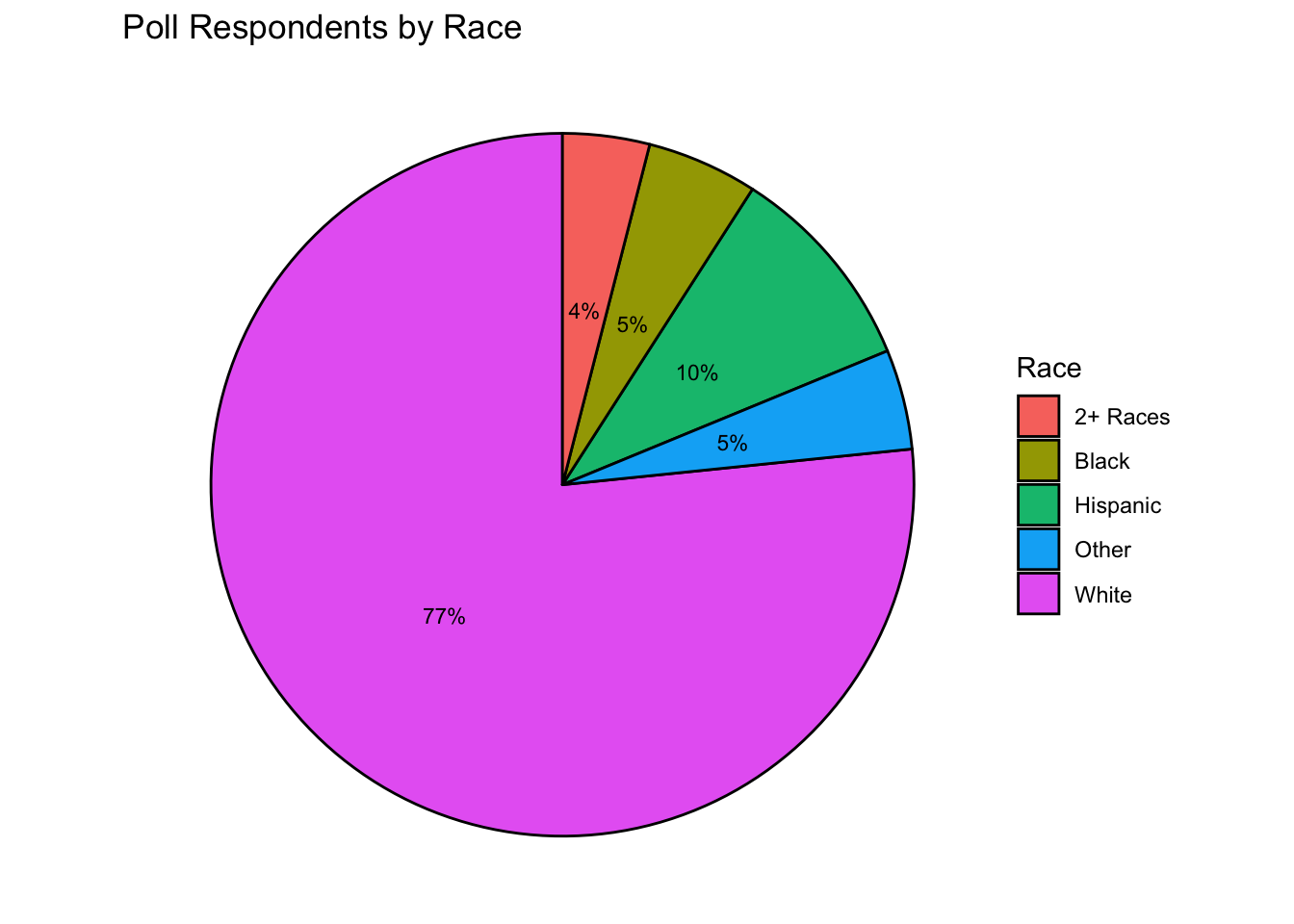
df_list <- list(cereal_df, abc_poll_2021, abc_poll_2021)
category_var_list <- list("Type", "Interview Consent", "Race")
chart_titles <- list("Cereals by Type", "Poll Respondents' consent to be interviewed", "Poll Respondents by Race")
# Combining all the above parameters lists into a single named list
t <- list(input_df = df_list, category_var = category_var_list, chart_title = chart_titles)
# Calling the map function
pmap(t, plot_pie_chart, .progress = FALSE)[[1]]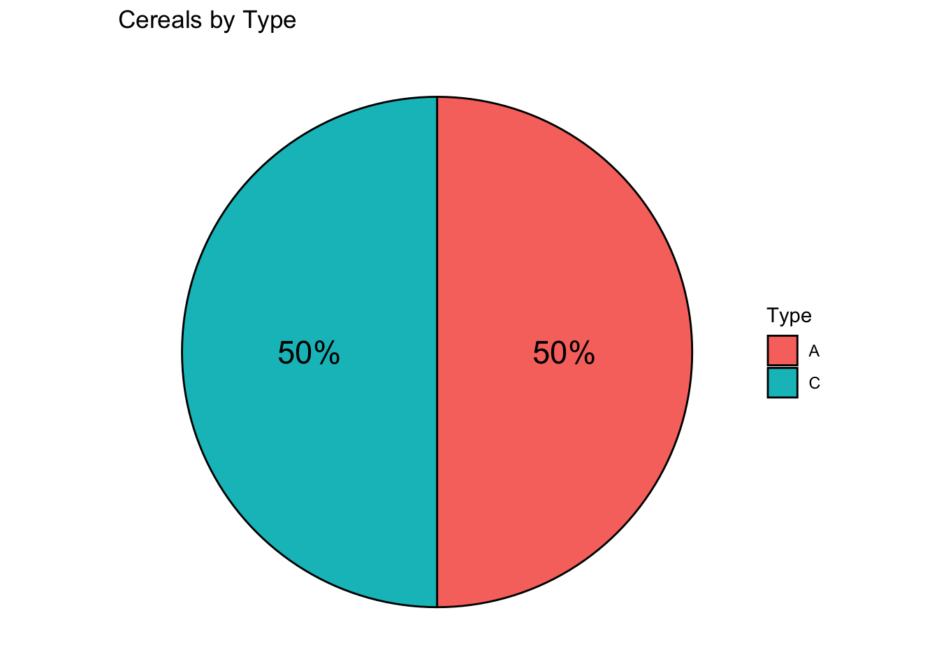
[[2]]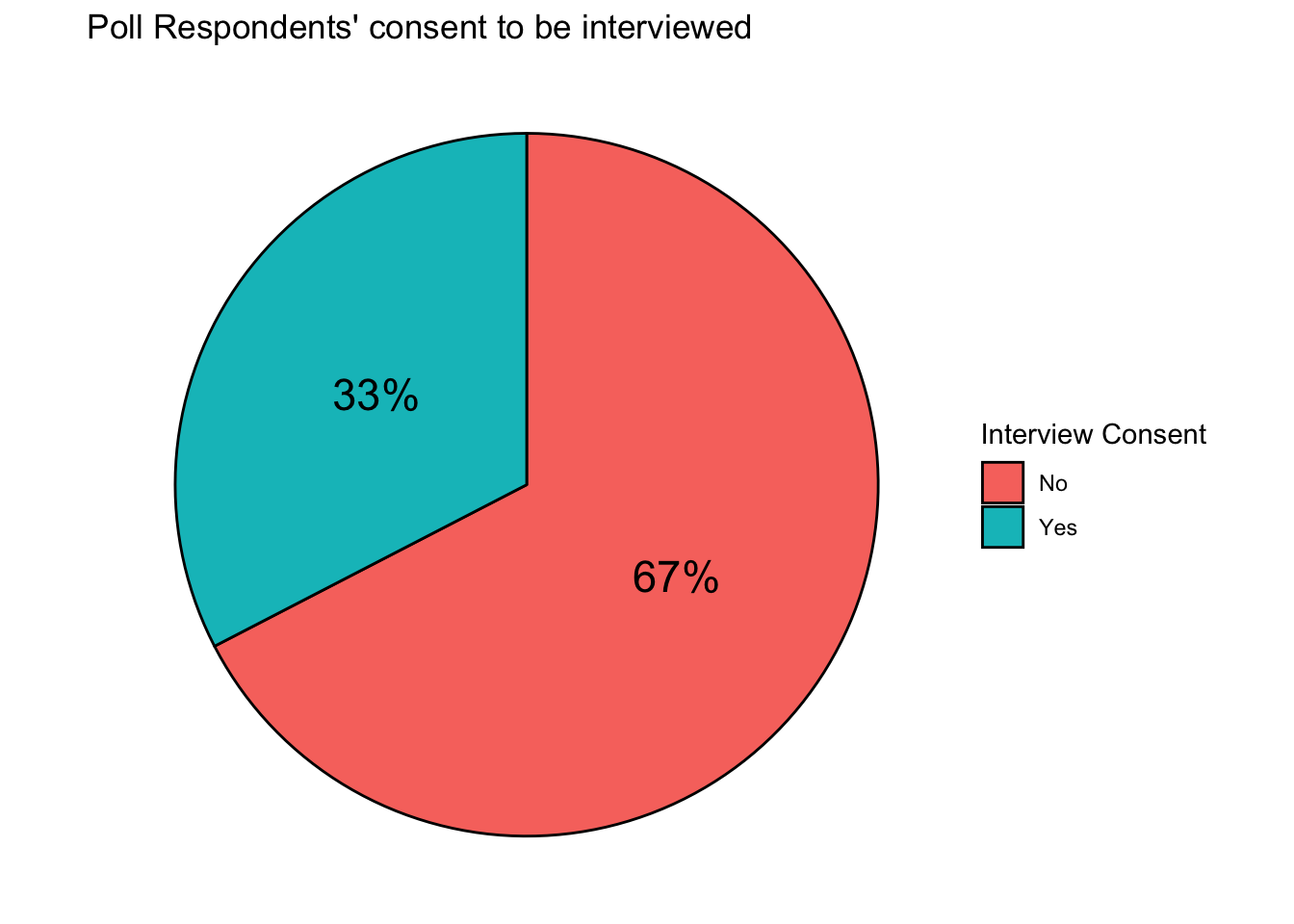
[[3]]