library(tidyverse)
library(ggplot2)

knitr::opts_chunk$set(echo = TRUE, warning=FALSE, message=FALSE)
Challenge 7
challenge_7
Prasann Desai
eggs
Visualizing Multiple Dimensions
Challenge Overview
Today’s challenge is to:
- read in a data set, and describe the data set using both words and any supporting information (e.g., tables, etc)
- tidy data (as needed, including sanity checks)
- mutate variables as needed (including sanity checks)
- Recreate at least two graphs from previous exercises, but introduce at least one additional dimension that you omitted before using ggplot functionality (color, shape, line, facet, etc) The goal is not to create unneeded chart ink (Tufte), but to concisely capture variation in additional dimensions that were collapsed in your earlier 2 or 3 dimensional graphs.
- Explain why you choose the specific graph type
- If you haven’t tried in previous weeks, work this week to make your graphs “publication” ready with titles, captions, and pretty axis labels and other viewer-friendly features
R Graph Gallery is a good starting point for thinking about what information is conveyed in standard graph types, and includes example R code. And anyone not familiar with Edward Tufte should check out his fantastic books and courses on data visualizaton.
(be sure to only include the category tags for the data you use!)
Read in data
Read in one (or more) of the following datasets, using the correct R package and command.
- eggs ⭐
- abc_poll ⭐⭐
- australian_marriage ⭐⭐
- hotel_bookings ⭐⭐⭐
- air_bnb ⭐⭐⭐
- us_hh ⭐⭐⭐⭐
- faostat ⭐⭐⭐⭐⭐
# Function call to read a csv file
aus_marriage_df <- read_csv("_data/australian_marriage_tidy.csv")
aus_marriage_df
# A tibble: 16 × 4
territory resp count percent
<chr> <chr> <dbl> <dbl>
1 New South Wales yes 2374362 57.8
2 New South Wales no 1736838 42.2
3 Victoria yes 2145629 64.9
4 Victoria no 1161098 35.1
5 Queensland yes 1487060 60.7
6 Queensland no 961015 39.3
7 South Australia yes 592528 62.5
8 South Australia no 356247 37.5
9 Western Australia yes 801575 63.7
10 Western Australia no 455924 36.3
11 Tasmania yes 191948 63.6
12 Tasmania no 109655 36.4
13 Northern Territory(b) yes 48686 60.6
14 Northern Territory(b) no 31690 39.4
15 Australian Capital Territory(c) yes 175459 74
16 Australian Capital Territory(c) no 61520 26 Briefly describe the data
Response:
From the above output, we can see that the dataset contains territory-wise split of % Australians who are married vs not married. In addition to the percentage split, it also contains the raw counts of people who are married vs not married.
Tidy Data (as needed)
Is your data already tidy, or is there work to be done? Be sure to anticipate your end result to provide a sanity check, and document your work here.
Response: It appears to me that the data is already tidy. (Each variable has its own column, Each observation has its own row and Each value is in its own cell)
# Sanity check for duplicate responses
n_distinct(aus_marriage_df$territory, aus_marriage_df$resp)
[1] 16# Check to see if the 'resp'-wise totals add up to 16
table(aus_marriage_df$resp)
 no yes
  8   8
Are there any variables that require mutation to be usable in your analysis stream? For example, do you need to calculate new values in order to graph them? Can string values be represented numerically? Do you need to turn any variables into factors and reorder for ease of graphics and visualization?
Document your work here.
# For better readability in the visualizations, I am adding a column that clearly describes the marriage status
aus_marriage_df <- mutate(aus_marriage_df, married = case_when(str_detect(resp, "yes") ~ "Married",
                                                                     str_detect(resp, "no") ~ "Not Married"
                                                                     ))
Visualization with Multiple Dimensions
ggplot(aus_marriage_df, aes(x = married, y = percent, fill = married)) +
  geom_bar(size = 1, stat = "identity") +
  facet_wrap(~territory) +
  scale_fill_manual(values = c("Married" = "#7DCE82",
                               "Not Married" = "#FF8360")) +
  labs(title = "Territory-wise % Married population",
       subtitle = "All 8 territories of Australia",
       x = "Married (Yes/No)",
       y = "Percentage") +
  geom_text(aes(label = paste0(percent,"%")),
            color = "black",
            size = 3,
            vjust = 2
            ) +
  theme_linedraw()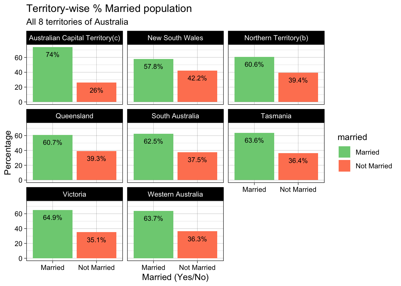
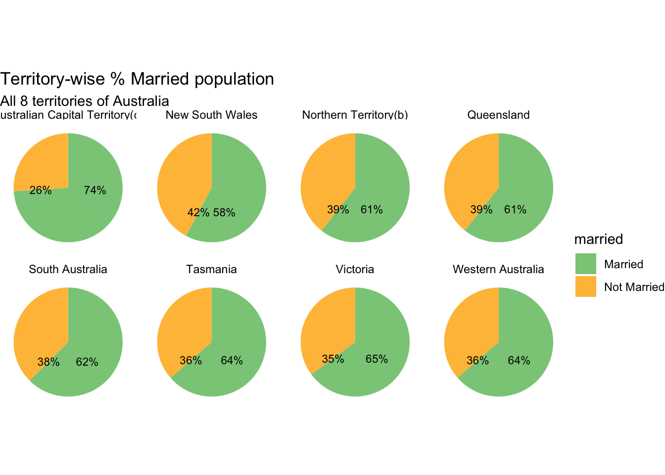
# Creating a pie chart
ggplot(aus_marriage_df,
       aes(x = "",
           y = percent,
           fill = married)) +
  facet_wrap(~territory, ncol = 4) +
  scale_fill_manual(values = c("Married" = "#8ACB88",
                               "Not Married" = "#FFBF46")) +
  geom_bar(width = 1,
           stat = "identity") +
  geom_text(aes(label = paste0(round(percent),"%")),
            color = "black",
            size = 3
            ) +
  coord_polar("y",
              start = 0,
              direction = -1
              ) +
  labs(title = "Territory-wise % Married population",
       subtitle = "All 8 territories of Australia",
       x = "Married (Yes/No)",
       y = "Percentage") +
  theme_void()