Code
library(tidyverse)
library(ggplot2)
library(readxl)

knitr::opts_chunk$set(echo = TRUE, warning=FALSE, message=FALSE)library(tidyverse)
library(ggplot2)
library(readxl)
knitr::opts_chunk$set(echo = TRUE, warning=FALSE, message=FALSE)First, let’s read in the debt_in_trillions dataset.
  #Read in data
  debt <- read_excel("_data/debt_in_trillions.xlsx")
debtThe data shows quarterly measures (in trillions of dollars) of debt associated with six types of loans: Mortgage, HE Revolving, Auto Loan Credit Card, Student Loan, and Other (plus a Total).
The data runs from the start of 2003 through the second quarter of 2021.
The data is mostly tidy, though we need to adjust the format in which dates are presented. We’ll use mutate() and parse_date_time() to create a Date column with proper date formatting.
# use parse_date_time to parse out dates from years and quarters
debt <- debt %>%
  mutate(Date=parse_date_time(`Year and Quarter`,
                              orders="yq"))
# remove `Year and Quarter` column
debt <- debt %>%
  select(-one_of("Year and Quarter")) %>%
  # move Date to front
  select(Date, everything())
# view data
debt
We’re also going to create an alternate pivoted version of the data frame in which each observation contains data for a single type of debt with a date and amount. This version will have columns Date, Type, and Amount.
debt_longer<- debt %>%
  pivot_longer(cols=c(`Mortgage`,`HE Revolving`,`Auto Loan`,`Credit Card`,`Student Loan`,`Other`), names_to = "Type", values_to = "Amount")
debt_longer<-debt_longer %>%
  select(Date,Type,Amount)
debt_longerNow, let’s look at total debt over time. We’ll use a line plot (a variation of a scatter plot in which data points are connected with a line), which is good for visualizing change in one variable over time (a second variable).
ggplot(debt, aes(x=Date,y=Total)) +
  geom_line() +
  labs(title = "Total US household debt", subtitle="2003 - 2021", x = "Date", y = "Debt (in trillions, USD)") +
  theme_minimal()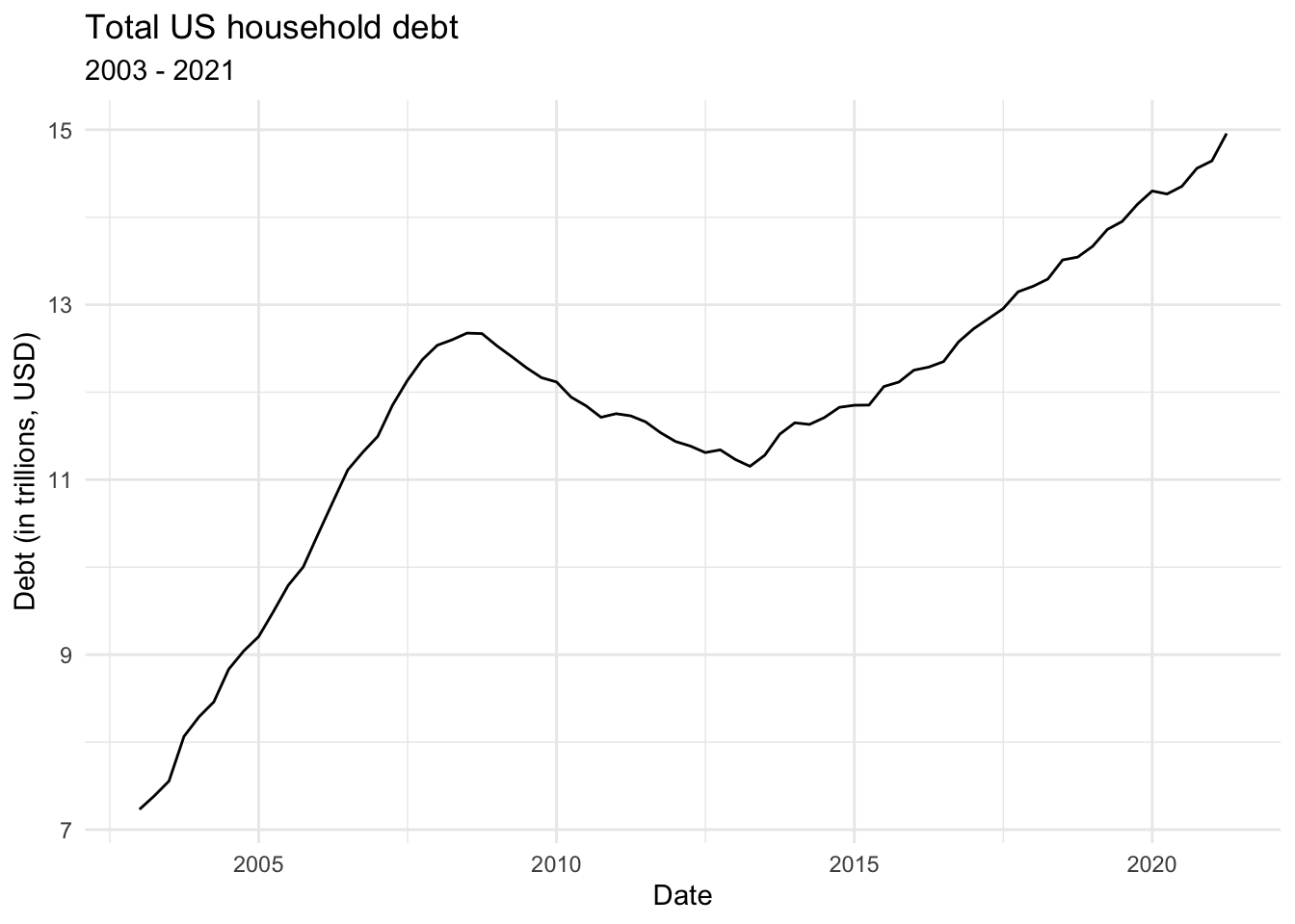
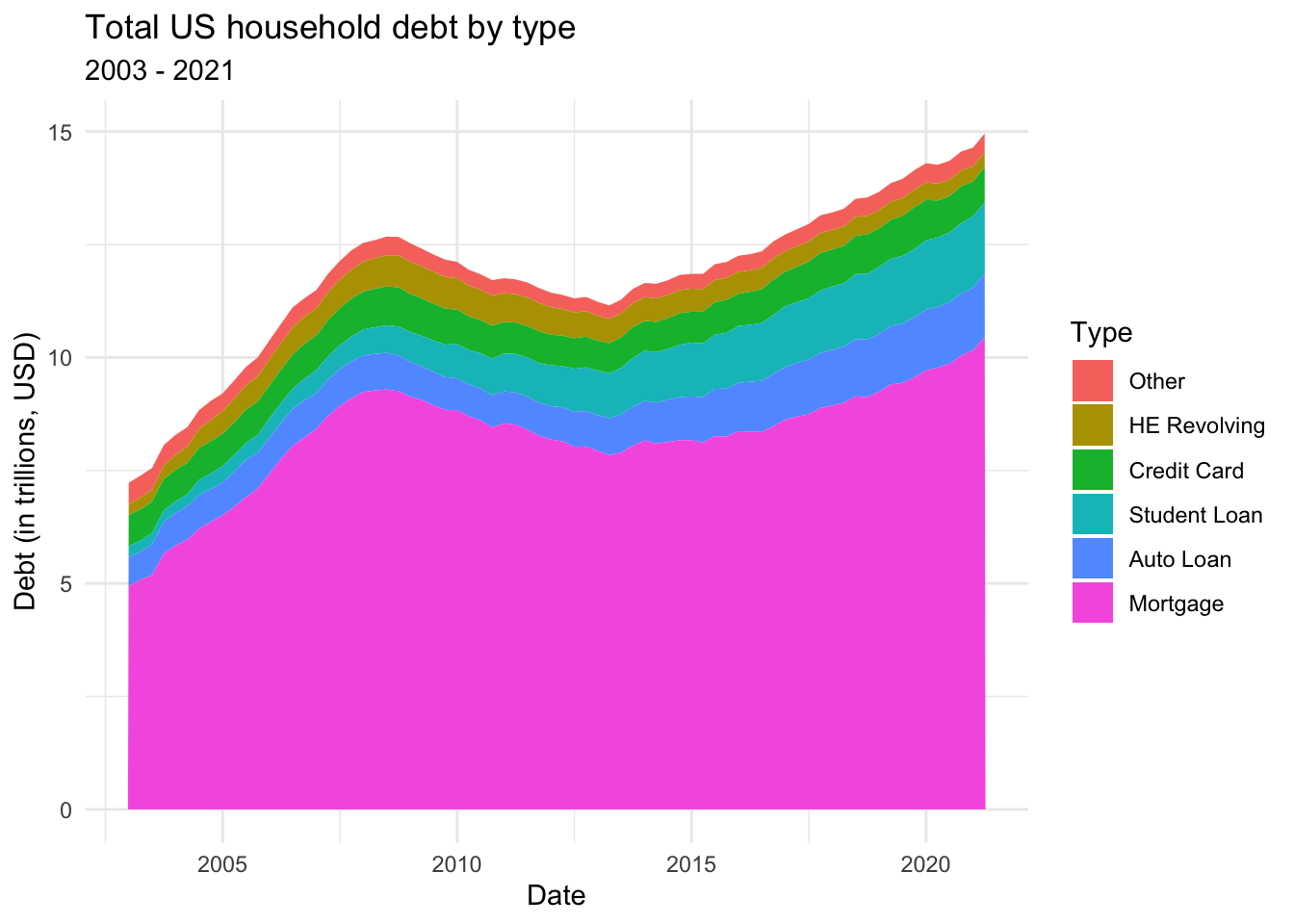
Now, we’ll look at debt over time, but broken out by type of debt. To do this, we’ll use debt_longer from earlier. We’ll use a stacked area chart, which is good for viewing changes in a set of things (in this case types of debt) where the cumulative value of all parts of the set is significant for analysis.
# order types of debt with factor()
debt_longer$Type <- factor(debt_longer$Type, levels=c("Other","HE Revolving","Credit Card","Student Loan","Auto Loan","Mortgage"))
# create stacked area plot
ggplot(debt_longer, aes(x=Date,y=Amount,fill=Type)) +
  geom_area() +
  labs(title = "Total US household debt by type", subtitle="2003 - 2021", x = "Date", y = "Debt (in trillions, USD)") +
  theme_minimal()