I’m going to revisit the 2019 NYC Air BnB data I used in Challenge 5.
AB_NYC ⭐⭐⭐⭐⭐
Description of bnb_og
bnb_og provides us with 2019 AirBnb listing info for the five NYC boroughs. Numeric variables include: Price, Min Nights, Availability, Review Count, and Host Listings. Nominal varibales include Neighborhood, Borough, and Room Type. We’ll use several combinations of these variables to visualize interesting relationships regarding booking AirBnbs in NYC.
bnb_plot
The data was fairly tidy after the read-in; the only mutation/manipulation I made outside of removing variables was to transform both Availability and Host List Count from numeric to categorical for better plots.
Unfortunately, the only date variable present in the original data was Last Review which I didn’t find interesting enough to plot, as we wouldn’t necessarily visualize a change over time since each listing is unique.
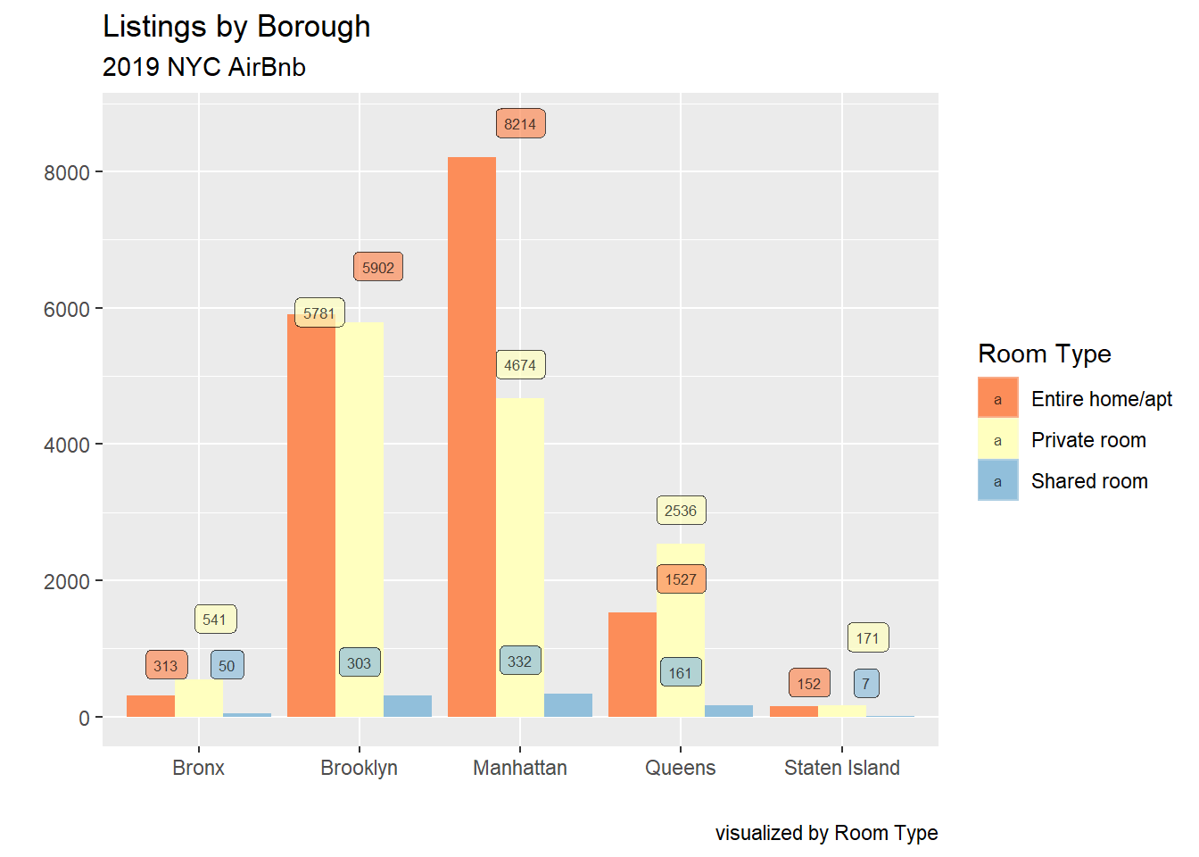
Lisitng Count by Borough and Room Type Bar
Using a bar plot with position = dodge allows us to view Lisiting counts for each Borough by Room Type, with every Room Type having an individual bar. The labels here aren’t great but this was the best I could do with such comapct bars; probably not a good choice for the dodge aesthetics.
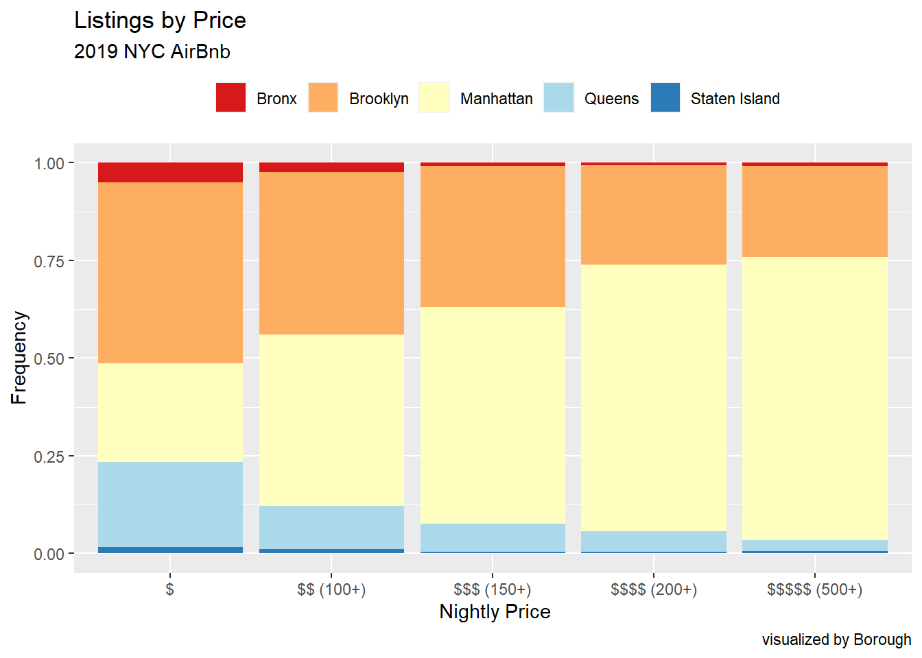
Listings by Price Bar
A bar graph with position = "fill" allows us to view each Borough’s share of the different Price Ratings. Next, I need to figure out how to label each proportion.
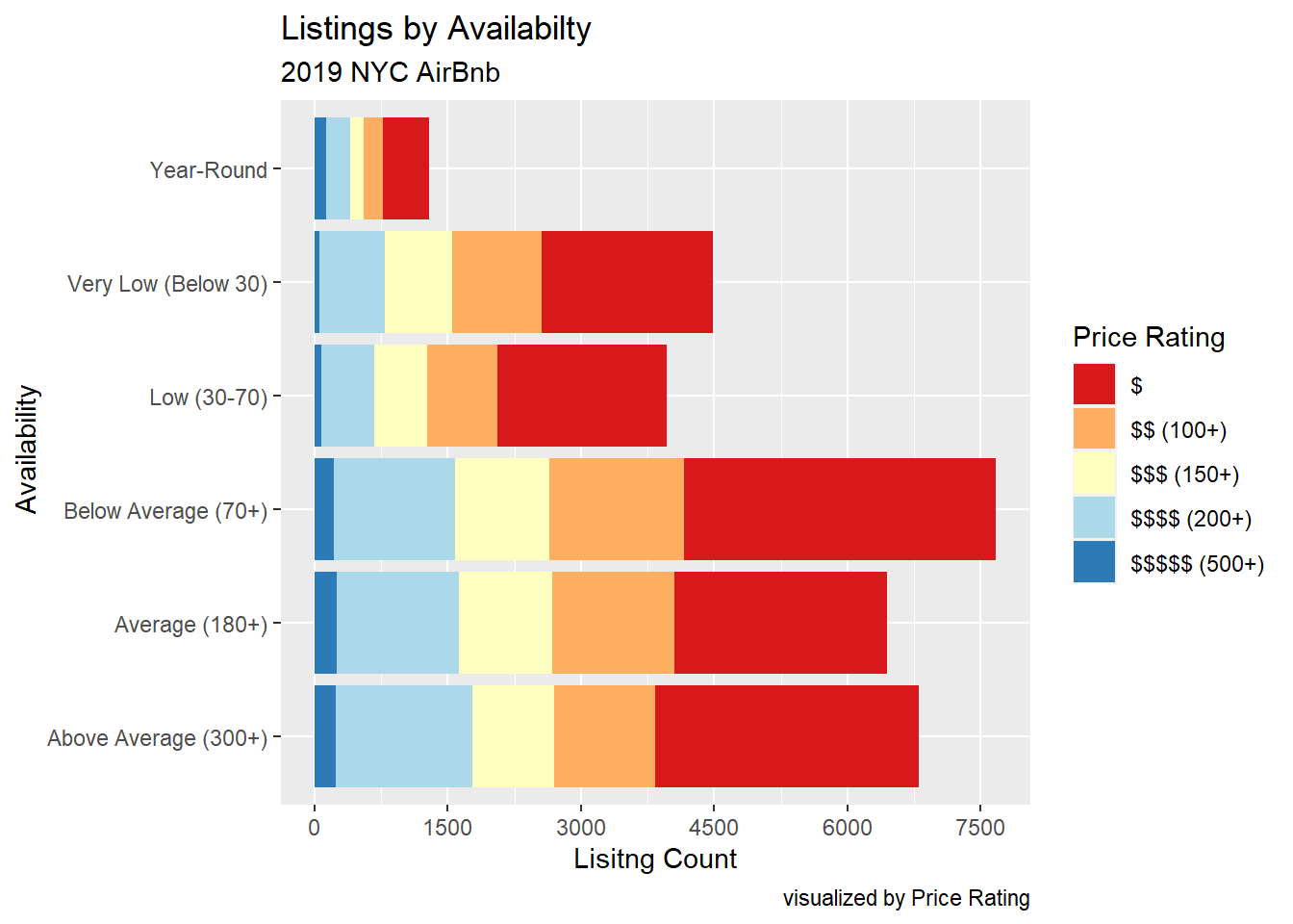
Listings by Availability
Using a normal position = stack bar graph to plot Listing Count by Availability (and Price Rating)
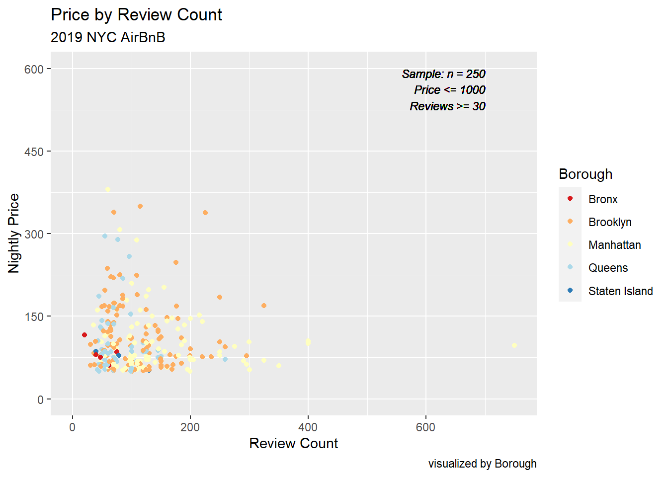
Price by Review Count Scatter
Not a particularly useful visualization, I wanted to take a look at the relationship between Price and Review Count. Using a scatterplot, we can see that properties with more reviews typically have a lower price point, which makes sense as they are more accessible to the general public. Unfortunately, there are so many unique price points, the graph is very saturated and we cannot properly view Borough, the third dimension.
Update: Took a sample of n=250 from all listings with Price below $1000 and Review Count above 30. Now we can see there isn’t that strong a trend between Price and Review Count.
Source Code
---title: "Challenge 6 Solution"author: "Dane"description: "Visualizing Time and Relationships"date: "10/31/2022"format: html: df-print: paged callout-appearance: simple callout-icon: false toc: true code-copy: true code-tools: truecategories: - shelton - challenge_6 - air_bnb---```{r}#| label: setup#| warning: false#| message: false#| include: falselibrary(tidyverse)library(ggplot2)library(ggforce)library(gghighlight)library(ggeasy)knitr::opts_chunk$set(echo =FALSE, warning=FALSE, message=FALSE)```## Challenge 6Tasks:1) read in a data set, and describe the data set using both words and any supporting information (e.g., tables, etc)2) tidy data (as needed, including sanity checks)3) mutate variables as needed (including sanity checks)4) create at least one graph including time (evolution) - try to make them "publication" ready (optional) - Explain why you choose the specific graph type5) Create at least one graph depicting part-whole or flow relationships - try to make them "publication" ready (optional) - Explain why you choose the specific graph type[R Graph Gallery](https://r-graph-gallery.com/) is a good starting point for thinking about what information is conveyed in standard graph types, and includes example R code.:::panel-tabset## 1.) Read in dataI'm going to revisit the 2019 NYC Air BnB data I used in [Challenge 5](https://dacss.github.io/601_Fall_2022/posts/shelton_challenge5.html). - AB_NYC ⭐⭐⭐⭐⭐```{r}#| label: loading data#| echo: false# read inbnb_og <- readr::read_csv('_data/AB_NYC_2019.csv', show_col_types =FALSE)# removing clutter and observations of residences with less than a week of availability per yearbnb_og <- bnb_og %>%select(-c('id','host_id','host_name','latitude','longitude','last_review','reviews_per_month'))%>%filter(availability_365 >=3)# rename and relocatebnb_og <- bnb_og %>%rename("Description"=name, "Borough"= neighbourhood_group, "Neighbourhood"= neighbourhood,"Room Type"= room_type,"Price"=price,"Min Nights"=minimum_nights,"Review Count"=number_of_reviews,"Host Listings"=calculated_host_listings_count,"Availability per Year"=availability_365) %>%relocate("Availability per Year", .before =contains("Review Count"))```:::{.callout-note collapse="true"}## Description of `bnb_og````{r}head(bnb_og, n=5)````bnb_og` provides us with 2019 AirBnb listing info for the five NYC boroughs. Numeric variables include: `Price`, `Min Nights`, `Availability`, `Review Count`, and `Host Listings`. Nominal varibales include `Neighborhood`, `Borough `, and `Room Type`. We'll use several combinations of these variables to visualize interesting relationships regarding booking AirBnbs in NYC.:::## 2.) Tidy Data (as needed):::{.callout-note collapse="true"}## `bnb_plot````{r}#| label: tidy and format#| include: true# Getting Rid of any duplicate listingsbnb_og <-distinct(bnb_og)# Remove Description (word clouds later maybe?)bnb_og <- bnb_og %>%select(!contains("Description"))# Mutating Availability and Host Listings to plot as a 'class' varbnb_2 <- bnb_og %>%mutate("Availability"=case_when(`Availability per Year`==365~"Year-Round",`Availability per Year`>300~"Above Average (300+)",`Availability per Year`>=180~"Average (180+)",`Availability per Year`<180&`Availability per Year`>=70~"Below Average (70+)",`Availability per Year`<70&`Availability per Year`>=30~"Low (30-70)",`Availability per Year`<30~"Very Low (Below 30)"),"Host List Count"=case_when(`Host Listings`>10~"Very Frequent",`Host Listings`>=3~"Frequent",`Host Listings`<3~"Low",`Host Listings`==1~"One"))bnb_plot <- bnb_2 %>%select(!contains(c('per Year', 'Host Listings')))head(bnb_plot, n=5)```:::The data was fairly tidy after the read-in; the only mutation/manipulation I made outside of removing variables was to transform both `Availability` and `Host List Count` from numeric to categorical for better plots. ## Time Dependent VisualizationUnfortunately, the only date variable present in the original data was `Last Review` which I didn't find interesting enough to plot, as we wouldn't necessarily visualize a change over time since each listing is unique.## Visualizing Part-Whole Relationships:::{.callout-note collapse="true"}## Lisitng Count by `Borough` and `Room Type` Bar```{r}#| label: Count x Borough Bar#| output: truebar_list_data <- bnb_plot %>%count(Borough, `Room Type`)bar_list <- bnb_plot %>%ggplot(aes(x=`Borough`, fill=`Room Type`))+geom_bar(position='dodge')+ ggrepel::geom_label_repel(stat='count',aes(label=..count..), segment.color=NA, size=2.25, nudge_y =500, label.size =0, alpha=0.7)+scale_fill_brewer(palette ='RdYlBu')+scale_y_continuous(breaks=seq(0,8000, by=2000))+theme_grey()+labs(subtitle="2019 NYC AirBnb", title="Listings by Borough" , x="", y="", caption="visualized by Room Type")bar_list```Using a bar plot with `position = dodge` allows us to view Lisiting counts for each Borough by Room Type, with every Room Type having an individual bar. The labels here aren't great but this was the best I could do with such comapct bars; probably not a good choice for the `dodge` aesthetics.::::::{.callout-note collapse="true"}## Listings by `Price` Bar```{r}#| label: Price x Borough Bar#| output: truebnb_price <- bnb_plot %>%mutate("Price Rating"=case_when(`Price`>=500~'$$$$$ (500+)',`Price`>=200&`Price`<500~'$$$$ (200+)',`Price`>=150&`Price`<200~'$$$ (150+)',`Price`>=100&`Price`<150~'$$ (100+)',`Price`<100~'$'))bar_price <- bnb_price %>%ggplot(aes(x=`Price Rating`, fill=`Borough`))+geom_bar(position ='fill')+scale_fill_brewer(palette ='RdYlBu')+theme_grey()+theme(legend.position ="top")+#coord_flip()+#ggeasy::easy_rotate_x_labels(side="right")+labs(title="Listings by Price", subtitle="2019 NYC AirBnb", x=" Nightly Price", y="Frequency", caption="visualized by Borough", fill="")bar_price```A bar graph with `position = "fill"` allows us to view each Borough's share of the different Price Ratings. Next, I need to figure out how to label each proportion.::::::{.callout-note collapse="true"}## Listings by `Availability````{r}#| label: availability x price#| output: truebnb_price %>%ggplot(aes(x=Availability, fill=`Price Rating`))+geom_bar(position ='stack')+scale_fill_brewer(palette ='RdYlBu')+scale_y_continuous(breaks=seq(0,7500, by=1500))+#theme(axis.text = element_text(family="sans", face="italic"))+theme_grey()+coord_flip()+labs(subtitle="2019 NYC AirBnb", title ="Listings by Availabilty", x=" Availability", y="Lisitng Count", caption="visualized by Price Rating")```Using a normal `position = stack` bar graph to plot Listing Count by Availability (and Price Rating)::::::{.callout-note collapse="true"}## `Price` by `Review Count` Scatter```{r}#| label: price x review count scatter#| output: trueset.seed(100)price_rev_scatter <- bnb_2 %>%summarize(`Price`, `Review Count`, `Borough`)%>%arrange(desc(Price), desc(`Review Count`))%>%filter(`Review Count`>=50, `Price`<=1000)%>%slice_sample(n=250, replace=F)%>%ggplot(aes(x=`Price`, y=`Review Count`))+geom_point(aes(color=Borough))+#geom_smooth()+geom_text(aes(x=700, y=600, label="Sample: n = 250 Price <= 1000 Reviews >= 30", fontface="italic", family="sans"), size=3, vjust='top', hjust='right', alpha=0.5, )+coord_cartesian(xlim=c(0,750), ylim=c(0,600))+scale_color_brewer(palette ='RdYlBu')+scale_y_continuous(breaks=seq(0,1500, by=150))+theme_grey()+labs(title="Price by Review Count ", subtitle ="2019 NYC AirBnB", x="Review Count", y="Nightly Price", caption="visualized by Borough")price_rev_scatter```Not a particularly useful visualization, I wanted to take a look at the relationship between Price and Review Count. Using a scatterplot, we can see that properties with more reviews typically have a lower price point, which makes sense as they are more accessible to the general public. Unfortunately, there are so many unique price points, the graph is very saturated and we cannot properly view Borough, the third dimension.**Update:** Took a sample of n=250 from all listings with `Price` below $1000 and `Review Count` above 30. Now we can see there isn't *that* strong a trend between Price and Review Count.::::::