Code
library(tidyverse)

knitr::opts_chunk$set(echo = TRUE, warning=FALSE, message=FALSE)library(tidyverse)
knitr::opts_chunk$set(echo = TRUE, warning=FALSE, message=FALSE)I have been regularly watching Formula 1 for the last few years. In that time, there was a significant rule change that–purely observationally–appears to have changed the sport. It is not clear entirely how much or in what ways, so for my final project, I want to dig into the data to see if I can come to some evidence-based conclusions.
Formula 1 (F1) is the top class of single-seater motorsport racing. “Formula” refers to the set of rules to which all participants’ cars must conform. For example, Formula 2 has different rules about car design and racing than Formula 1.
An F1 season consists of a series of races, known as Grands Prix (GP), which take place around the world on purpose-built racing circuits as well as public roads (termed “street circuits”). The number and location of races per season has varied significantly across the years.
There are currently 10 teams in Formula 1, officially termed “Constructors”. Like the races, the number of teams (and names) has varied significantly over time. Each team has two drivers who race for them each season (as well as a driver on standby in case one of the primary drivers get sick/injured).
Each Constructor is responsible for designing their own car each season within a shared set of regulations that restrict the design across all teams (e.g. a minimum weight, certain aerodynamic requirements, etc.). Some Constructors are known as “works teams”. These teams design and construct the engines for their cars in addition to the aerodynamic components. The rest of the teams are called “customer teams”. They design the aerodynamic parts of their car, but purchase their engines from one of the works teams instead of designing it themselves. For example, currently, the Mercedes works team uses their engines for their own car and also provides engines to the Williams and McLaren teams.
There is also the concept of “junior teams”, where one company essentially has ownership over multiple teams in F1. They have one primary, A-team, and then a B-team that they can use to develop talent for their A-team. For example, currently Red Bull owns both the Red Bull Racing and Alpha Tauri teams, and regularly promote their drivers from Alpha Tauri to Red Bull Racing. For the purposes of the championship, however, these are considered separate constructors.
Because each Constructor designs their own car, cars can vary quite dramatically across teams, so there tends to be a somewhat clear hierarchy. The “worst” car often has nearly zero chance of winning a race, and the “best” cars almost always end up on the podium. In formula 1 lingo, teams are broken into three categories:
Due to this team hierarchy, it can be difficult to compare a driver from one team to a driver on another. Just because one driver always has faster lap times or finishes in a better position does not mean that they are necessarily a better driver, and could just mean that they have a better car. Since both teammates on a given team drive the same car, driver skill is often judged more-so based on how well a driver does compared to their teammates.
In each season, there are two separate championships up for grabs – a Drivers Championship and a Constructors Championship. The Drivers Championship is considered more prestigious and awards the individual driver who received the most points throughout the season. The Constructors Championship is awarded to the team with the most combined points across their two drivers.
Teams and drivers have the chance to earn points at each Grand Prix (note that there are also points available in what are called “Sprint races”, but these are a new feature in F1 and we’ll be excluding them for the purposes of this analysis in order to simplify things).
Each GP occurs over one weekend is broken up into two segments: qualifying (typically on Saturday) and the race (typically on Sunday). In qualifying, drivers try to put together the fastest lap. Lap times then determine the order that the cars will start for the race.
Within the race, cars are required to make at least one pit stop to change which type of tires they are using (there are hard, medium, and soft tires available for each race, each of which have different pros and cons). Depending on how much a given track damages the tires, along with other factors such as if a car is involved in a collision, additional pitstops may take place to change tires or swap out parts.
At the end of the race, points are awarded based on drivers’ finishing position. Additionally, the driver who records the fastest single lap throughout the race is awarded an extra point in addition to their points for finishing position.
The current points distribution is as follows:
Points are cumulative across a season, and the championships are awarded to the team and driver with the highest point totals.
Data on Formula 1 is available through Kaggle at the following link https://www.kaggle.com/datasets/rohanrao/formula-1-world-championship-1950-2020
It contains F1 race data from the series’ start in 1950 to the present season, which is currently in-progress and will run until November. This data was likely scraped from the official F1 website, which publishes detailed information after every race, and so it is likely to be accurate and official.
There are 14 separate files within this dataset that store different types of information:
circuits.csv contains information about the different tracks the drivers race on (a row here is a track). There are 77 total circuits raced on since 1950.constructor_standings.csv contains information about how many points each team has after each race (a row here is a single team at a single race). We have 12,941 data points for the standings.constructors.csv stores the names and nationalities of teams (a row here is a team). There have been 211 total teams since 1950, and there are currently 10 active teams.driver_standings.csv stores information about how many points each driver was awarded at each race (a row here is a single driver at a single race). We have 33,902 records on drivers standings across all of the races.drivers.csv stores the names and nationalities of drivers (a row here is a driver). There are 857 recorded drivers.lap_times.csv stores the lap times for every driver on every lap of each race (a row here is a single lap for a single driver at a single race). We have 538,121 lap times.pit_stops.csv stores information about every pit stop taken during each race (a row here is a single pit stop taken by a single driver at a single race). We have 9,634 recorded pit stops.qualifying.csv stores qualifying lap times for each driver from each GP (a row here is a single driver in a single GP, and each row contains all qualifying lap times across multiple sessions). We have 9,575 observations here.races.csv contains information about each GP, e.g. track name, date, etc. (a row here is a single GP). There are 1102 recorded races here.results.csv contains all of the finishing results for each race, e.g. driver finishing positions, # laps completed, fastest lap (a row here is a single driver at a single race). There are 25,840 observations.seasons.csv contains the years and urls for wikipedia pages associated with each season (a row here is a season). There are 74 seasons, covering 1950-2023.sprint_results.csv same as results.csv but for sprint races, which we’ll be excluding as they are currently just a new feature that F1 is testing (a row here is a single sprint race). There are 120 recorded observations, a very small number since there have only been a handful of these.sstatus.csv contains the encodings of a status variable that is referenced in the results files (a row here is a status). There are 139 unique statuses.We complete a cleaning of these datasets below. See the associated homework 2 blog post for more details on these modifications and what each dataset looked like before and after.
The main goals of these data cleaning steps are to:
There is no pivoting involved in this step. Instead, this will be done as needed during the analysis of each research question (based on the question at hand and whether such reshaping is appropriate).
# Circuits
circuits <- readr::read_csv("_data/formula1/circuits.csv")
circuits <- circuits %>%
  rename(circuit_name = name) %>%
  select(-alt)

# Constructors Standings
constructor_standings <- readr::read_csv("_data/formula1/constructor_standings.csv")
constructor_standings <- constructor_standings %>%
  select(-positionText)

# Constructors
constructors <- readr::read_csv("_data/formula1/constructors.csv")
constructors <- constructors %>%
  rename(constructor_name = name)

# Drivers Standings
driver_standings <- readr::read_csv("_data/formula1/driver_standings.csv")
driver_standings <- driver_standings %>%
  select(- positionText)

# Drivers
drivers <- readr::read_csv("_data/formula1/drivers.csv")
drivers <- drivers %>%
  mutate(number = na_if(number, "\\N"))

# Lap Times
lap_times <- readr::read_csv("_data/formula1/lap_times.csv")
lap_times <- lap_times %>%
  mutate(laptime_seconds = milliseconds/1000) %>%
  select(-c(time, milliseconds))

# Pit Stops
pit_stops <- readr::read_csv("_data/formula1/pit_stops.csv")

# Qualifying
qualifying <- readr::read_csv("_data/formula1/qualifying.csv")
qualifying <- qualifying %>%
  select(-number) %>%
  mutate(across(q1:q3, ~ period_to_seconds(ms(na_if(.x, "\\N"))))) %>%
  rename(q1_time_s = q1, q2_time_s = q2, q3_time_s = q3)

# Races
races <- readr::read_csv("_data/formula1/races.csv")
races <- races %>%
  select(raceId:name) %>%
  rename(gp_name = name)

# Results
results <- readr::read_csv("_data/formula1/results.csv")
results <- results %>%
  mutate(
    disqualified = as_factor(ifelse(positionText == "D", 1, 0)),
    retired = as_factor(ifelse(positionText == "R", 1, 0)),
    fastestLap = as.numeric(fastestLap),
    rank = as.numeric(rank),
    fastestLapTime = period_to_seconds(ms(na_if(fastestLapTime, "\\N"))),
    fastestLapSpeed = as.numeric(fastestLapSpeed),
    finishTimeSeconds = as.numeric(na_if(milliseconds, "\\N"))/1000) %>%
  rename(start_position = grid, finish_position = positionOrder) %>%
  select(-c(number, position, positionText, time, milliseconds))

# Seasons
seasons <- readr::read_csv("_data/formula1/seasons.csv")

# Status
status <- readr::read_csv("_data/formula1/status.csv")An important note that was not considered in the previous homework is that in order to look at details by team, we will need to take another consideration into account: team names. From 2016 - 2022, there are quite a few different team names recorded in the data:
constructor_standings %>%
  inner_join(constructors, by = 'constructorId') %>%
  filter(raceId >= 948) %>%
  select(constructor_name) %>%
  unique()
Although these teams all have separate names and designations, some of them are actually the same team, just in different years. For example, the current “Alpha Tauri” team used to be called “Toro Rosso”. In order to keep the teams joined together through name changes, we can recategorize the team names as just their current name.
Additionally, we are interested in comparing things before and after the rules change in 2022. This is impossible for teams that no longer existed in any form in 2022. The only team fitting in this category is “Manor Marussia”. We can simply remove this one from our data.
constructors_renamed <- constructors %>%
  filter(constructor_name %in% c("AlphaTauri", "Toro Rosso", "Alfa Romeo", "Sauber", "Alpine F1 Team", "Renault", "Aston Martin", "Racing Point", "Force India", "Haas F1 Team", "Ferrari", "McLaren", "Mercedes", "Red Bull", "Williams")) %>%
  mutate(constructor_name =
           case_when(
             constructor_name %in% c("AlphaTauri", "Toro Rosso") ~ "Alpha Tauri",
             constructor_name %in% c("Alfa Romeo", "Sauber") ~ "Alfa Romeo",
             constructor_name %in% c("Alpine F1 Team", "Renault") ~ "Alpine",
             constructor_name %in% c("Aston Martin", "Racing Point", "Force India") ~ "Aston Martin",
             constructor_name == "Haas F1 Team" ~ "Haas",
             TRUE ~ constructor_name #everyone else has remained the same name

)) Using this data, I’d like to investigate how Formula 1 has shifted before and after the most recent regulation change in 2022.
This change shifted how F1 cars look and perform, with new engine requirements, weight requirements, and aerodynamic guidelines. Just by watching (and not looking at any data) this change seems to have shaken things up considerably, finally ending the Mercedes’ team’s dominant win streak in the Constructors championship and seeing Red Bull take first place instead.
I’m interested in using this dataset to take a deeper look into how things have changed since the regulations shift – comparing the previous era to the new era, which started in 2022.
There are a few different aspects of this this comparison that are of interest:
The new regulations were designed to make it easier for cars to follow one another, theoretically making passing easier. How has this translated in reality? Is it easier now than before for “top” cars that start out of position to make up positions? Being “out of position” here means starting the race from a position worse than would be expected based on their car’s performance due to a qualifying mistake, mechanical failure, etc.
How have lap times changed, both in qualifying and the race? Are the new cars getting faster/slower overall? Is this change the same across all race tracks?
How has car reliability changed? Are mechanical failures in races more common or less common than before? Are certain types of failures popping up that we didn’t see much of before (or the opposite)?
How did the regulations shake up the order in the Constructors championships? Did any teams go from dominant to mediocre? Did anyone suddenly shoot up?
Which drivers did the best job adapting to the regulations?
We will look at these questions one by one.
Note: The previous era prior to the regulation change, called the Turbo Hybrid era, technically started in 2014. However, due to a shift in qualifying formats in 2016, we will ignore 2014/15 and just look at 2016-2021 (“Before”) and 2022 (“After”) as our two comparison periods. We will also exclude the 2023 season as it is still not complete and data is not properly updated yet.
For this data, we need to look at the results dataset and capture start position, finish position, and overall positions changed for the time period in question.
positions_gained <- results %>%
  filter(raceId >= 948) %>%
  select(raceId, driverId, constructorId, statusId, start_position, finish_position) %>%
  mutate(positions_gained = start_position - finish_position)
We then join this information to the race info, as well as driver and constructor names:
positions_clean <- positions_gained %>%
  inner_join(drivers %>% select(driverId, code, surname), by = 'driverId') %>%
  inner_join(constructors_renamed %>% select(constructorId, constructor_name), by = 'constructorId') %>%
  inner_join(races %>% select(raceId, year, gp_name), by = 'raceId') %>%
  select(code, surname, constructor_name, year, gp_name, start_position, finish_position, positions_gained, statusId)

positions_clean %>% head(5)
Taking a quick look at our new positions gained variable, we can get some basic descriptive statistics:
summary(positions_clean$positions_gained) Min. 1st Qu. Median Mean 3rd Qu. Max.
-22.0000 -2.0000 0.0000 -0.3108 3.0000 18.0000 The max number of positions lost is 22 (not sure how that is possible as there are only 20 spots on the grid?). Max gained is 18, which is very impressive. On average, people lose 0.3 places.
In order to see if it is easier to pass, we can look into how much the average # of positions gained per race has changed over time (specifically for those who finished the race):
positions_clean %>%
  filter(statusId == 1) %>%
  group_by(year) %>%
  summarize(avg_gain = mean(positions_gained)) %>%
  mutate(post_rules_change = ifelse(year == 2022, TRUE, FALSE)) %>%
  ggplot(aes(x = year, y = avg_gain, fill = post_rules_change)) +
  geom_col() +
  ylab("Average Positions Gained") +
  xlab("Season") +
  ggtitle("Avg Positions Gained For Drivers Who Finished, 2016-2022") +
  scale_fill_manual(values = c("gray", "orange")) +
  theme_minimal()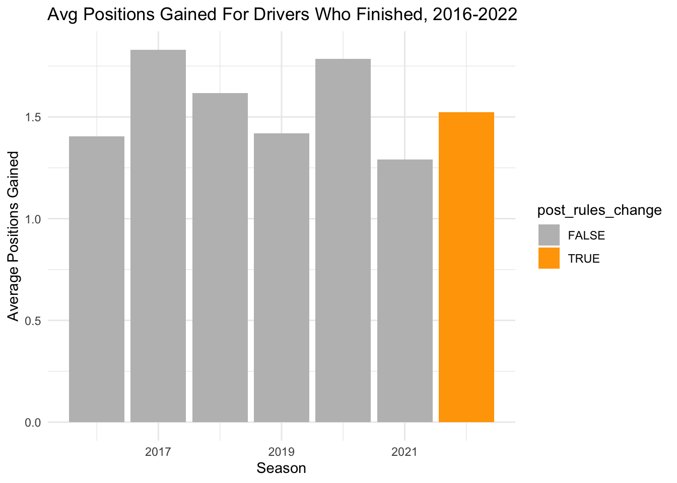
Overall, we see a jump from 2021 (before the rules change) to 2022 (after), but it is very small and doesn’t seem to be part of a larger trend.
What if we just look at cars that started out of position? For this analysis, we will define this as a car that started at least 2 places behind the average starting position of their team that year.
We can calculate average start position for each team each year and use that to identify who is starting out of position:
avg_start <- positions_clean %>%
  group_by(year, constructor_name) %>%
  summarize(avg_start = mean(start_position))

out_of_position <- positions_clean %>%
  inner_join(avg_start, by = c('year', 'constructor_name')) %>%
  mutate(out_of_position = ifelse((start_position - avg_start >= 2), TRUE, FALSE))

out_of_position %>%
  group_by(year, out_of_position) %>%
  summarise(avg_gain = mean(positions_gained)) %>%
  mutate(post_rules_change = ifelse(year == 2022, TRUE, FALSE)) %>%
  ggplot(aes(x = year, y = avg_gain, fill = out_of_position, color = post_rules_change)) +
  geom_col(position = "dodge") +
  geom_hline(yintercept = 0) +
  ylab("Average Positions Gained") +
  xlab("Season") +
  ggtitle("Avg Positions Gained Based on Out Of Position Start, 2016-2022") +
  scale_fill_manual(values = c("gray", "lightblue")) +
  scale_color_manual(values = c("white", "orange")) +
  theme_minimal()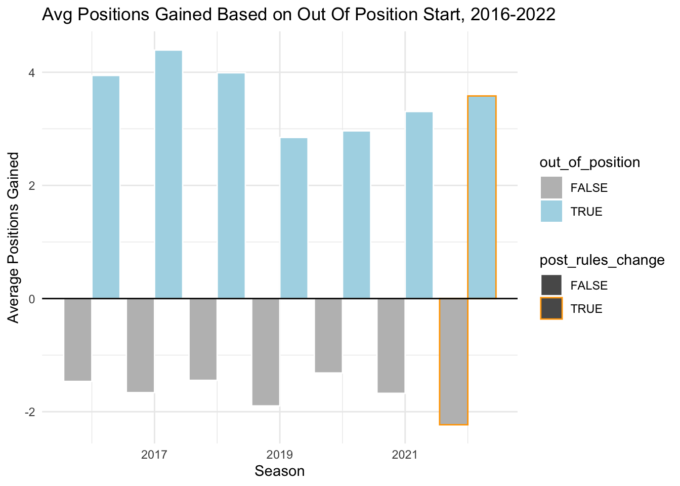
We see now that drivers who started in position on average lost positions (but typically fewer) while drivers who started out of position on average gained positions (typically more). This makes sense logically. When a fast car starts the race behind where they should, they can more easily pass. If a car starts at its average position or even higher, then it is surrounded by other cars that are at least as good, and so it’s much easier to be passed and much harder to pass.
Looking at the trend overall, there does not seem to be a clear change with the 2022 rule change. In 2022, the average number of positions gained for cars starting out of position was higher than 2021, but is more so part of a continuing upward trend than an outlier, particularly as we note that both 2017 and 2018 have higher average positions gained.
For cars starting in position, we see a similar trend of changing times. However, we do note that 2022 is the largest number of positions lost on average across all years in our time frame, so it is possible that starting in position (or ahead of expectations) left drivers more vulnerable than in past years. In other words, just because they started at the front does not mean that a faster car behind could not pass.
== COMMENTARY / LIMITATIONS == : I think that the second graph definitely helps provide context that the first one is missing (by adding in whether a driver started out of position). It might be slightly confusing though that in a sense, a driver could also be “out of position” by starting AHEAD of where they would be expected, so at the moment we are more so comparing starting behind expectation to starting at or above expectation. Not sure if this makes sense, or if it would make more sense to categorize as below expecation / at expectation / above expectation.
Next, we’ll look at lap times to see if there were any noticeable changes. To look at how lap times changed before and after the rules change, we need to consider the shifting calendar. The races that happen each year are not always the same. For example, 2021 had a Grand Prix in Russia, but this race was cancelled in 2022 due to the war in Ukraine and a ban on Russian participation in motorsport racing.
In order to look at changes over time, we will just look at the races that happened in 2022 and look at how those specific tracks changed, ignoring races in the previous years on tracks that were not used in 2022.
Since there are so many tracks, we’ll just select a random set of 5 to look at, and we’ll also remove outlier laps over 150 seconds.
tracks_2022 <- races %>%
  filter(year == 2022) %>%
  select(gp_name)

selected_laps <- lap_times %>%
  inner_join(drivers %>% select(driverId, code, surname), by = 'driverId') %>%
  inner_join(races %>% select(raceId, year, gp_name), by = 'raceId') %>%
  filter(raceId >= 948, gp_name %in% c(tracks_2022$gp_name)) %>%
mutate(post_rules_change = ifelse(year == 2022, TRUE, FALSE))set.seed(4)
races_list <- sample(tracks_2022$gp_name,5)
selected_laps %>%
filter(gp_name %in% races_list, laptime_seconds < 150) %>%
ggplot(aes(x = laptime_seconds, fill = post_rules_change)) + geom_density(alpha = 0.5) +
facet_wrap(~gp_name) +
scale_fill_manual(values = c("white", "orange")) + theme_minimal() +
xlab("Lap Time (s)") + ggtitle("Lap Time Distributions For Select GPs, Pre and Post 2022 Rule Change")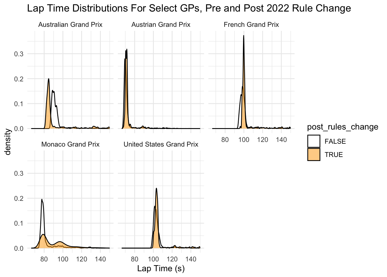
There is no clear pattern here.
For the Australian GP, lap times appear to be significantly slower after the rules change than prior. The French GP seems to be slightly faster, as does the Austrian GP. The US Grand Prix times seem pretty much the same. So it is possible that the regulations may have made lap times change differently on different tracks.
We can conduct a quick T-test to see if, controlling for track, we see a difference in track times before and after the rules change:
model <- lm(laptime_seconds ~ post_rules_change + gp_name, data = selected_laps)
summary(model)
Call:
lm(formula = laptime_seconds ~ post_rules_change + gp_name, data = selected_laps)

Residuals:
    Min      1Q  Median      3Q     Max
 -38.04   -8.78   -4.48   -1.18 3087.31

Coefficients:
                                 Estimate Std. Error t value Pr(>|t|)
(Intercept)                      102.8433     0.9308 110.491  < 2e-16 ***
post_rules_changeTRUE              1.2066     0.5983   2.017   0.0437 *
gp_nameAustralian Grand Prix      -6.5029     1.4497  -4.486 7.28e-06 ***
gp_nameAustrian Grand Prix       -30.5107     1.2414 -24.578  < 2e-16 ***
gp_nameAzerbaijan Grand Prix      25.8440     1.5003  17.226  < 2e-16 ***
gp_nameBahrain Grand Prix          1.5085     1.3135   1.148   0.2508
gp_nameBelgian Grand Prix         18.8421     1.4854  12.685  < 2e-16 ***
gp_nameBrazilian Grand Prix       -9.1527     1.3500  -6.780 1.21e-11 ***
gp_nameBritish Grand Prix         12.7926     1.3538   9.449  < 2e-16 ***
gp_nameCanadian Grand Prix       -22.8286     1.3567 -16.826  < 2e-16 ***
gp_nameDutch Grand Prix          -24.3936     1.7746 -13.746  < 2e-16 ***
gp_nameEmilia Romagna Grand Prix  -6.4299     1.6424  -3.915 9.05e-05 ***
gp_nameFrench Grand Prix          -1.9119     1.5570  -1.228   0.2195
gp_nameHungarian Grand Prix      -14.6695     1.2416 -11.815  < 2e-16 ***
gp_nameItalian Grand Prix         -9.0956     1.3336  -6.821 9.11e-12 ***
gp_nameJapanese Grand Prix         0.4622     1.4937   0.309   0.7570
gp_nameMexico City Grand Prix    -18.4737     1.8032 -10.245  < 2e-16 ***
gp_nameMiami Grand Prix           -4.1705     2.6411  -1.579   0.1143
gp_nameMonaco Grand Prix         -16.4380     1.2637 -13.008  < 2e-16 ***
gp_nameSaudi Arabian Grand Prix   25.6234     2.1520  11.907  < 2e-16 ***
gp_nameSingapore Grand Prix       16.2886     1.4261  11.422  < 2e-16 ***
gp_nameSpanish Grand Prix        -14.2038     1.2632 -11.244  < 2e-16 ***
gp_nameUnited States Grand Prix    1.9482     1.3739   1.418   0.1562
---
Signif. codes:  0 '***' 0.001 '**' 0.01 '*' 0.05 '.' 0.1 ' ' 1

Residual standard error: 78.64 on 120150 degrees of freedom
Multiple R-squared:  0.03379,   Adjusted R-squared:  0.03362
F-statistic:   191 on 22 and 120150 DF,  p-value: < 2.2e-16
Here, controlling for the race name, we see the following information for the rules change variable:
post_rules_changeTRUE || Estimate: 1.2066 || P-value: 0.0437 *
The p-value of < 0.05 indicates the presence of a potential relationship between lap times and the rules change. Since the estimate is positive, this means that statistically, the lap times seem to be slightly longer after the rules change than before, controlling for the track.
We can also do some further analysis to determine which tracks had the greatest change in lap time by looking at their average lap time before the change and comparing to 2022 times. We display the 5 tracks with the greatest increase in lap times, followed by the 5 with the greatest decrease, again removing outlier laps over 150 seconds which would indicate some sort of car or weather related issue:
laptime_changes <- selected_laps %>%
  filter(laptime_seconds < 150) %>%
  group_by(gp_name, post_rules_change) %>%
  summarize(avg_lap = mean(laptime_seconds)) %>%
  mutate(post_rules_change = ifelse(post_rules_change == TRUE, "after_change", "before_change")) %>%
  pivot_wider(names_from = post_rules_change, values_from = avg_lap) %>%
  mutate(difference = after_change-before_change, direction = ifelse(difference < 0, "Faster", "Slower"))


laptime_changes %>%
  filter(direction == "Faster") %>%
  arrange(difference) %>%
head(5)laptime_changes %>%
filter(direction == "Slower") %>%
arrange(desc(difference)) %>%
head(5)We can also plot this on ggplot to get a sense overall:
laptime_changes %>%
  filter(!is.na(difference)) %>%
  ggplot(aes(x= reorder(gp_name, difference), y = difference, fill = direction)) + geom_col() + coord_flip() + scale_fill_manual(values = c( 'lightgreen', 'tomato')) +
  xlab("GP Name") + ylab("Avg Lap Time Difference") + ggtitle("Difference in Avg Lap Time, Pre- and Post- 2022 Rules Change") +
  theme_minimal()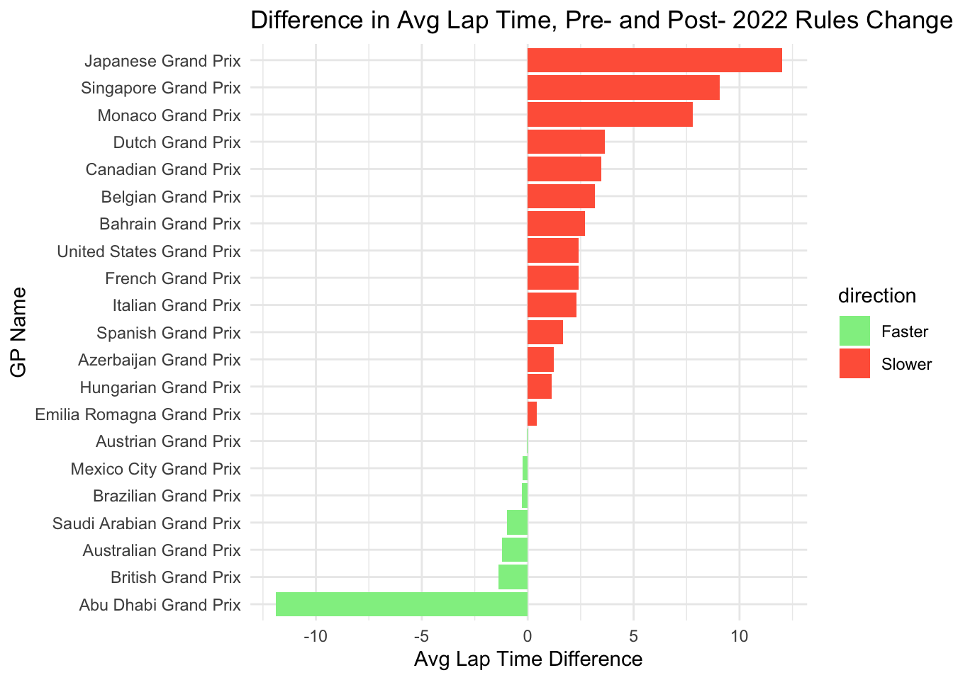
Here we can see that more tracks had slower lap times than had faster. We can also see that in the “Faster” direction, the Abu Dhabi GP is an outlier, and most tracks only got slightly faster if they did at all. In the “Slower” drection, there were 3 tracks (Japan, Singapore, Monaco) that were > 5 seconds slower.
== COMMENTARY / LIMITATIONS == : For our first graph with the 5 random density plots, it is hard to get a sense of the actual pattern so I’m not sure really how helpful this visualization is. I tried doing a version with all the tracks but it was just far too chaotic. Not sure if it is worth keeping some version of this, but potentially having more reasoning behind which tracks were selected, versus just a random draw? But not sure how to define the selection criteria. The statistical model definitely helps make this trend more clear though! I really like the graph with the red and green lap time changes. One thing that could maybe be added to make this more interesting though would be to classify each track further by track type in some way. For example, street track vs purpose built track. These tend to have very different characteristics that could provide further insight It might also make sense to look at this data by constructor to see which constructors had the biggest jump in lap times
Next, we can look at reliability. Within our results data, we have some basic status information built in that shows us who finished, retired, and was disqualified.
By calculating the proportion of each of these per year, we can get a sense of overall trends in terms of how many cars are falling into each condition.
percent_status <- results %>%
  inner_join(races, by='raceId') %>%
  mutate(finished = as_factor(ifelse(statusId == 1, 1, 0))) %>%
  select(raceId, year, disqualified, retired, finished) %>%
  pivot_longer(disqualified:finished, names_to = "status", values_to = "status_met") %>%
  filter(status_met == 1, raceId >= 948) %>%
  group_by(year, status) %>%
  summarize(count = n()) %>%
  mutate(status= factor(status, levels = c("disqualified", "retired", "finished")))


percent_statuspercent_status%>%
ggplot(aes(x=year, y=count, fill=status)) + geom_area(position = "fill", color = "black") + scale_fill_brewer(palette = "Set1") +
xlab("Season") + ylab("Proportion of Cars") + ggtitle("Proportion of Cars Finished vs Retired vs DSQ, 2016-2022") +
geom_vline(xintercept = 2021) +
theme_minimal()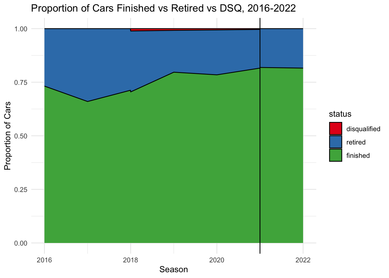
We can see that disqualifications are very rare in modern Formula 1. We also see that on average, around 75% of cars have finished each race since 2016. There seems to be a slow overall trend of more cars finishing per year. However, we see no change from 2021 to 2022 when the rule change was implemented.
However, this graph doesn’t give us information about why cars are retiring. Just because the number of retirements has not changed dramatically does not necessarily mean that the cars have not become more reliable. This is because there are many different potential reasons for retirement. They could retire due to a car reliability issue (e.g. an engine failure) but they could also retire due to an incident that involved driver area (e.g. a crash with another driver, spinning off the road, etc.).
The races data has another variable that can help with this: status ID:
results %>%
  select(resultId, raceId, driverId, constructorId, start_position, finish_position, statusId)
The status table contains the encodings for this table. For example, the first 5 status IDs in the table above are all 1, which indicates “Finished”, while the two people with status 5 had “Engine” issues.
We can quickly see how common each status is in our time period, specifically for drivers who retired:
results_status <- results %>%
  filter(raceId >= 948) %>%
  inner_join(races, by = "raceId") %>%
  inner_join(status,by="statusId") %>%
  select(raceId, year, driverId, disqualified, retired, status)


retirements <- results_status %>%
  filter(retired ==1)

table(retirements$status)
        Accident          Battery           Brakes        Collision
              49                4               27               98
Collision damage   Cooling system           Damage           Debris
              36                1                2                1
    Differential       Driveshaft       Electrical      Electronics
               1                1                5                2
          Engine          Exhaust       Front wing        Fuel leak
              49                3                1                1
   Fuel pressure        Fuel pump          Gearbox       Hydraulics
               3                1               20               12
         Illness       Mechanical         Oil leak     Oil pressure
               1                4                7                1
     Out of fuel      Overheating       Power loss       Power Unit
               1                5                9               25
        Puncture         Radiator        Rear wing          Retired
               6                1                1               13
            Seat      Spark plugs         Spun off         Steering
               1                1                6                1
      Suspension     Transmission            Turbo             Tyre
              15                2                3                2
       Undertray       Vibrations       Water leak   Water pressure
               2                1                3                4
      Water pump            Wheel        Wheel nut         Withdrew
               1                9                3                1
There are a ton of different statuses here. To help with our analysis, we can define which ones are obviously associated with a mechanical car failure. There are a few that are ambiguous (e.g. rear wing/front wing often have to do with damage versus failure), so we’ll ignore those:
mechanical_failures <- c("Battery", "Brakes", "Cooling system", "Differential", "Driveshaft", "Electrical", "Electronics", "Engine", "Exhaust", "Fuel leak", "Fuel pressure", "Fuel pump", "Gearbox", "Hydraulics", "Mechanical", "Oil leak", "Oil pressure", "Overheating", "Power loss", "Power Unit", "Radiator", "Spark plugs", "Steering", "Suspension", "Transmission", "Turbo", "Undertray", "Water leak", "Water pressure", "Water pump", "Wheel", "Wheel nut")retirements <- retirements %>%
mutate(mechanical_failure = ifelse(status %in% mechanical_failures, TRUE, FALSE))We can now create a similar graph to last time, but just looking at mechanical vs non-mechanical retirements:
retirements %>%
  group_by(year, mechanical_failure) %>%
  summarize(count = n()) %>%
  ggplot(aes(x=year, y=count, fill=mechanical_failure)) + geom_area(position = "fill", color = "black") + scale_fill_brewer(palette = "Set1") +
  xlab("Season") + ylab("Proportion of Cars") + ggtitle("Proportion of Cars Retiring For Mechanical vs Other Failure, 2016-2022") +
  geom_vline(xintercept = 2021) +
  theme_minimal()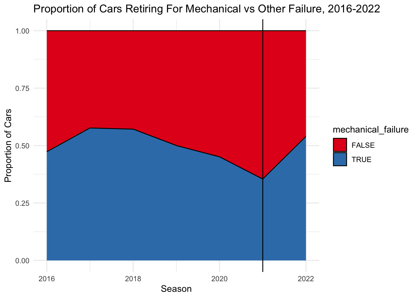
We can see here that there was a strong change in direction in terms of increased mechanical failures after the rule change. In 2021, less than half of retirements were related to mechanical issues, but in 2022, it was over 50%. It seems like cars were previously getting more and more reliable in the years prior to the rule change, but this changed with the institution of the change.
Given this jump from 2021 to 2022, it would be interesing to look into whether this was universal across all types of mechanical failures or if the new regulations caused some types of failures to increase while others decreased.
mechanical_failures <- retirements %>%
  filter(year %in% c(2021, 2022), mechanical_failure == TRUE) %>%
  group_by(year, status) %>%
  summarize(count = n())

mechanical_failuresmechanical_failures %>%
pivot_wider(names_from = year, values_from = count) %>%
mutate_all(~replace(., is.na(.), 0)) %>%
mutate(change = `2022` - `2021`) %>%
ggplot() +
geom_segment( aes(x=reorder(status, change), xend=status, y=`2021`, yend=`2022`), color="black") +
geom_point( aes(x=status, y=`2021`), color="skyblue", size=3 ) +
geom_point( aes(x=status, y=`2022`), color="orange1", size=3 ) +
coord_flip() +
theme_minimal() +
xlab(NULL) +
ylab("# of Retirements") +
ggtitle("# of Retirements For Different Mechanical Related Issues", subtitle = "2021 (Blue) vs 2022, post rules-change (Orange)") +
theme_minimal()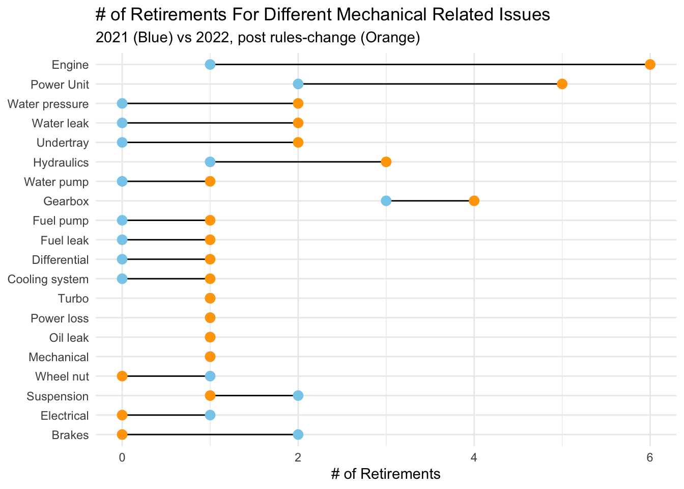
This plot gives us a lot more information than we had previously. We can now see that patterns vary significantly across different types of mechanical issues. Engines, for example, had a HUGE increase in number of related retirements. 2021 had only 1 engine related retirement while 2022 had 6! This makes sense as a big part of 2022 was a change in engine design, and often a new year of engine design means that there are still some kinks to be worked out.
We also see a big increase in power unit related failures, as well as water related issues.
There are a few areas where we saw fewer incidents in 2022 than 2021. These are: wheel nuts, suspension, electrical, and brake issues.
== COMMENTARY / LIMITATIONS == : The lollipop chart here is super useful for helping explain what we saw in the earlier analysis and I think that would be interesting to readers. It might be useful to see if there is a way to add a legend for the colors though. Because of the way I had to draw the plot, this legend did not show up, which cna make it harder to read. Another thing that is potentially worth looking into here is which teams were the ones facing the mechanical issues. Were these issues universal (all teams having them), or were they just focused on one specific team (e.g. there was a lot of commentary throughout the season on Ferrari’s reliability issues). We are missing that information in this analysis so far, and it could just mean that rather than the regulations instituting overall reliability challenges, what really happened is that one team was just terrible at designing a reliable car compared with the others.
For this question, we will look at the Constructors Standings.
Do we see a significant change in the lineup of teams before and after the change? To determine this, we can create a timeseries plot showing how team placings changed season by season from 2016-2022.
We start by joining the constructors and races tables together:
# Join constructor results table to more information on constructors and races
constructor_results <- constructor_standings %>%
  inner_join(constructors_renamed, by = 'constructorId') %>%
  inner_join(races, by = 'raceId')

head(constructor_results)
We can then filter this to the years and columns relevant to us, and group by/summarize to find the total number of points each team got each season:
constructors_ranked <- constructor_results %>%
  filter(year >= 2016 & year < 2023)  %>%
  select(year, raceId, position, points, constructor_name) %>%
  group_by(year, constructor_name) %>%
  summarize(final_points = max(points))
Using the same historic team name update as we have done previously, we will use reconfigured team names (which use the most recent name to reference all iterations of the team) to make it easier to compare each team’s performance over time. We also include a vertical line to show the point where the transition occurred. The line and to the left are before the transition. To the right is after.
Although these teams all have separate names and designations, some of them are actually the same team, just in different years. For example, the current “Alpha Tauri” team used to be called “Toro Rosso”. In order to keep the teams joined together through name changes, we can recategorize the team names as just their current name and also remove the teams that no longer existed in the 2022 season. This helps make our graph easier to follow so we can better trace the changes over time.
constructors_ranked %>%
  ggplot(aes(x = year, y = final_points, color = constructor_name)) +
  geom_line() +
  geom_vline(xintercept = 2021) +
  theme_minimal() +
  xlab("Season") +
  ylab("Constructors' Championship Points") +
  ggtitle("Points Earned In The Constructors' Championship, 2016-2022", subtitle = "Using Current Team Names")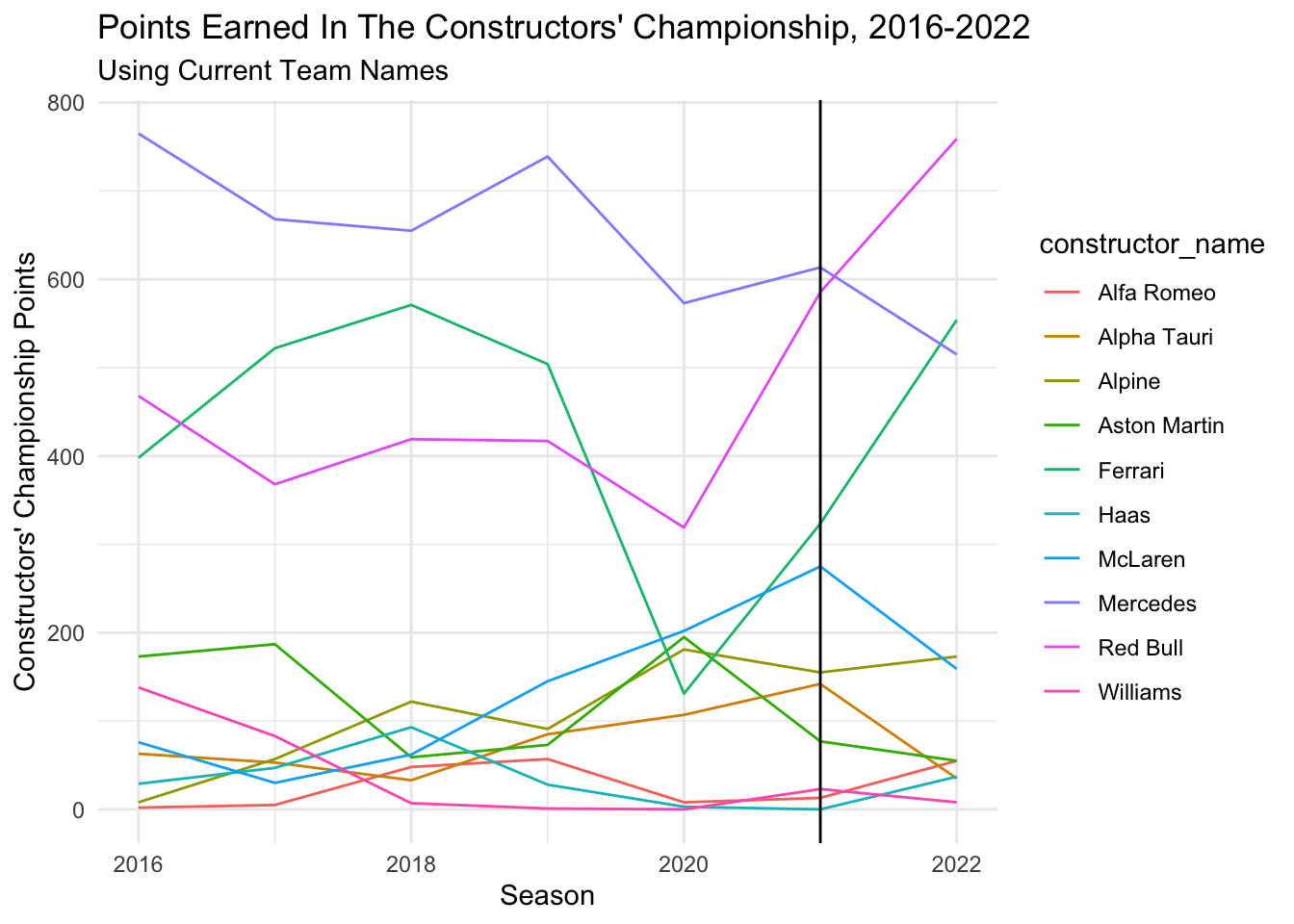
As we can see here, relative rankings in the championship remained pretty steady for a good part of the old regulations, with Mercedes dominant, Ferrari having a few good years, and Red Bull close behind.
After the regulations change, Mercedes dropped from 1st to 3rd place and Red Bull and Ferrari had massive spikes in points. However, note that they were on the up-swing before the change was put in place (in 2021) so it could be unrelated. McLaren did not seem to take the change well. They were previously on an upward points scoring trend and shot down in 2022. We see the same trend with Alpha Tauri. Meanwhile, Hass and Alfa Romeo, who in previous years had struggled to score any points did see a small jump in points and a positive shift in their overall rankings.
It is hard to tell fully, without a few more years worth of data, but it does appear that the regulation change did switch the team rankings up and some teams (Red Bull/Ferrari) adapted better than others (Alpha Tauri, McLaren).
We can also look at the number of wins and podiums by each team, where here we define podiums as a 1st, 2nd or 3rd place finish (which includes the 1st place finishes from the wins column).
wins_podiums <- constructor_standings %>%
  inner_join(constructors_renamed, by = 'constructorId') %>%
  inner_join(races, by = 'raceId') %>%
  inner_join(results, by = c('raceId', 'constructorId')) %>%
  select(constructor_name, year, gp_name, rank) %>%
  filter(year >= 2016 & year < 2023) %>%
  group_by(constructor_name, year) %>%
  summarize(wins = sum(rank == 1), podiums = sum(rank %in% c(1, 2, 3)))

wins_podiums %>%
  arrange(desc(podiums))
Looking at a summary of each of these new variables we see that for wins, the most we had recorded was 10 in a season. The average was 2 wins per team.
summary(wins_podiums$wins) Min. 1st Qu. Median Mean 3rd Qu. Max.
0.000 0.000 0.000 2.043 3.000 10.000 For podiums, the max was 29 across both drivers, with an average of 6 per team.
summary(wins_podiums$podiums) Min. 1st Qu. Median Mean 3rd Qu. Max.
0.000 0.000 1.000 6.129 11.000 29.000 wins_podiums %>%
ggplot(aes(x = year, y = wins, col = constructor_name)) + geom_line() + theme_minimal() + ggtitle("Wins Per Season, 2016-2022") + geom_vline(xintercept = 2021) 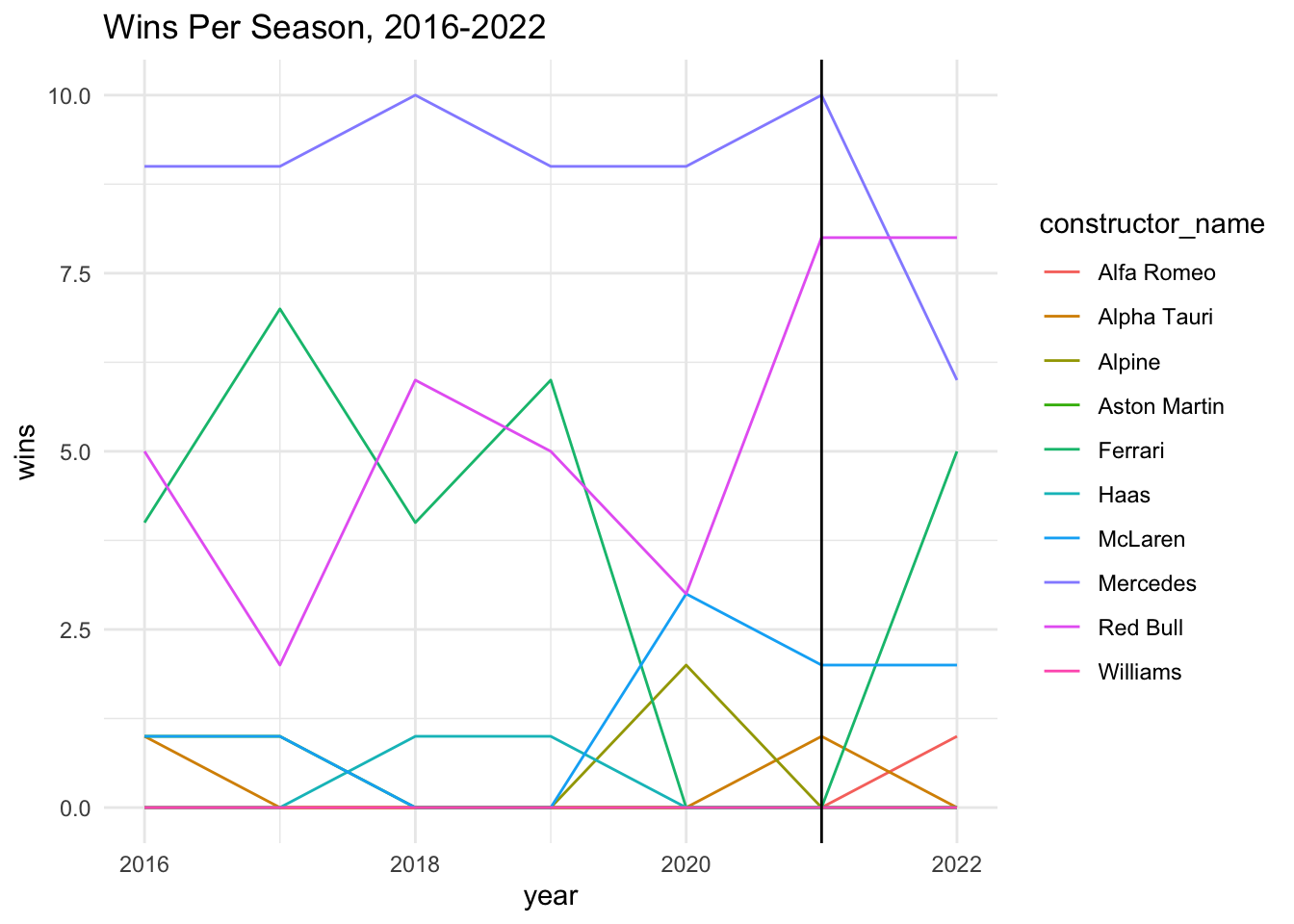
We see that looking at Wins, Mercedes took a big dip and Ferrari took a big jump, while Red Bull remained pretty steady after the rule change.
wins_podiums %>%
  ggplot(aes(x = year, y = podiums, col = constructor_name)) + geom_line() + theme_minimal() + ggtitle("Podiums Per Season, 2016-2022", subtitle = "Where a Podium Here Only Includes 2nd/3rd") +
geom_vline(xintercept = 2021) 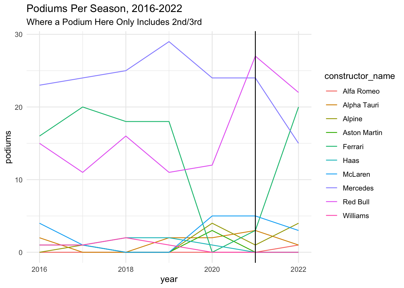
Looking at podiums, we see a similar trend.
== COMMENTARY / LIMITATIONS == : It is kind of difficult to tell all of these team colors apart. Would it make sense to use an official color palette that is representative of the actual team names? Might be worth adding for a final version. Not sure if it would be interesting or not to look at average finish position as well versus just points (from our first graph). If we look at points, we are missing all the information happening between 11th-20th place since no points are awarded. Technically a team could be finishing middle of the road in 11th all season and they’d look just as bad on the points time table as a team finishing 20th every time, so we definitely lose some info if we don’t look at finish position.
Next, we’ll look at drivers to see who did the best job adapting to the regulations. To do so, we’ll look at how drivers performed relative to their teammates, rather than overall, since differences across teams could easily be attributed to differences in cars.
Since which drivers are in the sport changes all the time, let’s just look at the driver pairings that stayed the same in both 2021 and 2022 (same team/same drivers in both years) . Those drivers pairings are:
All other drivers that only drove one of these two seasons are excluded from this analysis.
We pull these drivers below and their relevant results and qualifying data:
drivers_21_22 <- drivers %>%
  filter(driverRef %in% c("max_verstappen", "perez", "sainz", "leclerc","ricciardo", "norris", "alonso", "ocon", "tsunoda", "gasly", "vettel", "stroll"))


race_results <- results %>%
  inner_join(races, by = "raceId") %>%
  filter(driverId %in% drivers_21_22$driverId, year %in% c(2021, 2022)) %>%
  inner_join(drivers_21_22, by = "driverId") %>%
  inner_join(constructors_renamed, by = "constructorId") %>%
  mutate(fastest_lap = ifelse(rank == 1, TRUE, FALSE)) %>%
  inner_join(status, by = 'statusId') %>%
  inner_join(driver_standings %>% select(driverId, raceId, points) %>% rename(drivers_points=points), by = c("driverId", "raceId")) %>%
  inner_join(constructor_standings %>% select(constructorId, raceId, points) %>% rename(constructors_points=points)) %>%
  select(code, surname, constructor_name, year, gp_name, round, start_position, finish_position, status, retired, points, drivers_points, constructors_points)

qualifying_results <- qualifying %>%
  inner_join(races, by = "raceId") %>%
  filter(driverId %in% drivers_21_22$driverId, year %in% c(2021, 2022)) %>%
  inner_join(drivers_21_22, by = "driverId") %>%
  inner_join(constructors_renamed, by = "constructorId") %>%
  select(code, surname, constructor_name, year, gp_name, position, q1_time_s, q2_time_s, q3_time_s) %>%
  rename(qualifying_position = position)


overall_results <- race_results %>%
  inner_join(qualifying_results, by = c("code", "surname", "constructor_name", "year", "gp_name"))

overall_results %>% head(5)
Let’s start by looking at retirements:
overall_results %>%
  group_by(code, surname, constructor_name, year) %>%
  summarize(retirements = sum(retired == 1)) %>%
  mutate(year = factor(year)) %>%
  ggplot(aes(x = surname, y = retirements, fill =year)) + geom_col() + facet_wrap(~constructor_name, scales = "free_x") + xlab(NULL) + ylab("# of Retirements") + ggtitle("# of Retirements By Driver and Year", subtitle = "For Driver Pairings That Raced in both 2021 and 2022") + scale_fill_manual(values = c("skyblue", "orange1"))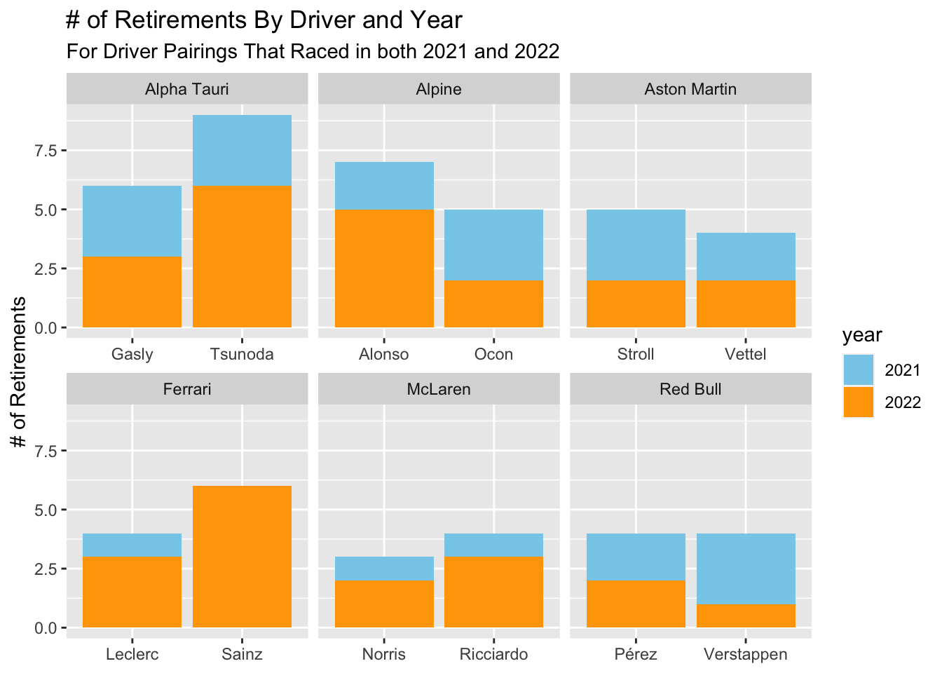
From this graph, we can see a few patterns: - Drivers that did better (fewer retirements) than their teammates in 2022 were: Verstappen (vs Perez), Norris (vs Ricciardo), Leclerc (vs Sainz), Ocon (vs Alonso), and Gasly (vs Tsunoda). - Stroll and Vettel did similarly in 2022. - In terms of change from 2021 to 2022, Verstappen and Ocon are the only two drivers that improved in terms of retiring less than the year before. Vettel, Perez, and Gasly retired the same amount. Tsunoda, Alonso, Leclerc, Sainz, Norris, and Ricciardo all retired more in 2022 than 2021.
== COMMENTARY / LIMITATIONS == : Would it make sense to again filter these retirements to those that exclude car related failures? This might leave us with very little data depending on driver, but it could help us be more accurate in avoiding issues of bad luck. For example, Alonso looks really bad here in 2022, but the reality was that he kept having terrible luck with his car breaking down.
Next, we can look at the proportion of points each driver earned for their team. We take the total constructors championship points and cumulative drivers championship points for each driver to calculate the gap between each of our driver pairs.
team_gaps <- overall_results %>%
  select(surname, constructor_name, year, round, drivers_points, constructors_points) %>%
  mutate(teammate_points = constructors_points - drivers_points, gap = drivers_points - teammate_points, percentage_points = drivers_points/constructors_points * 100)

team_gaps
We can then find the maximum gap to see which pair was the most unevenly matched:
team_gaps %>%
  arrange(desc(abs(gap))) %>%
  head(2)
The largest recorded gap in our data was in 2021, of Verstappen over Perez. Perez earned only 190 (34%) of Red Bull’s 585.5 points, for a gap of 205.5, which is huge!
Note: Half points were awarded for a race this year that was cut short due to rain and flooding, which is why the points don’t match up with the standard expected values.
We can also calculate the average gap:
single_gap_per_team <- team_gaps %>%
  mutate(abs_gap = abs(gap)) %>%
  distinct(abs_gap, .keep_all = TRUE) %>%
  arrange(desc(abs_gap))

mean(single_gap_per_team$abs_gap)
[1] 54.97938The average gap between teammates was ~55.
We can also plot the gap between each pair of teammates over time:
team_plot <- function(team_name, color1, color2) {
  team_gaps %>%
  filter(constructor_name == team_name) %>%
  ggplot(aes(x=round, y = gap, fill = surname)) + geom_area(color = "black") + facet_wrap(~year) +
  scale_fill_manual(values = c(color1, color2)) +
  ggtitle(paste0("Championship Points Gap Between ", team_name, " Drivers, 2021-2022")) +
  xlab("Race # In Season") + ylab("Points Gap") + theme_minimal()
}
Looking at Red Bull, the overall gap between Verstappen and Perez got closer in 2022, though Verstappen was still very dominant overall.
team_plot("Red Bull", "#E30118", "#000B8D")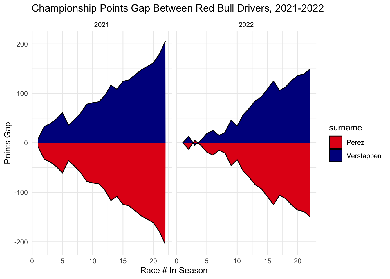
Looking at McLaren, Lando Norris significantly increased his gap over Daniel Ricciardo from 2021 to 2022. Ricciardo seemed to really struggle with the new cars and lost to Norris almost every race, as we can see by the nearly always increasing points gap. This is not surprising to see, as 2022 was the year that Ricciardo was not offered a new contrac and lost his spot in the sport.
team_plot("McLaren", "#47C7FC", "#FF8000")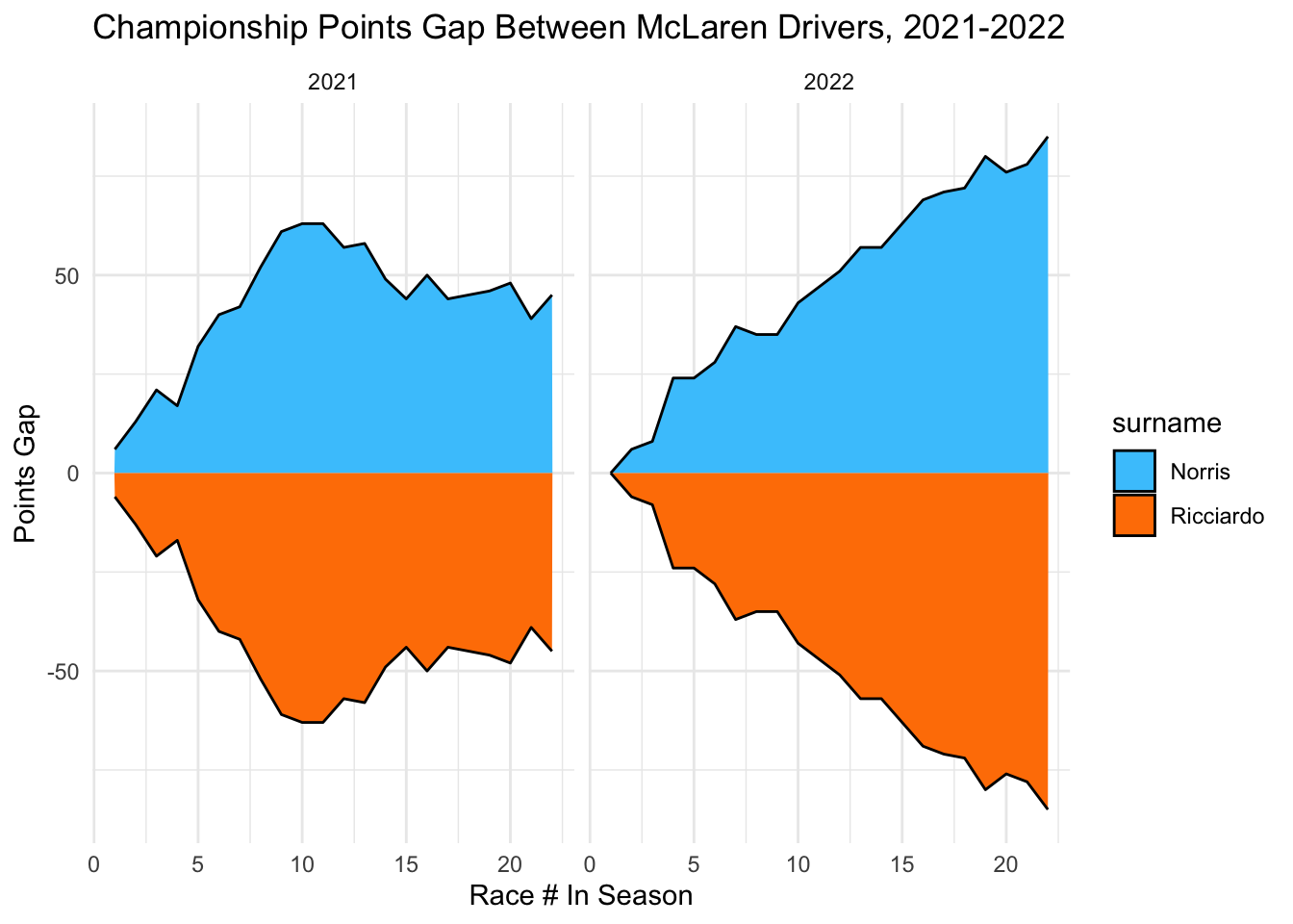
Looking at Ferrari, Leclerc and Sainz were extremely back in forth in 2021. Essentially, equally matched. This is very different from 2022, where Leclerc had a points lead over Sainz across the entirety of the season. However, this was not as dominant a performance as Verstappen over Perez, since Leclerc’s points lead only peaked at just over 60, compared to > 100 for Perez. Leclerc, though, seemed to transition better to the new cars.
team_plot("Ferrari", "#ED1C24", "#FFF200")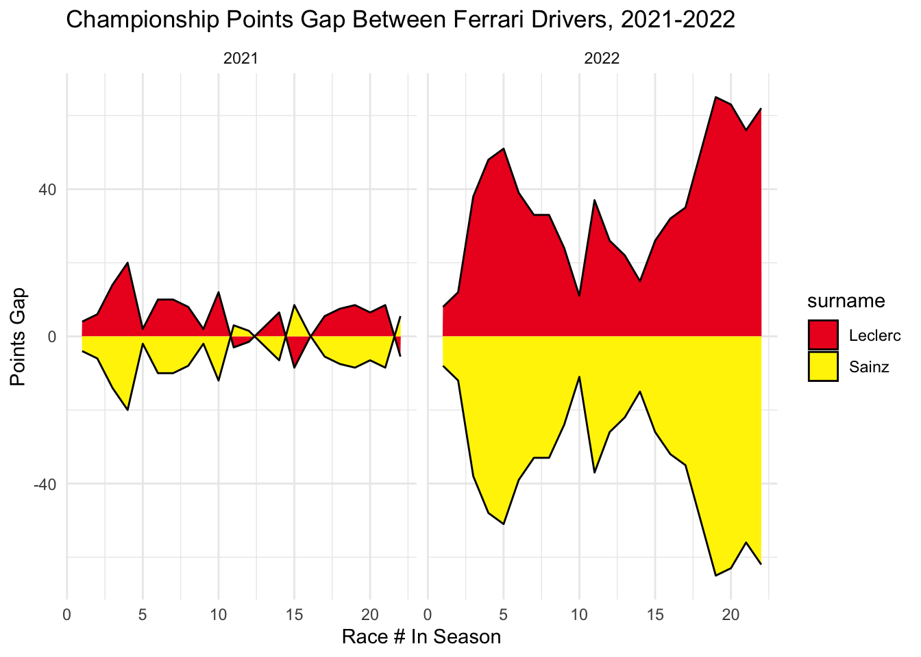
Looking at Aston Martin, Vettel seemed to have the lead over Stroll in both years, though his biggest points gap was achieved in 2022.
team_plot("Aston Martin", "#00594F", "#CEDC00")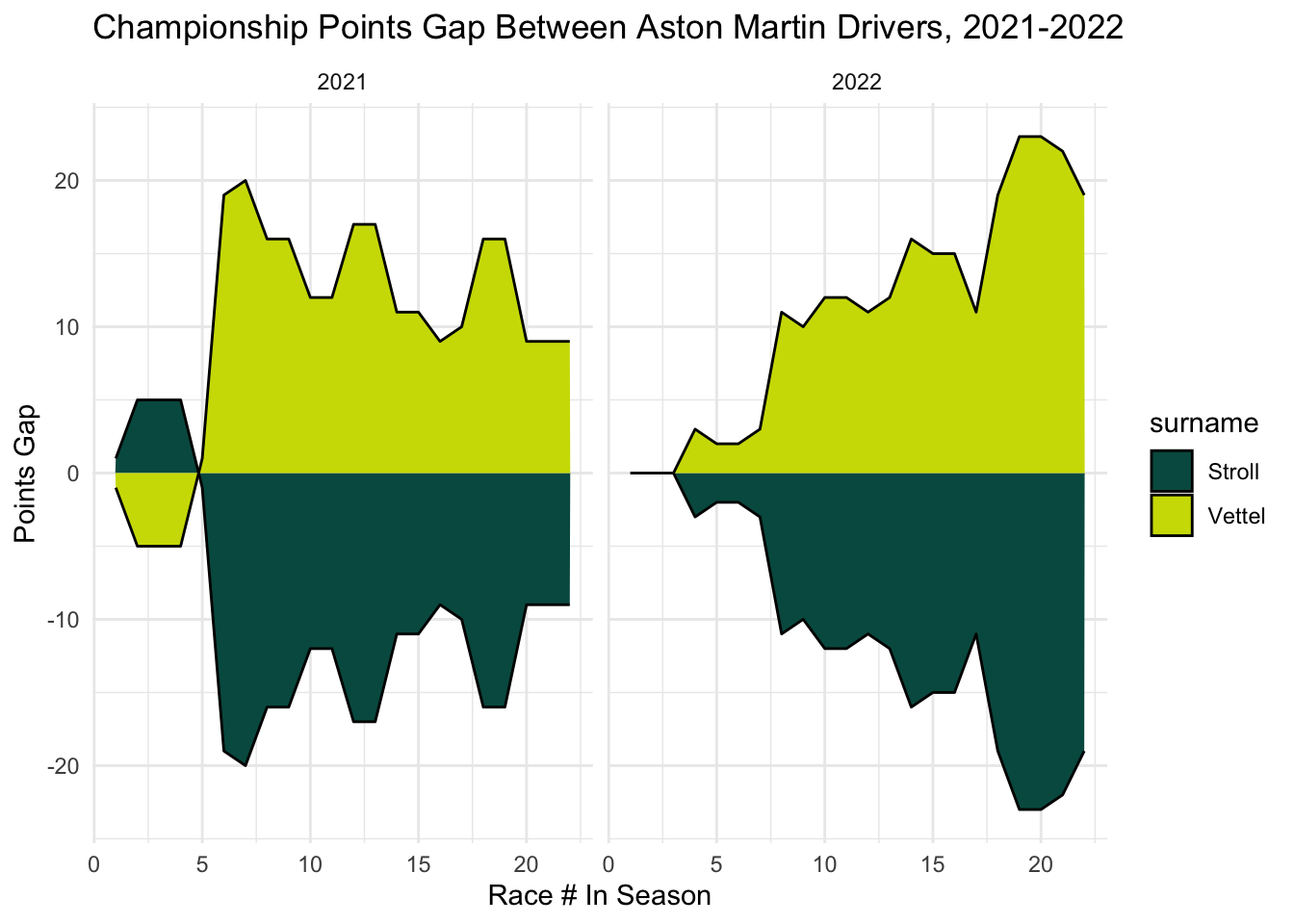
For Alpha Tauri, Gasly clearly outperformed Tsunoda in 2021, but the story was very different in 2022. Tsunoda and Gasly were very evenly matched. This huge decrease in gap indicates either that Tsunoda made a big step forward, Gaslly a step back, or both, with the new regulations.
team_plot("Alpha Tauri", "#00293F", "#F1F3F4")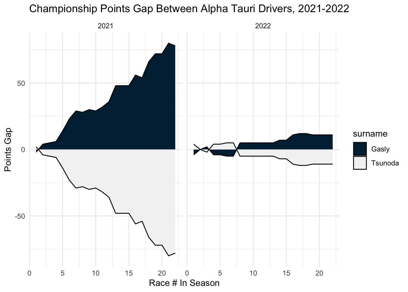
2021 was a very back and forth year for Alpine, with Alonso and Ocon swapping spots in the championship several times. In 2022, however, Ocon maintained a lead over Alonso for the entire season, though the points gap was never super large. Ocon’s dominance in 2022 may be in part due to the large number of retirements and mechanical issues that Alonso had throughout the season, since each DNF in a race means 0 points.
team_plot("Alpine", "#0078C1", "#FD4BC7")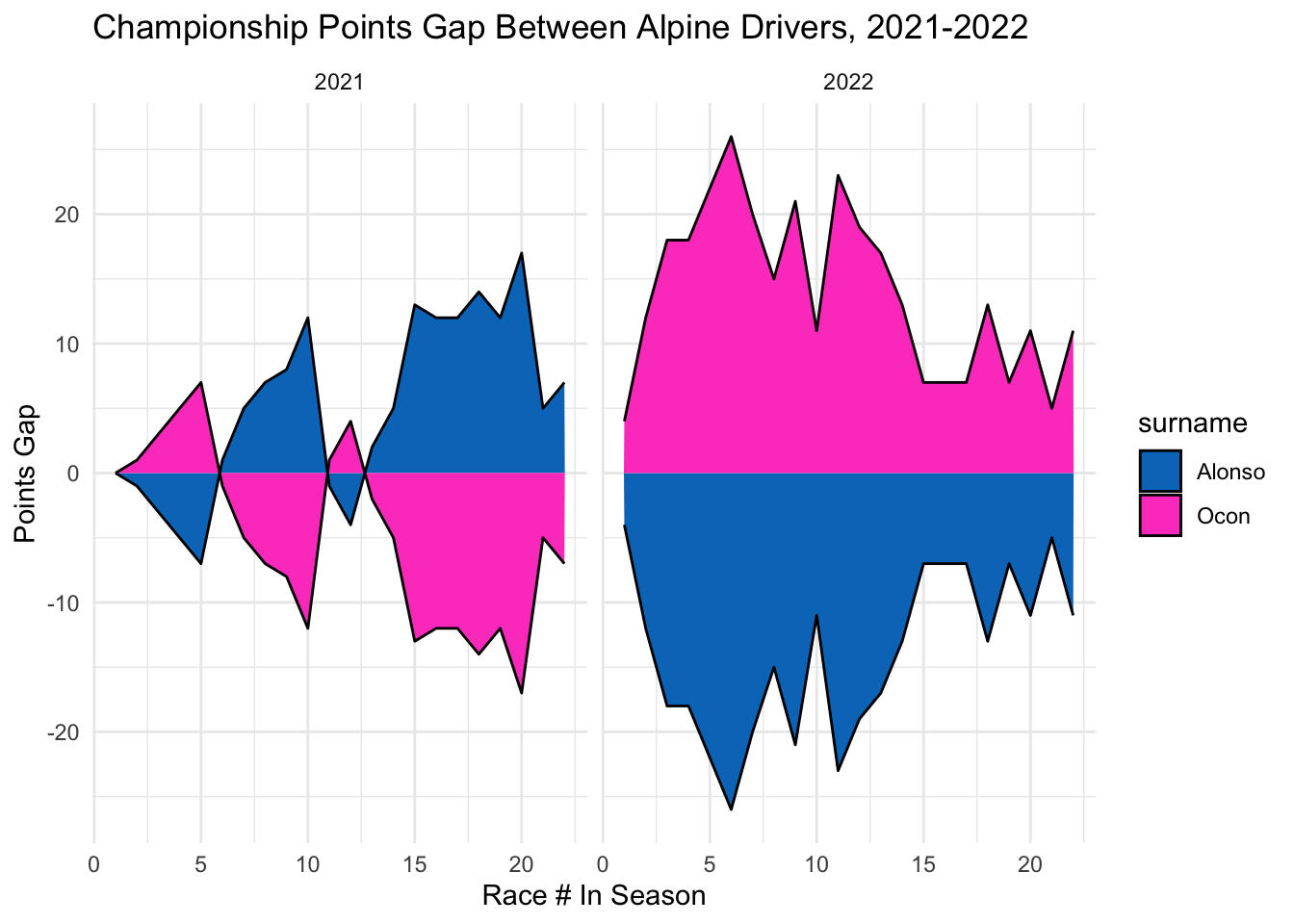
== COMMENTARY / LIMITATIONS == : I really like these graphs and find them really useful for comparing driver pairings across the season. My only note would be that having both the positive and negative points gaps at the same time makes the gaps look larger than they really are, but at least this is consistent across all the drivers, so it does not misrepresent trends over time. And, I like the way it makes the graphs symmetrical, which I am not sure how we could achieve otherwise. Not sure if it would also make sense to look at percentage gaps (in terms of % of overall points) as well, since the number of points achieved by different teams is quite different, so a 10 points gap for Red Bull is extremely small, while for Aston Martin this may be a huge gap.
Finally, we look at qualifying. Let’s look at each teammate pair to see how their qualifying records compared from 2021-2022.
First we look at some summary statistics on qualifying position:
overall_results %>%
  select(surname, constructor_name, year, round, gp_name, qualifying_position) %>%
  group_by(surname, constructor_name, year) %>% arrange(qualifying_position, .by_group = TRUE) %>% summarise(best_qual=first(qualifying_position), worst_qual=last(qualifying_position), avg_qual = mean(qualifying_position)) %>%
  arrange(avg_qual)
Arranging by average qualifying position, Verstappen had the best average in both 2021 and 2022 of any driver in our list, followed by Leclerc and Sainz in 2022. The worst qualifying pair was Stroll and Vettel in 2022, with an average position of 15.77 and 14.35 respectively. Norris (’21), Leclerc (’21, ’22), Perez (’22), Sainz (’22), and Verstappen (’21, ’22) are the only drivers in our list to qualify in Pole Position. Verstappen (’21), Ocon (’20), Tsunoda (’21, ’22), Stroll (’21, ’22) and Vettel (’22) are the only drivers to qualify last.
Graphing the distributions, we can get a better sense of the relative gap between teammates:
team_boxplot <- function(team_name, color1, color2) {
  overall_results %>%
  filter(constructor_name == team_name) %>%
  ggplot(aes(x=surname, y = qualifying_position, fill = surname)) + geom_boxplot() + facet_wrap(~year) +
  scale_fill_manual(values = c(color1, color2)) + scale_y_reverse() +
  ggtitle(paste0("Distribution of Qualifying Positions For ", team_name, " Drivers, 2021-2022")) +
  xlab(NULL) + ylab("Qualifying Position") + theme_minimal()
}
Looking at Red Bull’s Perez vs Verstappen, Perez seemed to close the qualifying gap from 2021 to 2022.
team_boxplot("Red Bull", "#E30118", "#000B8D")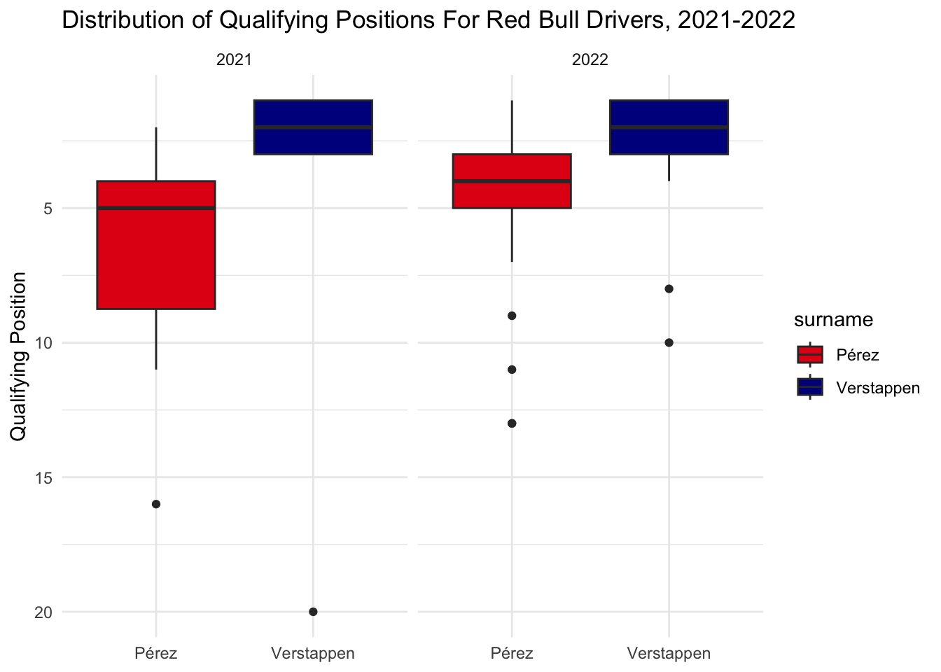
For McLaren, Ricciardo’s average qualifying position got worse in 2022, while Norris had a wider distribution. Overall, the gap seems to have increased.
team_boxplot("McLaren", "#47C7FC", "#FF8000")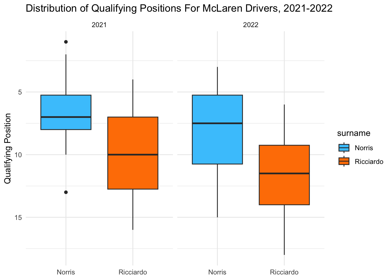
Looking at Ferrari, Leclerc’s best qualifying position was better than Sainz in both 2021 and 2022, but not his median. Leclerc seemed to take a step forward in terms of qualifying better than his teammate in 2022, though both drivers improved their qualifying significantly (likely due to the Ferrari performing very well in 2022). It is interesting to note that although Sainz had a lower overall limit on qualifying in 2021 (worse lows), he still ended up with more points than Leclerc in that season.
team_boxplot("Ferrari", "#ED1C24", "#FFF200")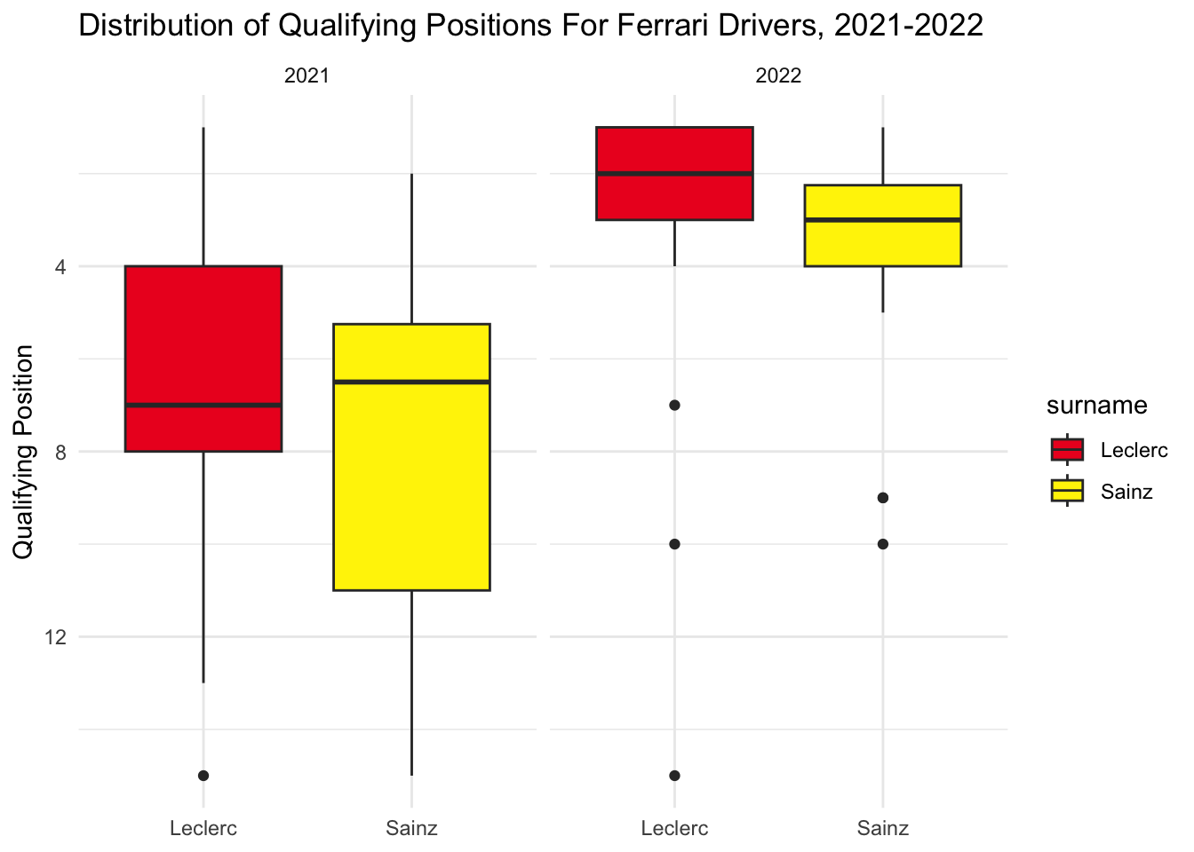
With Aston, Vettel did better than Stroll both years and the gap between median position remained pretty consistent. Vettel’s qualifying seemed to get less consistent from 2021 - 2022, though.
team_boxplot("Aston Martin", "#00594F", "#CEDC00")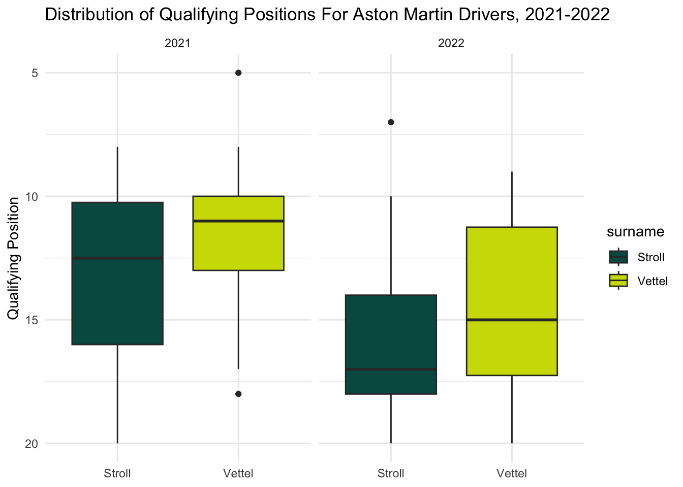
For Alpha Tauri, Gasly qualified better than Tsunoda consistently in 2021, but this gap significantly closed in 2022. This looks more to do with Gasly performing worse than Tsunoda necessarily performing better, since Tsunoda’s qualifying position distribution looks relatively similar over time.
team_boxplot("Alpha Tauri", "#00293F", "#F1F3F4")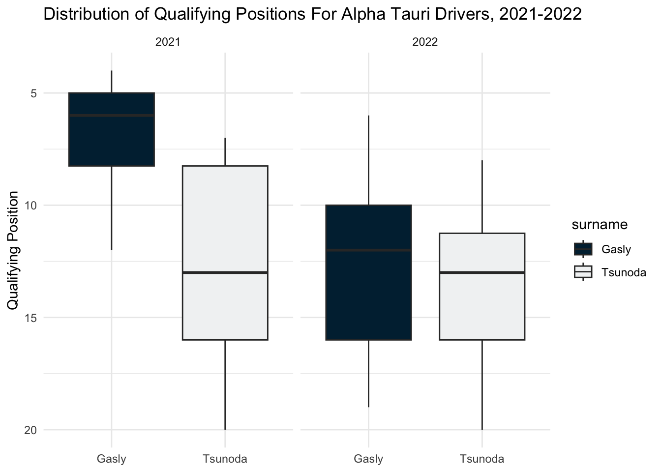
Finally, with Alpine, Alonso and Ocon seem to be our closest matched teammates overall. They qualified almost identically in 2021. In 2022, Alonso was more consistent, but both drivers seemed to have their moments of success and failure.
team_boxplot("Alpine", "#0078C1", "#FD4BC7")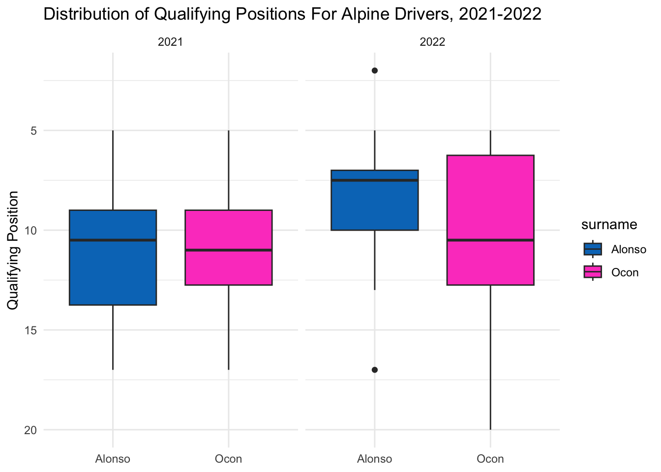
== COMMENTARY / LIMITATIONS == : I’m not sure if it would also be helfpful to include some sort of count of how many times each driver qualified for each of the three qualifying sessions. That is something that people talk about a lot on the TV broadcast, but this information is technically covered here (since qualifying position is directly dependant on which sessions the driver participates in), so I’m not sure if it would be interesting at all. On these graphs as well as the previous set, I’m not sure if it makes sense to keep the legend or not since we have that information on the x-axis as well.
Rao, R. (2023). Formula 1 World Championship Data: 1950-2023. Kaggle. https://www.kaggle.com/datasets/rohanrao/formula-1-world-championship-1950-2020
Formula 1 (2023). Formula 1 Race Result Archive. Formula 1. https://www.formula1.com/en/results.html
Federation International de l’Automobile (FIA). (2023). Regulations: FIA Formula One World Championship. https://www.fia.com/regulation/category/110
Tippett, B. (2021). The Complete Guide To Understanding Formula 1. Defector. https://defector.com/the-complete-guide-to-understanding-formula-1
Kanal, S. (2023). The beginner’s guide to…the Formula 1 Grand Prix Weekend. Formula 1. https://www.formula1.com/en/latest/article.the-beginners-guide-to-the-formula-1-grand-prix-weekend.20OGbgZCWKj9ML79gBzfoX.html
F1 Chronicle Media Team (2020). The Complete Beginners Guide to Formula 1. F1 Chronicle. https://f1chronicle.com/a-beginners-guide-to-formula-1/
Wickham, H., & Grolemund, G. (2016). R for data science: Visualize, model, transform, tidy, and import data. https://r4ds.had.co.nz
R Core Team (2023). R: A Language and Environment for Statistical Computing. R Foundation for Statistical Computing, Vienna, Austria. https://www.R-project.org/.